Can you recognize which of these three "ancient" LOGOs are?
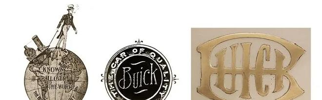
Is it even that some people will wonder: "Isn't this the LOGO from three companies?" In fact, these three LOGOs come from the same company, and they all come from a car brand that has recently caused a hot discussion on the Internet because of the new LOGO - Buick.

【Left is the existing LOGO; right is the new LOGO patent】
Did you feel surprised? A company's LOGO can have such a big difference before and after. In fact, not only Buick, but also every company with a long history and pivotal importance has had many times in the process of development, the logo of the earth-shaking has been replaced.
Started in 1904, Buick is a century-old brand in the automotive industry. As mentioned at the beginning, Buick is such a car brand that is in line with the "long history and great importance". The ancients said: Take history as a mirror, you can know the rise and fall. Looking at the Buick LOGO, we can also know the brand change and even the rise and fall of the world. In 1903, Buick was born, the LOGO for a gentleman to go to the world; the following year, Buick launched the first model named after Buick - B-type car, at this point, the buick name officially began a century-long journey. In this initial exploration stage, Buick has undergone three LOGO changes in just 7 years.
At that time, no one may have imagined that Buick would experience three serious crises between 1908 and 1941, but what is even more unexpected is that these three crises did not bring Buick down - it would only make me stronger if it did not bring me down. Incidentally, during this period, Buick did something that will still be hyped up by major car companies today - the world's first mass production modeled on concept cars.
From 1942 to 1972, Buick began to be responsible for the production of aircraft engines and ambulances, so the Buick LOGO at this stage was basically based on elements such as "eagle" and "shield". It is precisely because of this part of the accumulation of funds and technology that Buick ushered in a take-off moment, just like its 1975 LOGO, it is an eagle with wings spread.
Since then, Buick has continued to accelerate the process of globalization, and formally established the Buick Three Shields logo that we now know, and gave it a rich connotation: blue, symbolizing elegant art, representing high-end comfortable models; silver, symbolizing innovative technology, representing high-end SUV models; red, symbolizing the power of passion, representing high-end coupe models.
It is not difficult to see that the Buick brand has been very sensitive to the insight of the times in the past hundred years. Born from the Industrial Revolution, from the crisis to find development, from the war to the fire, and then to the accelerated globalization process. In the whole process, the Buick brand has contributed many "firsts", which are both in line with the times and to promote the times. And if you are sensitive enough, you will be able to find that in this century-old history, every change in the Buick brand and even the change that drives the world must be accompanied by a new change - logo replacement.
Although the official definition of the new LOGO has not yet been defined, with the help of the pictures circulating on the existing Internet, we can also make a bold guess. First of all, in terms of design, at first glance, the new LOGO returns to "flat" and "black and white style" like the original LOGO. This is the current trend of design, but why doesn't it mean a "new beginning"? The arrival of the wave of electrification and intelligence has made it inevitable for traditional fuel models to withdraw from the market, and for all traditional car companies, if they want to continue to develop, they must embrace the new era. So, what is the new era? Perhaps from another "Buick new LOGO hypothetical map" can be detected.
Compared with the new logo design of the flat black and white, the biggest difference of the hypothetical image is only one point: it will glow. And Edison told us a hundred years ago that there are only two reasons for luminescence - light and heat, and he himself chose to achieve it through electric current. Power! It is one of the options for embracing a new era. This remark is not simply "looking at the picture to speak" or "guessing", but combined with the analysis of the LOGO replacement and the existing resources of General Motors.
GM has been conducting deep research and reserve work on electrification technology since the middle of the last century, which means that it has deep experience in itself. At the same time, the emergence of the Aoteneng platform is more evidence of this view, which not only covers the core three electric technologies independently developed by the brand - battery, motor and electronic control, but also brings continuous innovation effect with its four characteristics of efficient and integrated modular drive system, flexible and expandable platform architecture, inclusive battery solution and stable performance, and future-oriented intelligent technology.
We may as well simply call it the "Aoteneng effect" here, and with its continuous release, it will be able to provide a strong foundation and impetus for Buick's transformation. According to the plan announced by Buick last year, it will accelerate the introduction of Aoteneng platform models and launch 5 new electric vehicles, which shows the determination of the Buick brand to increase its coverage and competitiveness in the new energy market.
Therefore, whether the new LOGO is really "lit" or not, it symbolizes Buick's determination and confidence to turn around in the new era. And we have reason to suspect that with the arrival of the new LOGO news, models built on the Aoteneng platform will soon appear in the domestic market to meet with us.
We all know that the biggest difference between traditional car brands and new forces is the logic of speaking. Unlike the concept of new forces, which talk about subversion; traditional car brands should be much more cautious under the lessons of experience and history, in short: when we see traditional car companies talking about concepts, it is possible that they have already built physical objects behind their backs. Of course, for now, we have not seen relevant news about Buick's new new energy models, but this does not mean that the Buick brand has been standing still, on the contrary, their grain and grass have already advanced. In 2021, under the impact of the epidemic and transformation, the Buick brand handed over an excellent report card of 828,627 vehicles, and continued to make new changes to its models. It is worth mentioning that in the Buick car family, the sales of high-end models accounted for 60%, and the GL8 car series increased by 8.4% against the trend, setting a new annual sales record. This data is a good illustration of the popularity and consumer identity of Buick brands in the middle and high consumer ends.
In the invisible places, the Buick brand is also continuing to promote structural adjustment. In the past two years, the new models launched by Buick have been equipped with GM's new generation of VIP intelligent electronic architecture, which will be installed on more models in the future. So far, Buick's models have achieved 100% cloud interconnection, creating a smart car-connected life for car owners to keep pace with the times.
At the level of intelligence, Buick chose the strategy of "high opening and high play", starting from its flagship MPV star model - Buick GL8. Last year, Buick brought the Buick GL8 flagship concept car at the Guangzhou Auto Show, and I believe that the mass-produced version of the model will soon meet with you; in January this year, Buick upgraded remotely through OTA for the first time, and some models of GL8 Aivia and GL8ES Luzun took the lead in equipping the eCruise Pro advanced intelligent driving assist system. Judging from the general law of the application of high-end technology, the large-scale decentralization and popularization of the future will also be expected to be greatly accelerated.
There are two signals released by this, one is that Buick will develop towards intelligence and electrification, and the other is that Buick will be rooted in the current product advantages and further develop towards luxury and high-end. On the coverage of the assisted driving system, the Buick brand that reaches 60% is more sincere than the luxury brands of the same level; on the sense of honor and quality that the product gives to the user, the performance of the Buick brand model is also unable to be given by many joint venture brand models of the same level.
And all of these are the best tricks of the Buick brand. It can be predicted that the arrival of the new LOGO is not only the determination and courage of the Buick brand to electrify, but also the symbol of the Buick brand's continued upward climb to luxury and high-end.
The information of the times is changing rapidly, and a major feature of the Internet era is to "survive with change". To do this, brands need to adjust their positioning at all times to meet the challenges that come at any time. In contrast, the LOGO is the most direct, efficient and concise way of communication, which not only expresses the determination and confidence of the brand, but also the "natural choice" made by consumers and the market. Nowadays, Buick, a century-old car company, has revealed its "fangs and ambitions", so how will this century-old car company change in this new era? We'll see. (Image source network, invasion and deletion)