The name Lishu was first seen in the Eastern Han Dynasty. Ban Gu's "Hanshu Yiwen Zhi": "(Qin) began to create Lishu Yi, and from the beginning of the incidental affairs with the officials and prisons, it tended to be easy to save, and it was applied to the disciples. ”
Lishu is a book body that is gradually formed in the process of the Great Seal Jieshu. Compared with the seal book, Lishu is a great revolution, and the cursive, xingshu, and calligraphy that followed were all derived from lishu.
Lishu is one of the eight bodies of the Qin Shu, which is a solemn font style common in Chinese characters, and it is generally believed that it is developed from the seal book, the glyphs are mostly wide and flat, the horizontal paintings are long and short, and pay attention to "silkworm head swallowtail" and "three folds in one wave". The Lishu is divided into "Qin Li" (古立) and "Han Li" (present-day Li). It originated from the Qin Xiaozhuan and Jian Mu body, and reached its peak in the Eastern Han Dynasty, and the book circle is known as "Han Li Tang Kai".
Lishu is basically evolved from the seal book, mainly changing the stroke of the seal book to a square fold, because it is difficult to draw a circular stroke with lacquer on the wooden jane, so the writing speed of the lishu is faster.
As a representative work of the Han Dynasty Lishu, the Cao Quan Stele is known for its elegant style and uniform structure, which has been highly respected by successive generations of calligraphers. As a beginner, if you want to quickly practice the Cao Quan Monument, you must summarize some writing techniques under the premise of hard training.
And here, Xiaobian has summarized 24 basic writing techniques of "Cao Quanbei" for you, and now xiaobian will introduce it to you!
1. Horizontal painting stretching, vertical painting contraction
Where the middle or bottom is interspersed with a horizontal knot, the horizontal painting should be highlighted, the horizontal should be long and vertical should be short, and the long horizontal should be plump and solid, but it should be avoided, so that the static word becomes a dynamic art.
2. It is flexible and changeable due to the shape of the word
The size, number, length and length of each Chinese character stroke are unequal, and the size and shape of the word must be determined according to the characteristics and natural form of the character when writing.

3. The center of gravity is concentrated in symmetrical up and down
The upper width and lower narrow glyphs such as the head of the treasure cover require the upper wide part to cover the narrow part below, in an inverted triangle shape, and the upper and lower structural units are axisymed with the vertical center line, but the center of gravity is not biased. The upper and lower virtual, reflect each other into the brilliance.
4. Horizontal, short and vertical mainstay
The structural characters running through the vertical painting in the middle should be made straight, and it is advisable to write slightly longer, so as to highlight the main position of the vertical painting in the knot, avoid short and oblique. To write is steady and strong, like a strong pillar.
5, left small right big surprise risk
Some glyphs are due to structural changes, often writing small dots on the left part, and writing large dots on the right part, stretching slightly longer, roughly looking inclined, in fact, without losing the center of gravity, balance and unity, is the charm of calligraphy art.
6, the left big right small funny
Some Chinese characters are written larger on the left, and the right part is written smaller, put the left and right, the right side is tightened, the left side is stretched, and the two parts are one big and one small, one high and one low, echoing each other, and there is no fun.
7. Left and right avoidance complement each other
Some Chinese characters due to the structure of the strokes complicated and simple and other issues, up and down, left and right arrangement, easy to appear loose, disharmonious, should be some strokes left or right extension, so that it is not crowded and not separated, to maintain the overall stability.
8, up and down small is more beautiful
In some Chinese characters, the upper part should be wide and stretched, and the lower part should not be large. The specific knots should be handled according to their respective structures, and it should be done to be wide and narrow, the upper and lower virtual, and the virtual support, so as to show the calligraphy art charm of Chinese characters.
9, up small down bigger more stable
Some words, the lower part should be wide and stretched, while the upper part should be tight and short, like a triangle. The specific strokes are processed according to their respective structures, and they must be narrow under the width, the lower solid and the lower virtual, stable and dignified, just like the base of the building is as stable as Mount Tai.
10. The right side is livable
The right part of the word is small, the right part should be close to the large left part, and in the middle, remember to be on the top or down, so that the knot as a whole has a sense of balance.
11, Yifeng do not lose weight
Words with few strokes and sparse structure should be sparsely made of abundant fertilizer, and it is advisable to open up the thick and plump strokes written in the strokes, and the glyphs have a sense of fullness and strength and magnanimity.
12, should be thin and not fat
Words with a large number of strokes and a wide structure should be made of thin and dense, requiring thinness and not weakness, and it is advisable to make the strokes slightly thinner and tighter. When transporting the pen, pay attention to the symmetrical structure of the interstitial frame, so as not to make the knot have a cramped or loose feeling. When transporting the pen, pay attention to the symmetrical structure of the interstitial frame, so that the words do not have a cramped or loose feeling.
13. The strokes should be interspersed clearly and do not stick
Words with many strokes crossed, should pay attention to the up and down or left and right intervals between the cloth white and cross strokes, the length, width and narrowness, interspersed intersection should not be glued and crowded, the strokes should be clear, and the interspersing should be decent.
14, the side of the hand to let the cooperation be decent
The size of the left and right sides should be determined according to the size of the main body, if the main body is larger, the side is slightly smaller, and it is necessary to take care of each other, meet and give in, cooperate closely, make it wide with narrowness, make it large with small, and coordinate harmoniously.
15. Avoid similarities and differences
In the case of two or more glyphs composed of the same parts juxtaposed or overlapping, the same parts of the same part should be written in different ways, and the harmony and vividness of the overall knot should be enriched and enlivened by the slight changes in each part.
16. Equal distance between paintings
Words with correct glyphs and many strokes should be symmetrical in the distance between strokes, and the strokes should be neat, and should not be too empty or too dense, too biased or too adhesion. In order to avoid rigidity and show lively dynamics, it is necessary to change flexibly according to different situations, make bamboo in the chest before the pen is written, arrange it properly, and try to make the stroke distance equal as possible when black and white.
17. Seek balance in the middle
Characters with skewed glyphs and strokes should be painted in skewed characters, and efforts should be made to paint patterns, centerlines, and support points, grasp the center of gravity, seek correction in the middle, and produce a visual effect of "unbalanced balance", so that the shape of Chinese characters produces a spiritual dynamic potential, giving people a sense of liveliness and solemnity.
18. The inside and outside complement each other moderately
The word surrounding the structure, the inside should be uniform and full, the inside should not be too large or too small, too high or too low, the position should be centered, not forced with the periphery, pay attention to the inside and outside to match, complement each other, do not have a feeling of emptiness or bloat.
19. Make concessions to the back
The left and right parts of the Chinese characters are facing or opposite, and they should be interspersed with each other, each getting what they want, and interspersed into a whole in the back, so that "the opposite direction is not hindered, and the opposite is not separated".
20, the word should be flat square
The flat shape of the word, to go with the nature, skillfully take the horizontal posture, the knot body is slightly flattened and wide, flexible and plump. It is necessary to prevent the strokes from being pulled too long to the left and right, and the upper and lower shapes should be pressed too flat.
21. Longitudinal exhibition
The shape of the narrow and long words, take the vertical posture, elegant and elegant, stretch up and down. Pay attention to the upper and lower strokes not to press too tightly, and do not pull the strokes too long. Achieve horizontal and indulgent, the upper part is denser and the lower part is more sparsely contrasted.
22. It is advisable to choose oblique twisting
When multiple horizontal strokes appear at the same time as oblique drawings, horizontal paintings should be subordinated to oblique drawings. Under normal circumstances, horizontal painting can not use the tail of the goose as a foot, should use oblique painting as a foot, so that the whole is more beautiful.
23, left high right low
For the sake of the beauty and liveliness of the word, some of the left and right parts of the word can be written as left high and right low, forming a sense of staggered and uneven, looking forward to vividness, seeking changes in coordination, so that the whole word is harmonious and flexible.
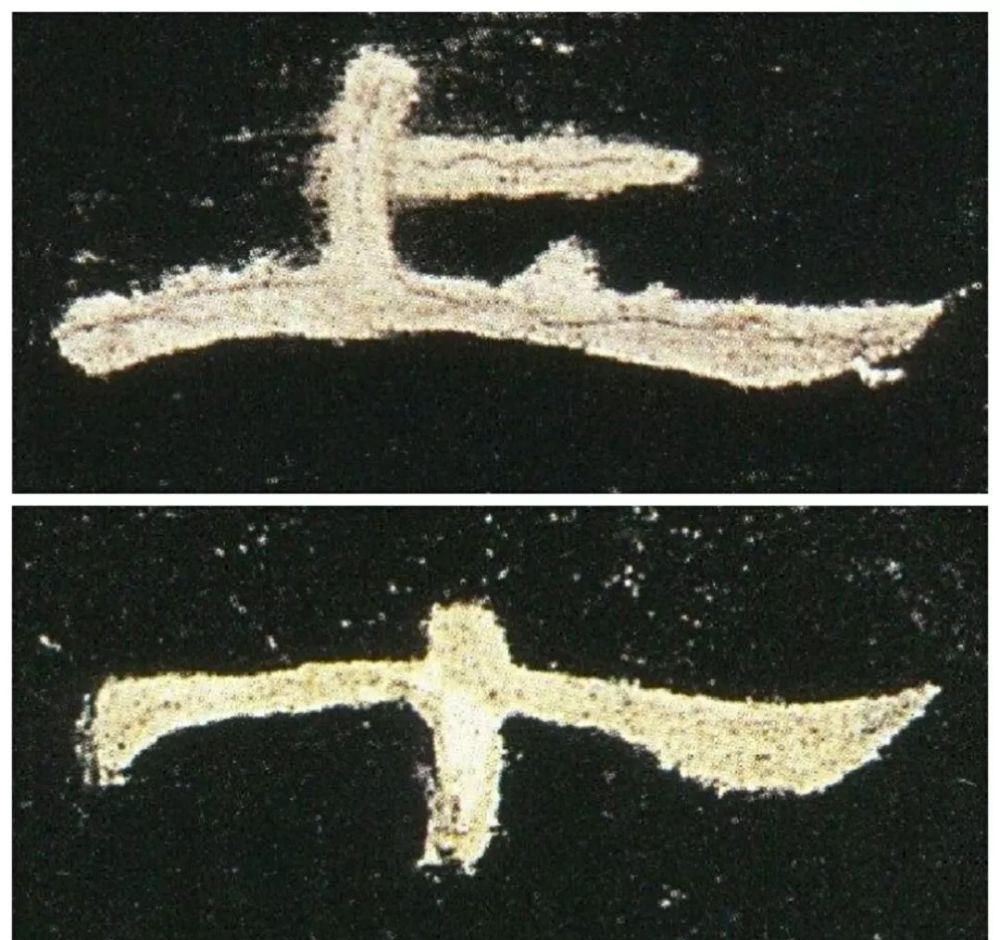
24, silkworms are not two, geese do not fly twice
The stroke of the pen in the book is in the position of the main pen, but the use is more stringent, and more than two silkworm heads are not allowed in a word, and it must be avoided when writing. Like the silkworm head, there can be no more than two goose tails in the middle of a word, such as multi-horizontal words should choose the most critical horizontal as the goose tail, so that the structure of the primary and secondary is clear and vivid.
The article comes from the Internet and is issued for dissemination, and the views in the article do not represent the position of this number
Hanmo Vision ◎ finishing release
Discover the beauty of calligraphy