1, cursive writing is not seen in the long horizontal
Cursive writing has horizontal lines as short as possible, and it should have a longitudinal sense. Can be replaced by dashed and thin lines.
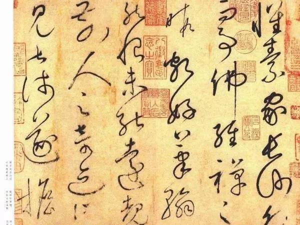
2, stay everywhere, everywhere
Avoid the phenomenon of flat dragging, dry writing, thickness and other failures from too fast strokes, but to have the charm of "staying everywhere and running everywhere".
3, thick ink has bones, light pen has shape
Start again with thick ink, and the strokes of thick ink characters should be explained clearly.

4, there are plates and eyes, the highlights are eye-catching
Avoid the "eye" in the word to prevent too many "eyes". The middle line is the focus. In a work, there must be several prominent, wonderful, and individual words. This is also called "book eyes".
5, beautiful long lines
Long lines are very important, be cautious when closing the pen, and generally use a dry pen at the end of the gesture.
6, thick but not fat, not swollen, not sinking
Words with heavy pen and ink cannot be of equal area, and the weight of words must be transitioned, and the group should be avoided.
7. The fine pen is powerful
The thin pen or single word should be tough, and the thick pen should be strong. There must be a thick pen that draws iron and silver ditches, and there must be a thin pen that flows through the clouds.
8, fast and slow
The ink is slightly slower when drying, slightly faster when wet, slightly slower when coarse, and slightly faster when thin. The line of grass has a meaning, and the letter should be written.
9. The pen is clear
When handing over the pen, the beginning is clear, and each stroke should be clearly explained.
10. Pay attention to the press, and strike out on all sides
Straight but not straight, straight but not straight, straight in the curve, straight in the curve. To "hold the pen and press down". Use both the center and the wing, the thin point use the center, and the thick part use the wing forward.
In the process of learning calligraphy, pay attention to the above ten details, which will surely enable you to enhance your own charm in calligraphy creation.
The graphics and text originate from the Network, if there is infringement, please contact to delete!