Zhongxin Finance, May 6 (Reporter Wu Tao) Recently, Haro, DingTalk and other companies have announced that they have changed their logos, and "iQiyi has changed their logos" and even been on the hot search. Can a different logo still attract attention? The key is that there are some logos, you don't look closely, you can't see it to change, what is the picture for it?
Companies have changed their logos
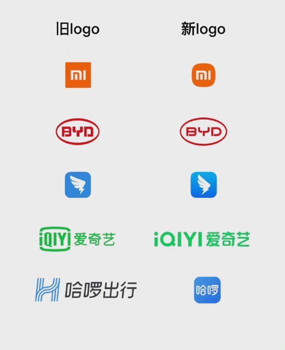
In recent times, companies have either changed logos or are on the way to changing logos. On April 25, Hello announced the brand upgrade, changing from Hello Travel to Hello, and released a new logo logo.
Some companies change the logo of the old and new comparison.
On April 22, iQiyi also changed its logo, the change was relatively large, and the "small TV" disappeared, in its own words: breaking through the border and turning the square into a circle.
At the beginning of April, NetEase Yanxuan also announced that the brand image was upgraded and a new brand logo was launched. Although at first glance there is little change, NetEase Yanxuan claims to have improved its saturation and brightness, and is more modern and young.
On March 22, DingTalk announced the brand upgrade, released a new logo and brand slogan. It is reported that this is the first time that DingTalk has updated the logo in the 7 years since its establishment. The appearance looks like "the wings have hardened".
In February, BYD Group announced a new logo, adjusting the round frame lines and font details, changing the original sharp corners of the glyphs to rounded corners, while the overall is more rounded.

COMPARISON OF Jingdong's old and new logos.
Last year, Xiaomi also changed its logo; Jingdong also changed the "Jingdong dog" during the 618 period, changing from a side photo to a front photo, and the dog was also fatter. If you go back further, almost all large Internet companies have changed their logos, Baidu, Huawei, Taobao, Alipay, Suning... Apple, in particular, has been changed 6 times.
Change to "lonely"? Even ridiculed as "deceived"
The reporter noticed that some companies changed their logos, as netizens said, "If you don't look carefully, you really can't find it." ”
For example, Xiaomi's new logo, which claims to have lasted three years, was personally completed by a famous Japanese designer, spending 2 million yuan, and finally the outside world looks like it has changed from "square" to "round". After Xiaomi changed the logo, it was ridiculed by the whole network, "Mr. Lei, you were deceived" and "call the police".
Some "enthusiastic masses" found that Xiaomi's new logo style can be easily completed by manually adding a line of code. "That's it, give me 200,000, and I'll design it for you."
With Xiaomi's "signature of the front car", when DingTalk replaced the logo this time, the relevant person in charge stressed that the upgrade logo did not cost 1 cent, and it was not hired for DingTalk to collect inspiration for the public, and did not hire a well-known external designer.
Hello also said that the new logo comes from "designers who have been almost bald for 100 days all night", there is no million design, nor is it a change of loneliness, they made it themselves.
Lei Jun in the live broadcast is talking about the Xiaomi logo change. Screenshot of Lei Jun's live broadcast
In response to the change of logo, Xiaomi CEO Lei Jun responded in the follow-up live broadcast, "The whole network suggested that I immediately call the police, but a mature brand, do logo can only be small changes." ”
But iQiyi does not believe in this "evil", and the logo has been greatly changed. Many netizens joked, "Bumping shirt vivo, OPPO." "iQiyi is going to sell mobile phones?" "When did OPPO do video sites?"
The reasons for changing the logo are similar, mainly with the business
The original logo is used well, why replace it? The reporter noted that in fact, almost every well-known company has a history of changing the logo, usually because of business changes.
For example, Starbucks Coffee underwent logo and brand optimization in 2018, removing coffee, mainly because the brand carried out other dessert and bread services, not only limited to coffee.
Hello said to Zhongxin Finance, "Hello slogan from 'doing every journey well' to 'accompanying life every day', it is more illustrative, from travel-oriented to life service transformation and upgrading." Hello travel becomes Hello. ”
NetEase strictly selects the comparison of new and old logos. Screenshot of NetEase Yanxuan Weibo
Of course, there are also logos that are not changed due to major business changes. DingTalk's replacement logo this time means that the details of the pattern angle change is to reflect the concept of "progress". Xiaomi, NetEase Yanxuan, and iQiyi all claimed that "the new logo looks younger." ”
BYD said that the new logo highlights BYD's "people-oriented" concept and determination to use technology to solve social problems and create a better life for mankind.
Some designers have summarized that the company has changed the logo, in general, it is fine-tuned, or "thickened, thinned, taller, shorter, pattern to letters, letters to patterns", as for what is the meaning, it all depends on "adding drama". From the circle to the square, the edges are clear; from the square to the circle, it is natural.
In short, in most cases, changing the logo is like a girl's haircut, two thousand yuan to tinker with a hairstyle, at first glance, it is exactly the same as the original. (End)