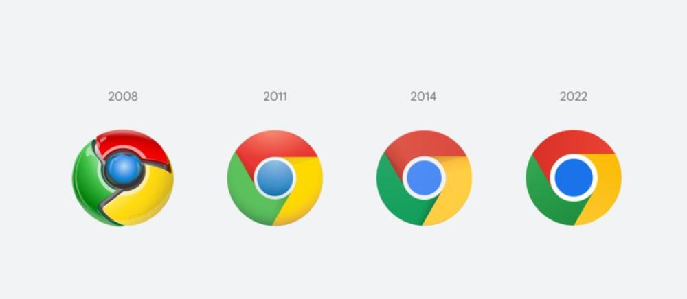
IT House February 5 news, Google Chrome browser since its first release in 2008, surrounded by three windmill-like slices of the blue circle icon design has remained unchanged, only slightly adjusted. Chrome browser is now about to use the latest fine-tuned icons.
Google's interaction designer Elvin Hu shared the new icon design on Twitter. "Some people may have noticed that there's a new icon in today's Chrome Canary update," he said. yes! For the first time in 8 years, we've updated chrome icons. New icons will start appearing on your device soon. ”

According to the introduction, the new icon removes the shadow, optimizes the proportion and brightens the color, thus simplifying the main brand icon to conform to Google's more modern brand expression.
IT House learned that from the actual installation effect, the new icon removes the shadow from the design, but still maintains a slight gradient between red, yellow and green. The icon also doesn't look exactly the same on every platform.
▼ Chrome browser for Win11 / Win10
The Windows version will get a more gradient look to accommodate Microsoft's new Fluent UI, the Chrome OS version will get a fully solid color version to match other system icons, and the Mac version of the icon will have a shadow inside the existing white rounded square.
▼ Chrome browser for Chrome OS
▼ Chrome browser for macOS, beta icon has also been changed
▼ Chrome browser for iOS, beta version uses iOS-style blue and white color
Elvin Hu says the new icons will be gradually expanded to other parts of the Chrome browser over the next few months.