IT Home April 22 news, according to iQIYI released, the company was born in the spring 12 years ago, today a new upgrade of the brand LOGO, the use of "more passionate curiosity, more innovative creation, warmer and simple youth image."
iQiyi said, "This time, iQIYI broke out of the box, paddled the oar of blood, and raised the sails of youth. ”

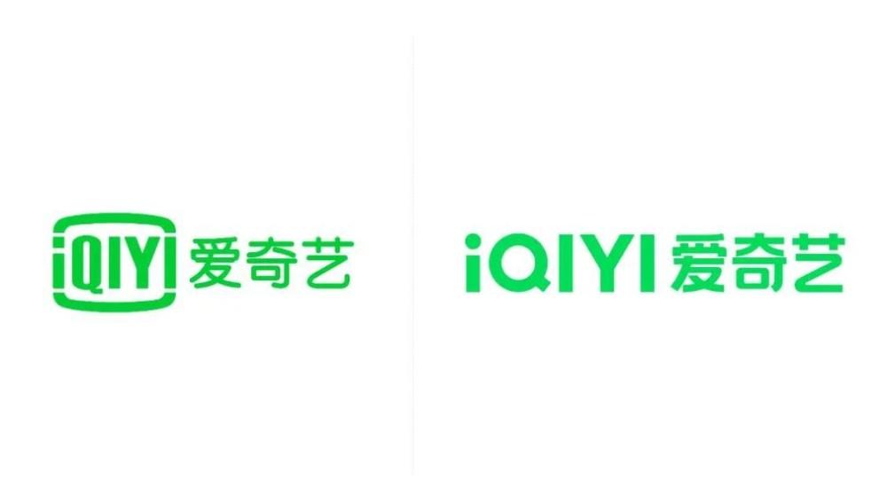
iQIYI chose green as the brand color, making the background color of youth brighter and greener and fuller.
A cleaner and more powerful font, more comfortable word spacing, and small dots on the iconic "Q" and "i" instead of a perfect circle cut design.