Can you imagine? The artistic aesthetics of the ancients before
It can be said that it is really not ambiguous at all
The colorleap website put 2000 BC
Artworks, famous paintings, posters, etc. from the 1960s
Comb through the timeline
The color scheme given by each era
All are worth learning and accumulating
2000 BC
We are often in the buildings of tombs and monuments
Generally seen art using distinct styles and symbolisms
The focus of most paintings is on the afterlife and the pursuit of eternity
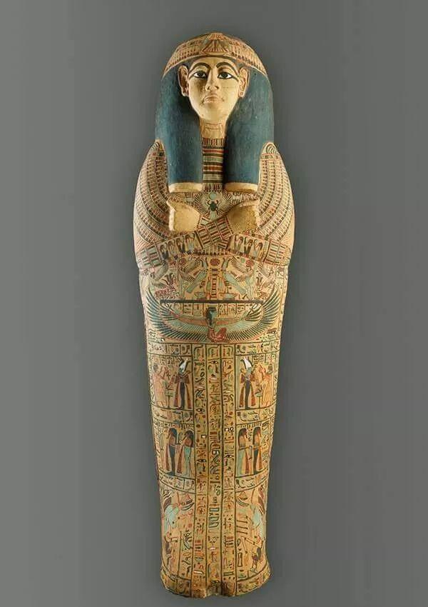
The artistic expression and color scheme of this style
It is often combined with earth yellow and brownish red with gray-blue, gray-green and dark gray-blue
It is also commonly used in today's design applications
(The following footage is only similar)
For example: a poster of the movie Thief Family made by the Yellow Sea
Similarly, this color scheme is used

In fact, art was defined as "skill" before 2,000 years ago.
Simply put, art was an important complementary method of language expression at that time
Especially in 2000-1000 BC
The Gulf of Mexico has emerged with the Olmac culture
At that time, people carved stone heads from a whole piece of basalt
The carving technique is skilled and has a strong realism
On top of the crafts, use repeatedly stacked patterns
Through reddish brown as the main color of the vase
The pattern is printed in a pattern similar to that of a sound wave line
Around 0 A.D
The art of this era is designed in people's daily lives
It plays an extremely important role
Marble statues, painted pottery and large murals are the cornerstones of culture
It's like this porcelain below
Elements of frescoes from the Western Han Dynasty are incorporated into the porcelain itself
Porcelain has black as the main background color
Orange patterns of different brightnesses are applied to the vase itself
This black orange color matching is also very common in the current application
Just like the poster matching of Jiang Wen's movie "The Sun Also Rises"
It is a typical black and orange color scheme
As well as the following posters inside
Both are classic in black and orange
In fact, after the Western Han Dynasty passed through the "rule of Wenjing"
It reached its peak during the reign of Emperor Wu of the Han Dynasty
And the shape of the porcelain itself at this time is also diverse
It is also more abundant in the application of color
It is available in a variety of colors, including yellow, white, brown, and navy blue
Like the picture below, in brown, reddish brown
Yellow and green are the main colors of the picture
After 1000 AD
During the Renaissance
The emerging bourgeoisie in the name of reviving classical Greco-Roman culture
Launched an anti-feudal new cultural movement that promoted bourgeois ideology and culture
Primarily man-centered, not God-centered
So most of the art at that time was based on
Stories of religious figures are the theme of printing and architecture
The colors are richer and more gorgeous
For example, the poster design like the following
The screen is red, yellow, blue, and green
And beige is the main color in the picture
This retro color
It is also relatively common in today's poster design
For example, Nestlé recently released this set of national tide style posters
Among them, color applications are all used in collocations like this
At that time, art was relatively full of flowers
We can call out a lot of artists' names alone
Like Michelangelo, Leonardo da Vinci, Raphael, etc
1700
At this stage
The Renaissance method of using color was challenged
From realistic drawing to simple illustration
Styles vary around the world
For example, like the one below
It is depicted in realistic oil paintings
There are also expressions like the following in line drawing
Depict women in kimonos
And for Europe, 1700-1799 AD
It is in a period of radical change
At that time, Neoclassicism in the Greek and Roman styles prevailed in the Western world
And influenced court art in India and China
This is especially evident in the design of clothing
In 1800
The advent of stone (zinc) chromatic printing
This allowed the graphic design of this period to be presented through paper printing
These posters are full of intricate lines and elements, which are very gorgeous
And the color scheme of these posters is also extremely bold
For example, the design of the poster like the following
It is the use of navy blue, orange and beige as the main color system
This color scheme and picture expression of the poster design
It is also popular to put on the current design elements
For example, the color scheme of the promotional poster of "Spider-Man Hero Expedition"
Basically, it restores the color matching of this era, but compared to before
The treatment of the lines is more calm and restrained
There is also a picture like the following one, with black and red as the main color
And the characters are partially expressed in black shadows
In the current retro style poster design
It is also a more commonly used form of expression
For example: Hidden Figures
The latest set of posters, the shaping of the characters above
Basically, this effect is used
In 1900
The modern advertising industry gave birth to complex illustrations
Hand-typed, live-action photographs, pattern textures and other diverse expressions
The advertising industry is a product of China's "modernity" since the 19th century
The years 1898-1904
The Qinghui Bao and even Liang Qichao himself began to use the term "advertisement"
After 1918
With the emergence of a large number of works such as "Advertising Instructions" and "Advertising Science"
The meaning of the word "advertising", introduced by Liang Qichao, began to shrink
"Advertising" has only begun to be widely accepted in the sense of modern commerce
In 1910
Color printing began to become common
This led to the development of the creation towards a painted scene centered on the character
And no longer ink painting
So we see works at this stage
Whether it is the expression of art, or the application of color
They are more abundant and express a certain story
In 1920
Complex hand-drawn style
Originated from the modern designist movement
Around the 1920s
A group of advanced designers in Europe have formed a strong group
Promote the so-called new construction movement
And broke the design of the millennium
Positions and principles for the service of the powerful
And the tradition of architecture that is completely attached to wood, stone, brick and tile
And the German modernist design master D. Rams
The basic principles of modernist design are expounded
"Simplicity is better than complexity, and blandness is better than vividness."
A single hue is better than a multitude of colors; durable is better than catching up with the fashion
Rational structure is better than blindly following fashion. ”
This style has led the worldwide design trend
So the design gradually tends to be
Rich colors plus minimalist geometry
In 1930
The Great Depression period was between 1929 and 1933
An economic crisis that originated in the United States and later spread throughout the capitalist world
So the color aspect at that time
Presents a subtle pastel tone
Form turned to futurism
More attention is paid to the use of simple lines to reflect the technology
These design techniques are also buffered
A recessionary trend at the time
By imparting a warm and positive design
Encourage people at that time to see more hope for the future
In 1940
1940 was during World War II
The Great War originated from September 1, 1939 to September 2, 1945
It is the world's "anti-fascist war"
In this age of war, design has indeed come
The portrayal of patriotic image propaganda
Extremely dependent on simple color schemes and powerful slogans
For example, the poster design like the following
The poster is a female character who resists the war
As the main core of the picture, in the application of color
Yellow, red, and blue play the dominant colors in the picture
This color scheme
In posters against war or violence
It is also a very common way of expression
▼
For example, the poster against discrimination below
There is also a representation like the poster design below
The expression of the silhouette with the main body of the picture as the silhouette
Paired with orange and yellow for visual clashes
Create a sense of contrast in the picture
In 1950
Print advertising excitedly ushered in a big move
There is a growing focus on ladies and family life
Creative typography also appeared during this period
Layout design like the poster below
It is a side-by-side typography to present
The picture is purple, fuchsia, green, and pink
These jumping colors of yellow are matched together
Makes the picture very jumpy
There is also a layout like this oblique type
@Designer Needle
In 1960
Swiss design is known for its layout grid and white space
Through a simple network structure
and near-standardized layout formulas
Achieve uniformity in design
This design is often based on a grid
But the typography of various flat factors on the grid
Basically, it is asymmetrical
Whether it's fonts, illustrations, photos, logos, etc
all are rationally and logically balanced
Arranged in this framework
Therefore, the layout often presents a vertical and horizontal change structure
This is associated with psychedelic illustration and the use of color
A stark contrast is formed
This style of design is found in contemporary art posters
It is also a relatively common form
@Marcos Faunner
Finish looking at the 2000 artwork
We can see that the design itself is changing with the times
Change from the needs of society to the needs of "users"
It's the brand upgrades we're seeing now, or the new trends in design
In fact, behind it is the development and progress of an era
Copyright notice: [In addition to original works, the articles, pictures, videos and music used on this platform belong to the original right holder, for objective reasons, or there will be improper use, such as, some articles or parts of the article citation content failed to get in touch with the original author in time, or the author's name and original source were incorrectly marked, etc., non-malicious infringement of the relevant rights and interests of the original right holder, please understand the relevant right holder and contact us in a timely manner to deal with it, and jointly maintain a good online creation environment]
END