Many people refer to color as "the most economical luxury",
Even the charts that are often used in work to show data and express content,
As long as the color matching is brilliant,
It can also become extra dazzling,
Be your step up the ladder for a promotion and a raise!
When matching colors for working charts, try to choose a concise color, use too much color, and the selection of hue cannot be too subjective, which can be cut from the following three aspects.
1. Color matching according to VI
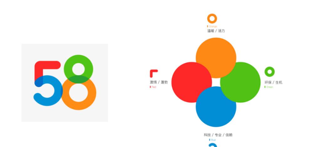
Many companies or brands have their own VI system (visual identity system), which includes color application specifications in VI. The figure below shows the new LOGO and VI color specification of the same city. Because the working chart is often related to corporate culture and product marketing, when designing and making the working chart, you can first consider the color matching of the chart according to the VI color matching, so that the color matching of the chart is matched with the enterprise or product, and the audience's impression of the enterprise or product is strengthened.
Some companies or brands have a LOGO but no VI, in this case, you can directly take out the main color and secondary color from the LOGO, and then match other colors according to the needs of the chart display content. On the basis of the main color system, it is a more secure way to choose different colors with different shades and saturation as the color scheme of the chart. As shown in the following figure, according to the LOGO in the figure, the main color of the LOGO can be used as the accent color, and then a series of colors as shown in the right figure can be established.

If the chart content is relatively simple, it is directly set to the logo-like color matching, which is more forced. For example, the primary color of the Starbucks LOGO is dark green and the secondary color is white.
Then Starbucks's sales statistics chart can be designed as a dark green data series, a white background color, and a good match with the corporate culture, the effect is as follows.
2. Color matching according to theme
Working charts are mainly a visual display of information and ideas, in this case, charts often need to be equipped with text for explanation, and even made into data analysis reports, so special attention needs to be paid to the coordination of charts and text paragraph formats, of course, including the coordination of colors.
It is recommended to analyze the content involved in the chart before beautifying the chart, and determine the hue according to the relevance of the content. Depending on the theme, the color needs to convey different information. For example, a chart that counts amethyst sales, because the product has noble and elegant characteristics, and it has its own purple color, so the first consideration is to use purple. In many cultures, purple is the color of the royal family, and purple has a mysterious and romantic atmosphere, which is most suitable for expressing nobility and elegance. Color can be extracted from amethyst items.
Fit with the content theme can be described as the basic requirements of color matching, serious and rigorous content selection of warm, lively warm color matching scheme, cheerful, relaxed content selection of dull, simple cold color matching, will inevitably appear to be unremarkable. For example, an analytical chart of the oil market, the content belongs to a more rational theme, the use of lively color matching as shown in the lower left figure will make people feel frivolous and unreliable, after changing to the color scheme shown in the lower right figure is much more rigorous.
3. Color matching according to industry attributes
To match the color of the chart, it is necessary to follow the common sense of color performance in actual work. Different industries have their own characteristics in color applications, so when they do not know how to determine the color matching, they can directly adopt the industry-wide color specifications. For example, green and blue are commonly used in environmental protection, medical, education, and public welfare industries, red, white, and yellow are commonly used in government agencies, and yellow is used in the financial industry... The following figure shows a common industry color selection point.