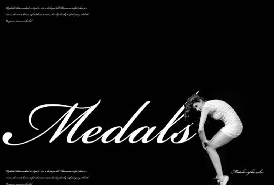
1, when only the picture appears partially, we should stick to the edge
2, through the shadow to create a sense of space in the picture
3. Create a visual focus
4. Use the dynamic sense of the font to guide the visual focus on the picture

5. Use the background or foreground formed by the part of the picture
6. Create a new visual focus: After removing part of the background, create a new picture center of gravity
7. Create a new visual space: planting, cutting
8. The relationship between text editing and picture formation
、
9. In the case of scarce picture resources, how to use the segmentation of pictures to create more design content
Graphics are mainly through a highly concise, bright form, creative, emotional image in a limited space, creative combination, intuitive, rapid, accurate and effective transmission of information, concepts and exchange of ideas, induce, attract people's attention, improve the picture to be noticed. It is mainly manifested in two forms: concrete and abstract
Figurative graphics are easy for people to accept and easily like, dominating in poster design, and mostly using photography and realistic painting methods to express. It can vividly reproduce the specific form, color, texture, etc. of the objective object, render the real scene feeling, enhance the credibility of the advertisement, stimulate people's interest and desire to buy, and meet people's aesthetic requirements to a certain extent.
The abstract form of the figure is a kind of highly conceptualized performance, discarding the unimportant and trivial shapes of natural objects, representing the essential characteristics of the shape of the object in a condensed form, not bound by objects and expression techniques, and more freely expressing personality, while leaving people with space for association and re-creation.
"Creative"
Static – creative ideas, ideas
Dynamic – an extension of creative thinking
1. Direct display
It is to directly and truly display the goods in front of consumers and impress consumers. This is a more traditional and popular expression method, but it is consistent with the goal of advertising products, so it has endured for a long time.
2. Reasonable exaggeration
Exaggeration is based on real life, with rich imagination to emphasize and expand the typical characteristics of the picture image, or change the proportion between objects, in order to reflect the creativity of advertising, so that the picture is more novel, peculiar and full of changing interest, so as to achieve the purpose of attracting the attention of the audience.
3. Humor
Humor is funny and funny and meaningful. It is to use a kind smile, exaggeration, metaphor, substitution and other means to implicitly convey a certain idea or commodity information.
4. Comparison
The use of comparative means to promote goods has two meanings: one is a comparison of artistic techniques, and the other is a substantive comparison.
5. Illustration
When advertising needs to prominently promote the internal structure of the product, product functions, main ingredients, usage methods or other related knowledge, it is often necessary to use illustrated expressions. It saves on the interpretation of words, and is sometimes more intuitive, accurate, and easy to understand than words.
6. Metaphor
Metaphor is to compare one thing to another, and in general, the image of the metaphor and a certain characteristic of the ontology should have similarities before the metaphor can be established.
7. Abnormal
Abnormality is to deliberately violate the convention and make it unreasonable, so as to cause the surprise and attention of the audience, give the audience a deep impression, and thus achieve the purpose of advertising dissemination.
8. Anthropomorphism
It is to personify living or even inanimate objects outside of people, so that they have certain characteristics of people, to express the theme of advertising, to attract consumers' attention to goods, and thus to achieve the purpose of advertising dissemination.
Anthropomorphic expression makes the picture more vivid and interesting
Composition
(1) Clustered class graphics
Clustered graphics refer to the use of a number of the same or similar image materials, according to a certain law gathered together to form a combination of graphics. Some of these figures are flat, and some have a sense of three-dimensionality and space. Commonly used footage includes points, lines, polygons, or other shapes. The ancients said: "poly sand into a tower", we can also call this shape "poly material forming".
(2) Light and shadow graphics
(3) Composite class graphics
(4) Variation class graphics
(5) Grotesque graphics
(6) Anthropomorphism