Keywords: Sea and Air Art Bookstore, Typography Design, Creative Design, Album Design, Typography Design, Typography Design, Cover Design, Graphic Design, Design Company
(This article uses English typesetting as an example interpretation)
Learn how to use typography hierarchies to prioritize information.
Typography is like a second language, communicating on a more nuanced level than the actual text. The actual content is what you say, but the typography is how you say it, which is the first impression that is left.
Typography creates an experience before the audience reads a word or clicks a menu button. Typography isn't just about telling a story, it creates an atmosphere and emotional response, like the tone of a voice. If all the visual elements in web design are integrated into the user experience, then typography will certainly have a huge impact, especially on a website with a lot of content. Poor or lack of typography and obvious grammatical errors can disgust your audience.
In this article, you will discuss how to get the most out of typography. Start by exploring the hierarchy of typography hierarchies and drill down to individual elements.

The level of the typography hierarchy
A typography hierarchy is a subset of a visual hierarchy. Arrange text in a typographic hierarchy so that important words are easily prioritized by the audience who is browsing the information.
It's easy to see which parts are the most important on the website
Without this hierarchy, every letter and word in the design would look the same. The design should be as visually appealing as the MS DOS command prompt. As a general rule, designer Carrie Cousins suggests that fonts support at least three hierarchies.
Try to shape the font used in typography into these levels (levels):
01. Level 1
The most striking text on a page, usually larger and brighter in color than other text layers. Because this level of font is so powerful, it should be sparse – keep it for headings and templates only.
02. Secondary level
The second level is less obvious than the primary level, but more compelling than the main content, and the second level handles everything in between. This level has some of the smallest but unique elements in size and color, typically including subtitles, titles, citations, infographics, or supporting blocks of text separate from the main content.
03. Three levels
This refers to the most important content, the most common, and the least noticeable. It should be simple and not flashy – the goal of the other layers is to attract attention, and the goal of this layer is to encourage the reader to immerse themselves in the text, thereby reducing distractions.
04. Other levels
You can create smaller hierarchies by applying italics, colors, bold, underlines, and other effects to the three-level hierarchy. These hierarchies may include underlined links, several bold words to emphasize in paragraphs, and so on. Text that appears in banners, logos, or other background graphics also falls into this category.
Visual hierarchy example
To illustrate the difference between using typography levels correctly, take a look at Jon Tangerine's example below.
There are three different levels of typography here, and it is possible to clearly explain the elements of each piece without explaining anything. Let's look at the second item:
The title is obviously "We, Who Are Web Designers", but why is it so obvious? The text is larger (size), thicker (thick), and set at the top left corner where the viewer's line of sight first sees (position).
The second level is the publication date, which differs in size and color from the rest of the text and is also distinguished by italics.
The third level, the article preview, doesn't have any features. It may seem bland compared to other levels, but this is so that readers won't be distracted when it comes to appreciating the actual content.
Hierarchical elements in typography
Which part are you interested in?
As in other areas of design, typography follows its own structural hierarchy. Understanding typography levels is like knowing how to use typography, especially how to give priority to some text over others.
By manipulating the fields below, you'll have more control over the typography and better direct your audience's attention.
01. Size
The base unit of the typography hierarchy. Text of different sizes attracts varying degrees of attention.
02. Thickness
Bold? Or a thin body?
The thickness of the text, which can be noticed by bolding. While more subtle than size, it's still a straightforward way to make text stand out. Bolding is especially effective for adding three levels of fonts.
03. Italics
Italics are more likely to attract attention than bold. Because this is a subtle touch, this applies to the third level.
04. Capitalization
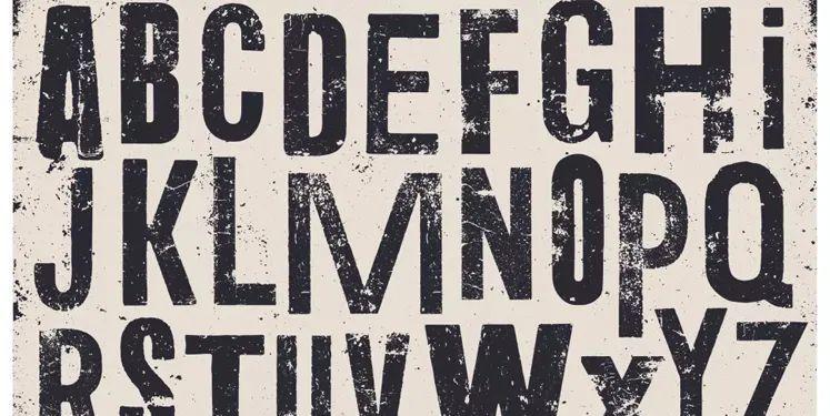
Just like an email written in capital letters that looks like you're yelling, the same applies to web typography. Be careful when working with capital letters, as they appear extraordinarily large and can suddenly appear in the foreground.
05. Color
Now let's look at the complex factors. Warm colors (red, orange, yellow) tend to attract more attention than cool colors (blue, purple), especially when warm text is set with a cool background. Color contrast is also important because saturated or bright colors stand out more than pastel colors.
06. Contrast
Any contrast between these factors — size, weight, or color — will be noticed. Comparing the fonts of headings and body text helps create a hierarchy.
07. Space
White space can make text appear larger (and therefore more readable). Lack of space can make the text feel cramped and smaller. Each space affects the hierarchy, from simple kerning adjustments to the relationship between words and the edges of the screen.
08. Location
If the distance is farther away, the influence of "Read on" will be small
Proximity can be a quick and easy way to convey meaning.
09. Direction
Mix the typographic directions of words and letters to enhance influence.
Turning letters and words horizontally, diagonally, or inverted increases visual appeal. This effect creates surprising visual effects for users. This is particularly effective for emphasizing phrases/phrases in the main text. Skewing, rotating to vertical, and other methods immediately focus the user on the affected text.
10. Texture
Different typographic elements add texture to the page.
Textures are very subjective and one of the hardest elements to master. This does not refer to the texture of the font itself, but to the texture created from the typographic pattern on the page. Each block of text produces its own pattern, so to create a texture, break the pattern by changing any other elements. Use with caution, otherwise it will be distracting.
Sea and Air Art Book House
This article is translated and edited by Haikong Design, if you need to reprint, please indicate the source, thank you.