The retro model launched by Pepsi In September 2021
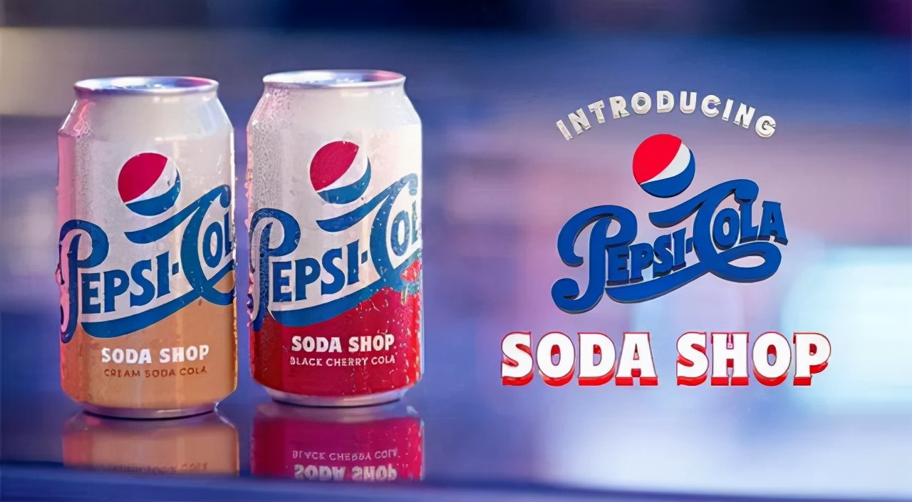
Recently, PepsiCo launched the Soda shop series of retro packaging, placing the retro blue icon "pepsi-cola" used from 1940 to 1962 on a white background and marking "real sucrose manufacturing".
In the change of brand vision, Pepsi Is not this time. Its text fonts and graphics have undergone many changes.
Let's take a look at its history of change:

This is Pepsi in 1898, and it was the earliest font used as a liquid for adjuvant treatment of digestive function, with sharp, even slightly sharp strokes
Pepsi in 1905, the font is relatively soft.
It wasn't until 1940 that Pepsi's font became cleaner, rounder, and no colons were used anymore.
In 1962, the word Coke was removed and the font was more concise and geometrically symmetrical. Its consumer base has also become more focused, and it has begun to spread to young people.
In 1973, Pepsi Transformed from a bottle cap to a globe.
In 1987, the "globe" underwent some subtle changes.
In 1991, the big change was that Pepsi and Globe "broke up."
In 1998, the font and background color changed.
In 2003, Pepsi's overall vision added silhouettes, light sources, shadows and other effects to look more three-dimensional and glamorous.
In 2006, PepsiCo added cool water droplets to its more three-dimensional globe.
In 2008, Pepsi went back to flattening, but leaked a "toothless smile", which some say sometimes seems mysterious at first glance.
In 2014, Pepsi's smile removed the blue sideline.
Seeing this, let's take a look at the earliest Coke brand - Coca-Cola.
To this day, it uses Spencer's handwritten font and the waist-pinching bottle line. All of this, as it was when it was born in 1886, is still it.
Today, Coca-Cola's brand positioning is still: authentic Coke. Brand vision, has remained unchanged for a hundred years. As the most valuable brand in the Coke category, it stands proudly in the forest of world brands and has maintained an absolute market share for a long time.
As Laura Rees, author of Visual Hammer (daughter of "brand positioning" theorist A.E. Rees), puts it: The best way to pin a "language nail" into a potential customer's mind is to use a "visual hammer."
Brand vision is the visual presentation of the brand concept, in which the logo presented by the combination of brand name and graphics is a high degree of visual condensation of the brand concept, which as a symbol represents the whole of the brand.
The Swiss linguist Ferdinand Saussure defined linguistic symbols as both "signifier" and "signified". Different signifiers can refer to the same signifier. Pepsi = Coke, Coca-Cola = Coke. These signifiers and signifiers are arbitrarily combined, and they are also remembered and agreed upon by everyone after the brand is published in the world. So from the image, the signifier of the globe to the signifier of the toothless smile conveys what different signifiers? In the near future, will this grinning signifier change? Consumers around the world, before deeply remembering the agreed relationship between the toothless smile and the Pepsi brand, PepsiCo also needs to do a series of marketing actions to interpret it. Maybe it's hard broad, maybe it's a web topic, maybe it's a series of promotions and so on. From another point of view, every change requires a large number of brand communication actions to complete a new brand interpretation and settle the new brand concept into the minds of consumers.
So let's imagine, if this visual hammer stationed in the minds of consumers, it has to change every one or two years, or even make great changes, then how can it firmly nail the core value of brand positioning in the hearts of generations of people?