It's better to do something that people have seen but haven't noticed.
Article source: Japanese design station
ID:japandesign
Author: Jun Hizawa
Edit: Twins
Recently, Ri Zhanjun saw this flat poster of Suntory on the Internet, and the expressiveness of the whole picture can be said to be very cattle!
At first glance, it is Mt. Fuji, but if you identify it carefully, you will find that the entire mountain is actually piled up with tea leaves, and the "snow" at the top of the mountain is actually a pinch of sugar, and the main information of "less sugar" is expressed!
Suntory, it is worthy of you!

Speaking of Suntory, like most of the old brands with a long history, it attaches great importance to the publicity design of the product, and the publicity design of each product is worth taking out and repeatedly observing, and it has been filmed in China for nearly 30 years just the advertisement of oolong tea!
Today, I will take you to enjoy these works!
<h2>01</h2>
You can feel the small freshness by the picture!
Suntory's most famous product must be oolong tea, which was born in the 1980s, when Japanese society at that time was described in one word as "materialistic"!
Even so, Suntory has always been calling for the simple idea of "returning to authenticity and focusing on self", and this oolong tea is designed along this line of thought!
· The "Source Properties" of Oolong Tea ·
Oolong tea was created during the Yongzheng period of the Qing Dynasty, and most Japanese people have the impression of Chinese tea as traditional and original.
This is very much in line with Suntory's positioning of this tea drink "sugar-free", and with respect for the source of oolong tea, Suntory decided to focus all on Chinese culture!
For example, the tea province "Fujian Province" is directly popped onto it, which occupies almost the entire picture, and suddenly has a sense of authority of the origin of tea.
The effect may be like most of us looking at Japanese products, confused, but it must be very pure!
· Classic moments of oolong tea ·
The idea of using "origin" all the time is too scarce! It was at this time that Suntory and Japanese photography master Yoshihiko Ueda began to cooperate, plus the art director was Kaoru Kasai, explaining in minutes what it means to join forces!
It is still a symbol of choosing Chinese culture, but it is basically expressed by people, that kind of "quiet, cool" feeling, just after watching it, you will feel "refreshing", this sense of transparency is like drinking oolong tea!
Not limited to the feelings brought by the scene, the characters are also the main source of inspiration, such as ballet dancers, boys learning martial arts, etc., all of which want to express the healthy beauty and positive spiritual strength brought by oolong tea.
And the tone of the picture began to change to blue, green and other cool tones, oolong tea is no longer a very large one appears in the picture, into a small place in the corner.
During that time, Suntory always wanted to convey a sense of vitality, and the strongest thing was that all of them used still pictures to express dynamic effects!
In 1992, an important node, Yoshihiko Ueda photographed young couples, marriage customs, etc., allowing him to find a "sense of expanse", the boundless sky occupies most of the picture, revealing a mysterious and strong inclusiveness at all times.
This kind of inclusiveness is natural to human beings, between husband and wife, and it is also at this time that a little Chinese philosophy can be read in the picture, and Suntory Oolong Tea begins to look more like China.
Yoshihiko Ueda once said, "Although China and Japan have different aesthetic senses, I think they are both very remarkable, China is my spiritual hometown", in order to shoot these advertisements, he has to come to China more than a dozen times a year!
However, with the acceleration of the urbanization process, the scenes he photographed have basically disappeared, replaced by high-rise buildings, and after shooting advertisements for Zhang Zhen and Fan Bingbing, Ueda Yoshihiko no longer shoots from China.
Nichiren Jun felt a little sorry, but there was no way to do it...
<h2>02</h2>
Wine looks at the occasion, salt or sweet!
In addition to tea, Suntory's liquor poster is also very creative, the picture is that kind of nonsense style, but also people can't help but look closely and study!
Crooked nuts with high nose bridges and deep eye sockets, combined with manga and Japanese text, in fact, the original intention is to express that Japanese-made whiskey makes foreigners love it!
Although the overall look is a little subtle, but also a little fun? However, the first impression of this wine is that it looks good and is quite authentic, right? Kind of wanted to drink!
The shooting of the whisky "Yamazaki" focuses on showing the natural, high-end and mellow feeling of the whisky, and the photographed picture also reflects the process and rigor of Yamazaki brewing.
The video goes straight to the theme at the beginning, using the mirror to connect each scene of the material together, and there is no sense of violation between the movements!
After watching the video, it feels as if the taste of each drop of wine is complex, and you can appreciate everything in the natural world, not only the taste and taste of the wine, but also the brewing process and respect for the winemaker!
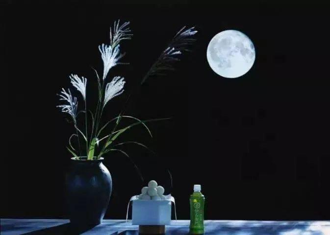
Suntory also has a very suitable wine for girls to drink, "Mirror Moon" is a shochu with an alcohol concentration of 16%, and there are many fruity flavors to choose from, so the main small freshness is the biggest feature of the video, the protagonist is still ten yuan girl (Ishihara Rimi) Oh!
The ten-yuan girl here looks like a delicate girl, and there are still a little broken thoughts after being slightly drunk!
Careful observation, the scene arrangement and the makeup and hair of the ten-dollar girl are silently conveyed: this is the daily enjoyment! Making the people in front of the screen feel like they are in it has always been the best way to publicize it in the heart of the daily station jun!
<h2>03</h2>
It is not at all "improper" Suntory!
RiZhan Jun carefully searched and found that Suntory also cooperated with the classic IP image of the Great Sage, and it was really subverting the impression after reading it!
Also starting from the source of tea, it is also necessary to show a kind of vitality, but the Tang monk's "female group legs", the figure of the great sage, and the dance posture of the master and apprentice are really too eye-catching! Seriously, I want to vote for them both to debut!
Latte ads, cow and matador "character reversal" revealed with the beginning of the music, such a way is more common today, but there is no denying that this kind of "thinking out of mind" promotional video is really not tired of watching!
This video of the man in white, standing in a row, throws coins into the beaker one by one. Not only the distance, curvature, posture, and time of tossing the coin, but even the depth of the liquid in the beaker is calculated to ensure that the sound of the coin falling into the cup can string together Mozart's Minuet!
Sure enough, it is the brain hole of Japanese advertising, anyway, it is quite cool to see, and I also remember the brand of Suntory!
There are also touching videos, such as Suntory and CRAFT BOSS coffee co-branding, on Father's Day, an original animation of "Crayon Shin" successfully brought many people to tears, and this is also an animation that misses the voice actor Nohara Hiroshi who has passed away.
It is still a familiar painting style and familiar characters, but this time the protagonist is Koshin's father, Hiroshi Nohara, so let us feel the change of time from his perspective
We used to think that we would get old, but the characters in the anime never will, especially childhood memories! After watching this video, there will be a little heavy feeling, especially the last sentence "To all Nohara Hiroshi", which may awaken things that we usually don't think deeply about!
<h2>04</h2>
Epilogue: It's all about feeling!
After watching Suntory's advertisement, Rizhan Jun felt that its biggest feature was that it could express the usual small details and delicate emotions in a very simple and intuitive way. Of course, while noticing these, the most important thing is the viewing of the picture and the sense of substitution of the content.
This is also the characteristic of Japanese advertising, which will pay more attention to forming a communication with the person in front of the screen, as if it did not deliberately sell anything to you, but there is a feeling that the heart has been hit. After we watch it, we will have the feeling of "Yes, it is me", "I want to live this life too"! That's why we don't think Japanese advertising looks like advertising!
Looking back at the posters and videos around us, it is more like an era of "traffic is king"! Nichiren jun sincerely hopes that this kind of interesting publicity can be a little more, because countless examples prove that we don't hate advertising, just more true to the content!
bibliography:
1, "Even if you don't drink tea, you will definitely fall in love with these" Rongbrand Rong brand
2. "How to do the national tide, you have to learn from Japan's Suntory" Peng Hao (public number id: thatyingpeng)
3, "Without him, there would be no most moving beverage advertisement in history" one-night aesthetics (public number id: yiyemeixue)
4. "Advertising, I Serve Suntory" Wine Online (public number id: WINECLOS)