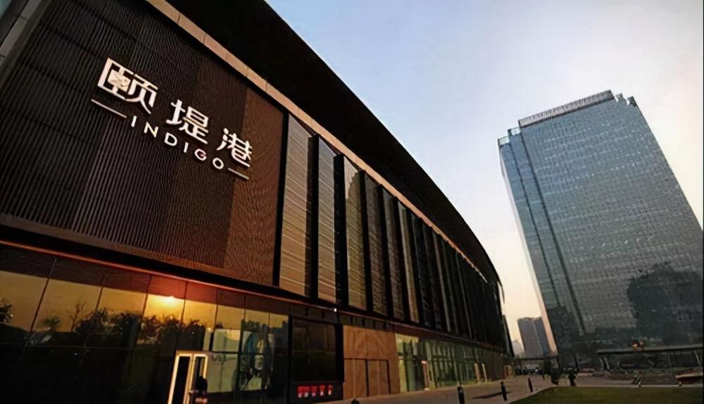
INDIGO, located in Chaoyang District, Beijing, is a retail-focused integrated commercial property jointly created by Swire Properties and Sino-Ocean Properties. Indigo Mall has a number of open public leisure centres within the mall, making it easy for shoppers and visitors to relax.

The author believes that YitiGang is a model of commercial real estate, and the ideas displayed in many aspects are very suitable for the development of commercial centers, such as gardens that become community children's activity centers, and then hold activities to attract people. Of course, these ideas are not only practiced by Yitigang, but the comprehensive aspects are indeed more outstanding.
This article attempts to speculate on the designer's original design ideas through the observed light, and this communication with the designer, like the communication with the artist who creates through the artwork, is a joy beyond language.
Let's start with a few window windows.
1. Moving line and window
Shops are the core element of shopping malls, and there are many articles in the micro-classroom that introduce the lighting of shops, which you can refer to.
Between the pedestrians' moving lines and the shop windows, there are some ideas that can be learned.
Let's first look at the following window:
Doesn't it feel like the aisle is not bright?
▲ In the previous two photos, you can also pay attention to the light on the roof inside the cabinet, did not see the lamp, right?
Yes, your feeling is correct, look closely, the pedestrians are dark, but the window as the overall background is bright, then people's attention will obey the light arrangement, the focus of the field of view is not the pedestrian but as the background of the shop. The shop can either display its cabinets or open the line of sight to the entire space.
This commercial space is very worth learning, it not only uses lighting to deal with the relationship between light and shade between shops and public spaces, but also to guide and enhance consumers' attention.
▲ The examples of the above two photos are more typical. The top lamp is hidden behind a block, so there are no messy luminous points, so that the customer's attention is focused on the display façade, which is also another very worthy reference.
▲ Look at the two pictures of H&M, his home is not obscured, but the lamp is consistent with the background color, which is the third point worth learning. The effects on concentration here include: 1, the light is consistent with the color of the ceiling; 2, the "bright spot" of the lamp is small; 3, the lamp is not directly above the model, but as close as possible to the front window; 4, the height of the cabinet is higher than other cabinets, and the perspective of the model can not see the light.
Is it really important to use black lights on black ceilings? Looking at the photo below, no one would want to change the black light in the photo to white. Notice that there is no light in the photo that shines in your eyes. This is most evident at IKEA, where you look forward along the moving line and look backwards against the moving line.
▲ Looking at these two photos, the light order at the top of the left one will attract/distract attention, while the attention of the picture on the right is focused on the order goods on the shelf, and the theme is more clear. The presence of lamps, like lights, will arrange people's attention.
Finally, a Tesla wall washer lighting, there is a black lamp hidden in the picture, can you find it?
2. The spatial characteristics of public space
As a large-scale building, the characteristics of the building should be extracted.
▲ The light slot on the façade of the layer strengthens the convergence of this visual line, like the above photo can see not many areas of the three layers, more areas can see like the two layers in the photo below.
▲An area where only one layer of space can be seen.
▲The surface of this curved gradient not only shows the spatial characteristics very well, but it is also a feature of this space. So seeing the scene below, the longitudinal banner completely destroys the lines of the building itself, and the author still feels some regret. (Ask the designer's feelings)
▲ Such diffuse light between the layers is actually very weak three-dimensional effect, even if you take the elevator to the front of the close observation, it is still a flat illusion.
▲In fact, it is a lamp slot with a distance difference between front and back.
When it comes to the characteristics of space, lights as a feature of space, not only when lit at night.
In the space below, the white tree does not exist independently, and together with the white functional column (surveillance camera), it is both a feature of the space and a common boundary that encloses the site. White appears abrupt in this space, but it is precisely because of white that it has achieved a significant feature in this space.
The effect of lighting up at night.
▲Looking down from the third floor, I didn't see the branches glowing, indicating that as many lights as possible were illuminated downwards, and there was no upward escape.
▲ The branches of a single lamp are naturally messy, so the author believes that this lamp will be more beautiful when used outdoors with a solid color sky as a background. (Suddenly I thought of the car that had not been wiped for a few days, and sighed)
If you grab 1,000 people passing by this space and ask, the impression of this space, 1,000 answers will be this tree. This is the characteristic of binding the tree to this space. Regardless of whether the lights are lit or not at night, the spatial features are bound to a component, and in this space it happens to be a lamp.
▲ In this space, the hollow roof is also a very important spatial feature, and it creates a mirror image on the large façade glass of the five-story high, connecting the inner and outer spaces. Unfortunately, the curtain wall of the day's event was raised, leaving little glass façade.
▲Some other lighting styles.
▲The special features of close-range wall lighting are well displayed here, and the shadow area of the stone texture is enlarged, and the sense of concave and convex is greatly enlarged.
▲Other areas
▲ This escalator, there is not much lighting provided on the escalator, but in the position of the lower escalator, it provides a higher level of lighting.
▲Praise Swire's activities, Swire regularly changes activities, the activities are fresh and attract a lot of popularity. Of course, as the provider of the event, this planet wonderland activity is also very professional, in addition to the experience in the venue, but also specially equipped with peripheral products and even commemorative coins, a model of activity products.
3. Courtyard of the front square
In the front square part, the design idea is also worth lapping, but the author feels that it may not be as good as the indoor part, so the effect is not played out. The indoor part is more significant.
The front square is a lawn with a raised ground, divided by stone strips, and the author of the tree species on the ground does not know, please explain it to more professional people.
▲The polyline outlined by the stone strip reinforces the layered feeling of dividing the lawn.
▲The rise of the large-angle slope was originally reinforced by a linear buried lamp. However, such an angle can fall on the slope of the light is small, and the glare is very serious, the line-type buried lamp in the figure is not turned on.
▲ The light that illuminates the tree strengthens the outline of the tree, and in the dark environment, people will have a strong impression of the tree array.
▲ Lawn lights are used as a line for dividing the car and pedestrians.
▲ Such a garden light provides illumination of the venue, the longitudinal luminous surface of the top looks brighter, towards the bottom fades.
▲ The passage facing the main entrance on the square, in addition to the 2x3 group of garden lights in the above picture to form an order guide, the low lawn lights are arranged between the garden lights. The arrangement of order reinforces the sense of passage-guided passage in this space.
▲ The lower part of this photo is the passage connecting the square. The business poster in the middle of the upper part is the event that is being held, Planet Wonderland. Color illumination with one 2 floodlights with four LED color-changing lights, the effect is average.
▲ The general reason for the lighting effect of the business is not only the way of wiping the wall lighting, but also the longitudinal side illumination, resulting in the fact that in a large range of views, the brightness of the ultra-high light source and the brightness of the direct reflection.
▲The light of the wall itself is not good at uniformity, in fact, the close condition of the wall is a very unfavorable prerequisite for uniform illumination. In pursuit of uniform illumination of the façade, the first task is to create distance conditions. The light of the wall is not good at uniformity, but the bumpy feeling of the reinforced surface is its characteristic.
▲ The lighting of the façade window, the luminous point of the lamp is hidden, and the color of the lamp is hidden.
▲Not all side windows are hidden. Notice the alignment of the light point of the lamp in this window, the light spot on the wall surface, and the division of the façade. The four upper parts of this window, with glowing dots at the top, become a prominent feature of this façade.