Whether it is lipstick, clothes, jewelry, I believe that everyone has been troubled by color selection, color selection is related to whether the overall wear has a high-grade and attractive effect.
The whole outfit will become tacky if the color is not selected, and the little girl in her twenties may also become a big mother, and the wearing problems such as fat and black will also find you.
Today Xiaobian wants to summarize 4 cheap colors for everyone, and it is recommended that you wear these colors no matter how old you are now. Then teach everyone how to rely on color selection and collocation to wear a sense of luxury in autumn and winter.
The characteristics of cheap colors: high saturation expansion color, dull warm color
>> rose red

The saturation of rose red is close to that of a fluorescent color, and the high saturation makes this color appear "frivolous and swollen", which is very tacky.
>> burgundy
Burgundy is a color with low saturation in the red system, and the combination of warm color and too low saturation will appear very dull, and then have the effect of showing age.
>> girl powder
Pink is really a color that is very easy to step on, and one of its most fatal drawbacks is that the age coverage is small, and once it exceeds the so-called girl's age, the wearer gives the feeling that it is tender and embarrassing.
>> coral oranges
Coral orange and rose red have the same high saturation, too eye-catching, coral orange is a black, for yellow skin, black skin is not friendly.
Summary: When wearing red, orange and other warm colors, we should carefully consider, warm colors are too high and black, too low to show old, it is recommended to choose the saturation of the middle position of the color plate, appropriately add gray tones, warm colors will appear more low-key, better control.
Question 1: How to choose a high-level color?
(1) Familiar with the characteristics of high-grade colors
1. Colors that are both everyday and can be worn in large areas
Take fluorescent colors as an example, large-area fluorescent color wearing is dazzling and not everyday, but high-grade color is the kind of color that even if a large area is worn, it still gives people a simple, low-key texture, which can be understood as "high-grade color is not the color of the body".
2. Friendly to skin color and white
Because the wearing color is black and your own natural black skin, black is to make people look very poor, high-grade color it can modify the skin tone in daily wear, white and improve the color.
3. Strong texture
Haute C-colour not only defines the body and skin tone, it can also set off a garment very high-grade, haute color has the magical effect of making the fabric more textured.
Question 2: Which colors are really advanced this winter?
◆ The first answer - no gender color
Genderless color is what we call colorless color in our daily life, black and white gray is the classic genderless color, genderless color is a group of neutral colors that are neither cool nor warm colors, these colors have no chroma, the style is varied, and there is no definition.
Advantages: The biggest advantage of genderless color is versatility, often used to coordinate the collocation of other colors, but even if the genderless color group is "debuted" in the group is also high-level, especially suitable for color matching Xiaobai to harvest a color system of wearing texture.
>> color scheme without gender
Classic black and white
Black and white is the color matching world of the sun does not set. White as a brightening color, understated, while black as a neutral color, appear thin. The combination of black and white makes the wearer burst out of a sense of luxury and fashion, and achieves the "highest realm" of lazy color matching.
* Enrich black and white with geometric elements
In addition to the black and white color matching method of solid color wearing, the use of stripe elements, checks and polka dots and other geometric elements composed of black and white color matching, enrich the layering of black and white color matching, so that the simple color matching is more eye-catching effect.
Black + white + secondary color
*Black and white with a little metallic color added
Metallic color is a color with a modern retro style, but also has a sense of futuristic technology, a large area of metallic color wearing may be difficult to control, but let the metallic color as an embellishment in the color matching, can make the genderless color more eye-catching, avant-garde.
*Take advantage of "affordable and fit" pieces
Auxiliary color control area is not good, will cause a "noisy" situation, the auxiliary color in the bag of this kind of upper and lower body wear other than the single product, not only to achieve the auxiliary color to brighten the wear, but also will not blur the focus of genderless color wear.
【Genderless color wearing tips】
>> white is a bright color, and it is not suitable to match bright and warm colors
White is already a highlight-like existence, it is the "expansion color" in the neutral color, and the "bright warm color" also has the same brightening expansion effect, two of the same attributes of the color expansion makes the wearing focus blurred, full of expansion color is undoubtedly fat.
Where when white is used as the main color of wearing, it is best to match a large area of colors with low saturation and high gray content, so that the small area of white acts as a brightening color, and the effect of "shrinkage and expansion" is obvious.
>> gray is cloudy and does not match the warm color
The higher the gray content of all the colors in the color card, the more turbid it appears, especially the warm color, gray + warm color collocation will make the gray wear appear too mature, and turbid, gray is more suitable for cool colors with high brightness, more white, more advanced.
>> black dull, not dark
Black is a very domineering color, but also the most dull color of the genderless color, so black is not suitable for matching the same dark dark color, will make the color matching appear cramped, light color with black is the correct way to open, will make the wear more breathable.
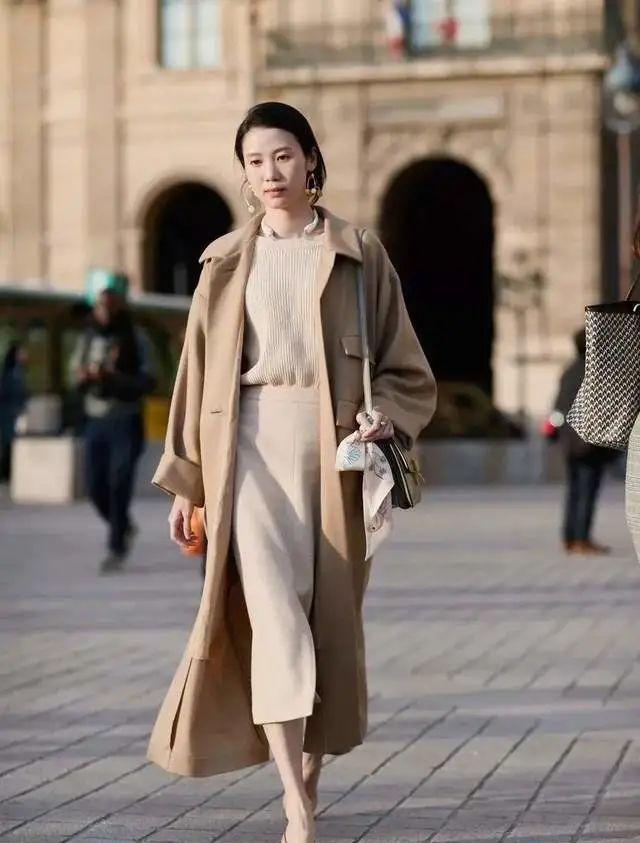
◆ The second answer - brown
Brown is the most worth wearing in autumn and winter, it represents the warm winter sun, sweet chocolate, fragrant toffee latte, warm and addictive.
Advantages: Brown wear can stimulate people's elegant temperament, at the same time it is also one of the most versatile colors in warm colors, contrast, smooth color wear with brown system can not go wrong.
>>> the brown color scheme
(1) The same color system is matched to create a sense of gradient layering
There are many popular and versatile colors in the brown system, khaki, milk tea, camel, these shades of brown are matched together with a gradient and progressive wearing effect, full of layering.
*Hide the brown in the check
The retro sense of the check coincides with the brown, and the brown of different shades is hidden in the check, which can make the overall feeling of the brown system stronger and more retro.
(2) Brown + yellow to create a retro feeling
The combination of brown + yellow belongs to the same color collocation method, and the color of the same tone represents that they are on the same side of the color ring, which is more coordinated and easier to control than the cold and warm collocation.
【Brown wear tips】
>> use light colors to make brown lighter when wearing large areas
When we encounter dark brown and chocolate color with low saturation in the brown system, we must add "light color" to make the wear lighter, so that there is no risk of getting old and fat because of dark color.
>> yellow and black leather wear brown away from the upper body
Warm color is a more black color, especially black and yellow leather when wearing brown, try to put brown down the half of the body, the upper body choose genderless color or cool color, will be more white.
In fact, advanced colors have a longer aesthetic aging, it is not too late, take action, for your color choice to reduce a negative.
(The picture and text originate from the Network, if there is infringement, please inform and delete)
Gratitude to pay attention to the following public number