It's the end of the year, and the annual "Pantone Colors of the Year" are once again revealed.
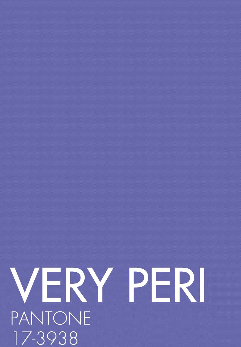
The 2022 annual color released by pantone, an authoritative color research institute, was officially unveiled recently: PANTONE 17-3938 Very Peri - the fairy and ethereal, mysterious and dreamy "periwinkle blue" is coming!
▼

After seeing THE PANTONE 17-3938 periwinkle blue, we have reason to believe that this wave of color bombardment will make your eyes light up. After all, this is the skin color of Disney's previous "top" star, Dailu!
It's still the color of Monica's apartment in Friends, did you suddenly remember it?
Because it's a bold, imaginative color. In the official interpretation, "periwinkle blue" is the blue hue of periwinkle, infused with a vibrant purple red. Unlike in the past, this time the popular color is not from the famous PANTONE color card, but by the institution itself.
As Leatrice Eiseman, Executive Director of the Pantone Color Institute, put it, "As we enter a world that has undergone unprecedented changes, Pantone chose TOTONE 17-3938 Very Peri to bring a new perspective to the beloved and trusted blue family. "In this environment of great changes and shocks, the stable and inclusive "periwinkle blue" can give us a more abundant sense of security.
"Periwinkle Blue" is a pleasant and comfortable color. This new color, blended from Tranquil Blue and Vibrant Red, is both calm and fresh, and its harmonious look and feel and hue mix can also bring stability and inclusiveness.
In the fashion circle, PANTONE 17-3938 periwinkle blue is actually "famous for a long time", it is not suddenly popular overnight. Looking at some of the design works of previous years, you can find traces of periwinkle blue -
Dita Von Teese wears a custom wedding dress with periwinkle blue at her wedding
Princess Diana also wore suits of this color as early as the 80s
A periwinkle blue skirt seems to be able to give people the confidence to support the scene, especially under the background of the glossy fabric, this gorgeous feeling will be more obvious.
Right: Alexis Mabille Spring/Summer 2021 Couture Collection
Armani Privé launched a large number of periwinkle blue-hued skirts as early as the Spring/Summer couture collection in 2016, each piece presents a completely different texture and luster under different materials, romantic and beautiful, as if in a fairy party.
Looking at the Spring/Summer 2022 runway, brands such as Loewe and Valentino bring periwinkle blue clothing and accessories, each of which is beautiful and deep, and at the same time very appealing to curiosity.
Loewe's Spring/Summer 2022 collection
Valentino's Spring/Summer 2022 collection
This color is dreamy and full of fairy spirit, but also with a little calm and deep power, so its use is very wide, even in men's design can see the periwinkle blue tone, just like Valentino 2021 autumn/winter couture series, the temperament of a clean boy to control it is not against the law.
Too dreamy runway styling may give you the stereotype that this color is not everyday enough. In fact, it is not, as a very passionate editor of blue and purple tones, I must say that as long as I can match, periwinkle blue will definitely become the explosive color of the new season.
It is not exclusive to cold white skin
As can be seen from the runway styling, it is not only the cold white skin of the Western standard that can control the periwinkle blue, but the slightly yellowish skin color can actually wear it well.
You see there are a lot of bloggers on INS who have skin tones, and they are not white to reflective types, but they can all wear periwinkle blue "head is the way", mainly because they have mastered the secret of periwinkle blue.
For example, you can start with small accessories such as shoes and bags, and they won't be as picky as a patch of clothing. This is one of the principles that editors are sure to mention when introducing non-basic color wear.
Then there is the combination of periwinkle blue and other colors, don't look at it so dreamy and fairy, in fact, it can also match the basic color with a different shape.
Periwinkle blue + black and white
Any non-basic color clothing that you haven't tried can be matched with black and white. For the gentle, non-sharp periwinkle blue, adding the same low-key black and white to the collocation will neither bury its own chromaticity nor feel mixed because of the more colors.
The more common way to wear is to choose a black and white inner layer in the periwinkle blue suit, and vice versa (adding a little periwinkle blue as an embellishment in the black and white outfit) can also be established. The two colors do not interfere with each other but complement each other, whether it is cold white leather or yellow skin, this combination of colors has a good tolerance for different skin tones.
Periwinkle blue + blue/purple
Following the Pantone color card to find the area between 2-3 shades that extend out of the central color is a good color matching method. Take the periwinkle blue, in its vicinity of pink blue, aqua blue, dark blue, as well as very close but lighter taro purple in color, are very good choices.
The principle of this collocation is to use the saturation adjustment of the color to match the color. From a visual point of view, periwinkle blue and blue, purple are relatively close, so from this point of view, the color scale collocation, generally will not go wrong.
Therefore, many bloggers will use this color of top with blue jeans, refreshing and very gentle, like a spring breeze.
Periwinkle blue + red series
The reason why I want to say that the red system is because the periwinkle blue itself can be matched with a series of different levels of red from positive red, purple red to burgundy, and the effect is good. Judging from the demonstrations and street photographies on the Internet, the combination of periwinkle blue and red can really make you feel like you are shining.
Lady Gaga standing in front of the red background is so domineering, which also confirms that the combination of these two colors together has no sense of conflict at all.
As mentioned by the previous editor, periwinkle blue itself is a color that combines blue and red qualities, so the enthusiastic red can better stimulate the inner vitality and beauty of periwinkle blue, as well as a deeper femininity, rather than being as difficult to approach as "a piece of ice" in winter.
Periwinkle blue + other colors
Periwinkle blue is not a very aggressive color, so even if it is used as a contrast color match, it is acceptable. In the December 2021 issue of World Fashion Garden ELLE, for example, Zhou Xun, wearing a CHANEL suit, stood in front of the yellow background, the picture was very harmonious, and there was no abrupt contrast at all:
It is the softness of the periwinkle blue itself that plays a key role. When it is matched with some colors with high saturation, its own introversion can dissolve the visual impact of high saturation colors, and the bright colors can also improve the brightness of periwinkle blue, and the colorful pleasure can give us a positive feeling full of hope.
If you want to wear a little low-key daily, you can use brown, khaki and other neutral colors to match periwinkle blue, and you will no longer feel too old-fashioned and frigid.
In the present moment full of unknowns and confusion, you may wish to use this popular color that represents hope and beauty, add some hope to next year and the future, and also give yourself the courage to embrace the unknown!
Image source: Oriental IC, Visual China, Sina Weibo, partly from Baidu
Design: Zhang Tiantian