The exploration of color expression techniques by The Impressionists, Post-Impressionists and Neo-Impressionists tells us that artistic experimentation can only be fruitful if it conforms to scientific principles or is guided by scientific theories, otherwise it will not work.
Written by | Fengsheng Lin (Shanghai University)
In the first two years, white gold and blue and black skirts, gray-green shoes and pink and white shoes caused an uproar on the Internet. Some test sites also hook the color and left and right brains: "If you think it is a pink white shoe, it means that it is a right brain advantage, partial sensibility, if you see a gray-green shoe, it means that it is a left brain advantage, and the individual is rational." Is there any truth to this statement? My answer was: "Color vision is a person's subjective perception of the wavelength of light reflected on the surface of an object, and no two people in the same environment see exactly the same color."
It is really a bit difficult to understand this matter, in fact, human beings' understanding of the difference between the two has also gone through a long road of exploration!
As we all know, around 1670, Newton learned through the dispersion experiment of light that sunlight (white light) can be decomposed into red, orange, blue, purple and other color light, thus establishing the optical theory of color. This can be said to be the beginning of the study of color. Although over many years painters and painters have found in practice that the colors painted on canvas or walls are often different from what the viewer perceives with their eyes. For example, if the painter uses the same strip of gray paint on the cloth, when it is placed in the background of the yellow-blue change, then it seems that the band gradually transitions from the left end to the yellow end of the right end, and people will not believe that the color of the tape is unchanged. This shows that the viewer's understanding of color is a subjective feeling, that is, "color vision", which is not the same thing as the name of the pigment smeared on the canvas. [1] [2]
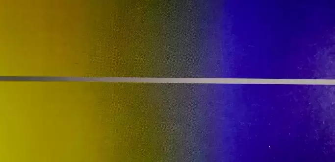
Figure 1. The gray band in the painting
For many years, painters often found similar situations in their creative practice, especially when different pigments were applied to the adjacent positions of the canvas, and the colors interfered with each other, but they were not further investigated. It was not until 1824 that the French chemist Chevrels began to pay attention to this problem. Because that year, he had worked in the laboratory of the great British scientist Faraday, he was appointed director of the Goblanc printing and dyeing factory in Paris, and after taking office, he often received complaints from customers that textiles made of dyes produced in the factory would change color. Schaeffler believed that the dyes themselves were impeccable, but that the way the dyeing threads were woven destroyed their innocent color. For example, a sweater with red and yellow wool knitted with a pattern interval, in which the red color will be biased towards rose color, and the yellow will be biased toward lemon yellow. Another example is to weave red and green woolen threads between flowers, and when viewed from a distance, red and green are fused, and the sweater becomes gray and not slippery. From this he found that when two colors are juxtaposed at the same time, they will affect each other, and he calls this law the law of contrast of colors.
Picture 2 is a precious photograph of the chemist Michel-eugene chevreul (1786-1889), taken by the son of the early master photographer Nadal, who was 100 years old at the time and still spoke so imposingly that it is conceivable that he must have been an angry roaring emperor in the face of customer complaints. The biography says that he was a man who refused to admit defeat, and had special functions, able to distinguish 15,000 colors, and encode and arrange them one by one into a table, and also invented the instrumentation of coding, and analyzed the visual effects of color juxtaposition. Through measurements, he observed a series of fascinating effects, such as the fact that red makes adjacent surfaces look green. "When the eye is staring at two patches of surface color that are close together, they represent a lot of optics and tones very differently than we are usually familiar with," he said. ”

Figure 2. 100-year-old chemist Schaefleur (left)
Schaeffler immersed himself in research, and after several years of hard work, his monograph "On the Law of Simultaneous Contrast of Color" came out, which had a great influence on the art of painting. [3] The great French painter Eugène de la Croix studied Schaeffler's theory, adopting a vague expression of the contours of people (things) in painting, which had a profound influence on the Impressionists (who could also be said to be practitioners of Newton's theory of optics). Even the Impressionist master Camille pissarro (1830-1903) said: "The goal of the post-Impressionists was to find ways to integrate science, Schaeffler's theory of color and the experiments of the physicist Maxwell. "Just as the perspective and anatomy of the Renaissance from the 14th to the 16th centuries contributed to the development of painting, the science of color was also deeply integrated into the practice of painting. [4]
Due to the wide content of Schaeffler's book and the relatively early time, the author chose some views that everyone agreed with and gave a brief introduction to colorology.
Primary colors: Schaefleur regarded red, green, and blue as three primary colors (red, yellow, and blue were regarded as primary colors at that time). Other colors (mainly spectral colors) can be mixed and blended through them.
Complementary color: Complementary color is a color compensation phenomenon required for visual physiology. For example, after looking at a piece of red for a long time, if you look up at the surroundings, you will find that there is a faint green, so green is a complementary color of red, and vice versa. The best way to determine which two colors are a pair of complementary colors is to mix them together and see if they produce a neutral gray. It is not difficult for the reader to find that orange is the complementary color of blue, and purple is the complementary color of yellow. Colorology also tells us that when two complementary colors are juxtaposed at the same time, the brightness of the color appears to increase. If you juxtapose red and green, the red is redder and the greener is greener. The famous physicist Hermann von Helmholtz (1821-1894) said: "Artists who wish to paint as strikingly as possible the impressions left by objects with the pigments they can grasp must paint the contrasts they produce." Schaeffler's writings attracted the interest of a wide range of painters. In the Impressionist master Renoir's Boating the Seine (Figure 3), the cobalt blue and chrome orange on the river are intertwined, and the effect of complementary colors is dazzling. Painter Monet said: "The brightness of a color should be attributed to the power of contrast, not to its inherent characteristics. ” [4][5]
Figure 3: "Rafting on the Seine"
Neuroscience tells us that the brain is divided into two ways when transmitting visual information: one is the "what pathway", which mainly transmits color information, and the other is the "where pathway" that transmits shape and position information. Because the visual nerve has to transmit a much larger amount of color information than the shape and position information. For example, it takes only a few dozen kbs (kilobytes) to transmit a frame of black and white photos, and hundreds of kbs to transmit a frame of color photos, so the difference between the two is so large, so the nerve cells of the color system can only work under low-resolution conditions, transmitting some blurry color images. Of course, in order for the transmitted color map to work, the system treats them differently: for those color blocks (low resolution) that are not much different from the background, they can only be mashed; and enough attention is paid to the lines outlined with thick colors. Therefore, Western watercolor painters and crayon painters often use a relaxed and casual brushwork to light colors on objects, and use lines of heavy colors (relatively high resolution) to outline the outline of the object to achieve the effect of highlighting. In 1906, the American modernist painter Abraham Walkowitz (1878-1965) met the modern dance master Duncan in Paris, fell for it, and painted 5,000 sketches. The water-colored, crayon painting lsadora duncan (Fig. 4) is one of them. The painting is sleek, the colors are understated, and Duncan's light dancing posture jumps on the paper. The painter's coloring of the dancer's clothes and body is quite casual, some details are not even colored, the color and contour line can be naturally integrated, some edge colors (some exceed the contour line, some also leave blank) can "stick" to the line, uneven, blank color in the middle shows the brushstroke and agility, which is much more pleasing to the eye than the painting method of filling the entire area with uniform colors.
Figure 4. Walkwitz "The Dancer"
The reason why this method of painting is successful is that it can coincide with the transmission mechanism of visual information. Color system cells are difficult to deal with large areas of color blocks, so the painter can handle it simply, but there is also a cell in the color nervous system called double-opponent color cell, as the name suggests, it is specifically concerned with the junction of two color blocks with obvious contrasts, which is obviously the contour line. [2] So using thick lines of color to outline the outline of an object and "filling" it with light colors is a good way to use color. Of course, you can also use a light color to smear a large area of color blocks (called rendering in Chinese paintings), and then use thick brush and ink to outline the necessary meridians in the painting, which can also play the role of "dense and dense, here colorless is better than colored". The large-scale freehand flower and bird paintings of Chinese painting use this method of painting.
Figure 5 is The Man by another color master, Raoul Dufy (1877-1953). He almost painted the painting to the fullest with extremely relaxed colored brushes, and then outlined the outline of the figure with high-contrast color lines, although the background color and outline can not correspond to each other, but we feel that the two are perfectly coordinated, full of a relaxed atmosphere of light singing and dancing.
Figure 5. Duffy "People"
Since the nervous system transmits color information very sloppily and the image resolution is low, it is easy for the viewer to have optical illusions on the color picture, and an interesting experiment is introduced below (Reference: eye, brain, and vision by david hubel, scientific american liberary, 1988).
Figure 6. Schematic diagram of experimental materials
In Figure 6, three sets of vertical flat images, respectively, in the background of white, gray and black, each group has three squares composed of upper, middle and lower squares, the entire image is drawn with horizontal, vertical and oblique blue lines, and the "meter" blue lines of each square figure change color before the intersection of the central crossroads. At some intersections, the reader can see the illusion of a disk (the intersection is the center of the circle, and the distance from the center of the circle to the point of color change is the radius) – this is the feeling that the colors of some lines spread outwards and penetrate into the background. A closer look can further reveal that the illusion of the disc is strongest if the color of the line is close to the brightness of the background. That is, the brightest yellow band is the most obvious disc on a white background; the medium-brightness red band is most pronounced on a gray background; and the lowest brightness purple band is most pronounced in the black background. Such discs can be perceived, but do not exist. From this, we can see that when two colors of similar brightness are close together, they give the viewer an illusion: the two colors will penetrate each other, even to the extent that you have me and I have you.
Similar color laying out can be seen in many Impressionist paintings. Figure 7 is the 1908 work of the Impressionist master Monet, the palazzo ducale, seen from the san giorgio maggiore, which depicts water, sky and buildings, made up of many brushstrokes of completely different colors. Although the brushstrokes left by Monet on the canvas are not mixed with each other, because the brightness of the colors in each part of the picture is so close, that these colors are fused together in the eyes of the audience, forming a patchy and harmonious color surface. [2]
Figure 7. Monet," The Doge's Palace from Maggiore
Based on the above color principles, the Neo-Impressionist painter Georges Seurat (1859-1891) created a unique school of painting, the pointillist school. For example, to draw a green leaf, he did not mix yellow and blue pigments on the palette and paint them on the canvas, but directly painted hundreds of small yellow dots and small blue dots on the canvas. There are more blue dots in the dark green and more yellow dots in the pale green, and when the viewer appreciates the painting a little further away from the painting, these color points will be connected on the retina, which looks no different from a piece of green, and is particularly harmonious. This phenomenon is called light oozing. Of course, this distance also has a "degree", too far away, these colors will first merge together, become a gray.
Considering that Seurat's method of pointillism is more extensive, this article selects a work by another pointillist, Paul signac (1963-1935), "View of the Port of Marseille".
Figure 8. Signac, A Glimpse of the Port of Marseille[7]
The contemporary American painter Chuck Close (1940-) experimented with Seurat's pointillist technique. He usually chooses a photo of a person's head, draws a grid on the photo (the grid is usually a slash setting), and then draws a grid with the same number of upper spaces on a much larger canvas. He painted each square of the photograph according to his own understanding, one at a time. In fact, each square was an image, and he experimented with filling the squares with different kinds of symbols. In fact, each square grid is filled with lines, circles, dots, and squares that are casually painted in solid colors. So, up close, the picture looks like a giant hive made up of hundreds of miniature figurative paintings. If the viewer recedes, the colors begin to merge, and a three-dimensional image seems to emerge from the plane. This technique is called "visual color mixing". Critics in the history of art have called it "photorealism" (also known as hyperrealism super realism or hyperrealism hyper realism), a special type of realistic art that first developed in the United States in the early 1960s. In fact, it is also an alternative kind of "pop art". [8]
Figure 9. Chuck. Clos's Self-Portrait
bibliography
[1] josef albers; interaction of color; yale university,1971
[2] margaret livingstone; the biology of seeing; abrams ,new york 2002
[3] elirne strosberg, art and science , abbeville press publishers ,new york 1999
[4] philip ball, bright earth: the invention of colour, yilin press 2001
[5] John Gage, Translated by Huang Chenyang, Color in Art, Zhejiang Photography Publishing House, 2018, 7
[6] victoria finlay; Yao Yunzhu Translation, The Story of Color, The Natural History of the Palette; Life, Reading, Xinzhi Sanlian Bookstore, Beijing 2008-9
[7] nathalia brodskaia,post-impressionism,parkstone pressinternational2010
[8] Pupa Gilbert Willy Haeberli, translated by Qin Kecheng, Physics in Art, Tsinghua University Press, 2011-4
Copyright note: Individuals are welcome to forward, any form of media or institutions without authorization, may not be reproduced and excerpted. Please contact the background within the "Return to Pu" WeChat public account for reprint authorization.
Special mention
1. Enter the "Boutique Column" at the bottom menu of the "Return to Simplicity" WeChat public account to view the series of popular science articles on different topics.
2. "Return to Park" provides the function of retrieving articles on a monthly basis. Follow the official account, reply to the four-digit year + month, such as "1903", you can get the index of articles in March 2019, and so on.
"Return to Simplicity", a good science popularizer led by scientists. Internationally renowned physicist Wen Xiaogang and biologist Yan Ning are co-editors-in-chief, and together with the editorial board composed of dozens of first-class scholars in different fields, they will explore with you. Pay attention to "Return to Simplicity" (WeChat: fanpu2019) to participate in more discussions. Please contact [email protected] for secondary reprinting or cooperation.