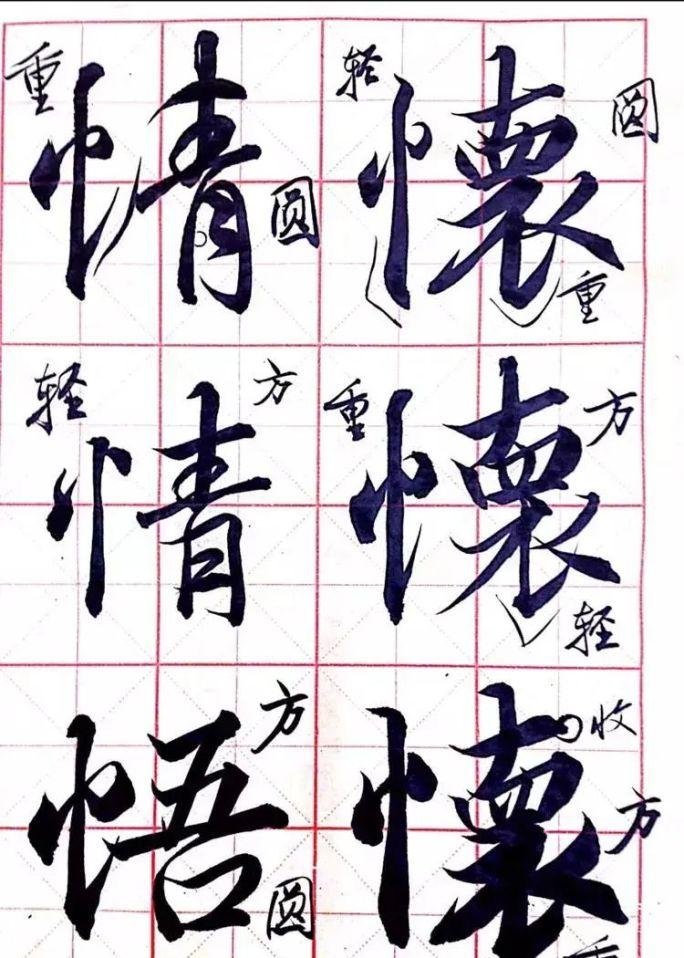
1. The weight of the strokes
Whether it is calligraphy, calligraphy, or cursive writing, attention should be paid to the change in the weight of the strokes. The lack of light and heavy changes is bound to be less expressive and bound to be dull and tacky.

In the following figure, from the comparison of these two lines, the change in the thickness of the stroke has a great influence on the glyph. A mature cursive calligrapher, whose strokes must be rich and harmonious. Even when writing in letters, you should pay attention to the differences in weight and thickness between strokes. The strokes of the letter are light and heavy, the rise and fall are heavier, the line strokes are lighter, the points are mostly from light to heavy, and the front is from heavy to light, but the strength needs to be penetrated to the end.
In order to write coherently and smoothly, the basic strokes (dots, horizontals, verticals, apostrophes, strokes, hooks, folds, and picks) are often connected in the form of strings. The basic strokes should be thick and the draws should be light. In this way, the priorities can be distinguished.
The texture of the stroke is determined by the writing strength and writing speed when the pen is transported.
2. Echo
The change in the thickness of the basic stroke is reflected in the clear and clear point painting; the change in thickness between the pen and the pen constitutes a ribbon, which can make the two originally unrelated strokes connect, so that the pen tone can be continued and echoed. In the line of writing and cursive writing, the echo is more obvious. In addition to the thread, there are other writing techniques that make the strokes form a corresponding relationship. There are three common ways to write that make up the echo between strokes:
2.1 Pen connection
Without affecting the glyph, the strokes that are close to each other at the beginning of the pen are connected. As shown below, the first stroke "horizontal" and the second stroke of "horizontal", as well as the "fold" and "囗", are all connected in the form of pen connections. This way of writing is concise and clear. Enhances the sense of flow in the word.
2.2 Wire drawing
The main purpose of the wire is to connect the two strokes that are farther apart, which appears between the front and back strokes, and the wire needs to be light and thin to ensure that the boundaries between the two basic strokes are clear.
2.3 Meaning
Yilian refers to the connection between strokes in the writing process, which is not directly reflected in the words, but is interconnected through "intention" and "potential". The simplest way to connect is to cut off the place where it could have been written with the wire, leaving only the forward and the pen, leaving the meaning of the connection between the point.
The second stroke and the third stroke of the word "zhi" are connected in this way. Is a red dotted line identifier for the illustration.
The beauty of the meaning is that there is nothing, it is implicit but not revealed, and it is hidden but not hairy.
In the book, the meaning of the line appears more, but most of it is formed by the consistency of the pen and the meaning, and the structure tends to be formed, and there is basically no simple practice of cutting the thread.