Yi Bingshou (1754-1815), the character Zu Xiang, the number MoQing, the late number Mo'an, Fujian Ninghua people, because Ninghua belonged to the capital of Tingzhou at that time, it was also known as "Iting Prefecture". Mo Qing's personality is noble and prosperous, and his calligraphy is also high and ancient, and the atmosphere is compelling. Sha Menghai once commented that "when he drops his pen, he will be separated from others in the realm of immortality."
Yi Bingshou's handwriting
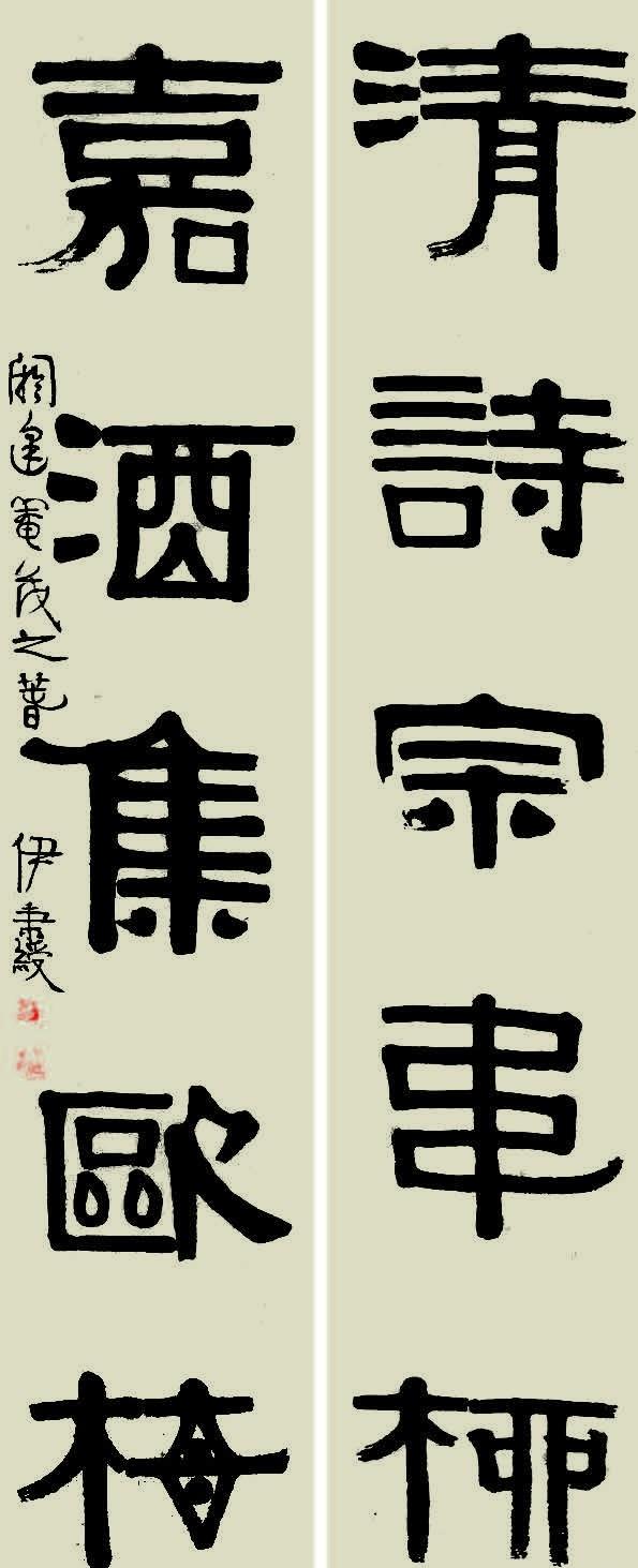
The "Qing Poetry Sect Wei Liu, Jia Jiu Ji Ou Mei" Lian (pictured) was written a year before Mr. Mo Qing's death, and the joint text is concise and profound. In history, some people refer to Wang Wei, Meng Haoran, Wei Yingwu, and Liu Zongyuan as "Wang Mengwei Liu", and the "Wei Liu" here is Wei Yingwu and Liu Zongyuan. Wei Yingwu and Liu Zongyuan were pastoral poets who inherited Tao Yuanming, and their poems were a portrayal of Yi Bingshou's life at that time. The "Oumei" in the lower link "Jia Jiu Ji Oumei" refers to Ouyang Xiu and Mei Yaochen. Ouyang Xiu was one of the "Eight Greats of the Tang and Song Dynasties" and was just and upright. Mei Yaochen was a famous poet of the Northern Song Dynasty, whose poetic achievements were outstanding, and he was friends with Ouyang Xiu for many years. The joint meaning is: to learn poetry, you should respect the style of Wei Yingwu and Liu Zongyuan, and drink fine wine with like-minded friends like Ouyang Xiu and Mei Yaochen. The inscription is "The Spring of Castration", that is, the Spring of Jiashu, that is, the spring of the nineteenth year of Jiaqing (1814). This joint is ingeniously conceived and neatly adapted to the battle. Among them, it is not difficult to find Mr. Mo Qing's recognition and admiration for Wei Yingwu, Liu Zongyuan, Ouyang Xiu, and Mei Yaochen. Mr. Mo Qing has too much in common with them, one of which is that they are all noble people, concerned about the people, and upright. Second, this association was written by Mr. Mo Qing at the age of 61, when he was resting in his hometown of Ninghua and had no official position. On the surface, it uses fresh and elegant writing to write the idyllic and comfortable life, but in fact, it has the deep meaning of worrying about the country and the people. In addition, Mr. Mo Qing is always idle, and his heart is relatively lonely, hoping to have a like-minded confidant like "OuMei". Third, they are all ancient, advocating Confucianism, and advocating a simple and ancient style of writing.
Yi Bingshou lishu and integration of various families, a school of its own, Kang Youwei", called it "Jigu Dacheng "Jigu Dacheng". In his early years, he studied the Tang Kai family, especially the Yan Ti Kai Shu, and in his middle age, he mainly absorbed the golden stone qi of Han Li and entered the stele. In terms of penmanship, make good use of the center line pen, weaken the wave brush method, and enter the book with the method of seal, the lines are smooth and clean, and the thickness is uniform. Its lines are as natural as Master Koichi's, monotonous and profound. Mr. Mo Qing makes good use of thick ink, full and full. He Shaoji once used "make ink like lacquer" to describe his ink. If Mr. Mo Qing does not have too many changes in brushwork, then he can be described as painstaking and unique in terms of structure. The overall glyph of the book will be elongated, the knot body is square, balanced and symmetrical, and the inside is placed and adducted. The combination of lines is even more exquisite. The three points of water on the left side of the "Qing" character are leaned on as a whole, so that the contrast between the left and right spaces is obvious; the last stroke of "Wei" is curved, and there are circles in the square; the two mouths under "Ou" are written as circles, lively and cute; the use of the lower right triangle of "Mei" makes the division of space reduce the square; "Qing", "Jia" and "Zong" skimming and skimming points fly white with the pen. The knot body has subtle changes on the basis of uniform symmetry, square but not rigid. In terms of chapter layout, Yi Bingshou's book as a whole is square and dignified, neat and orderly, and the layout is complete. Looking at his works, between the virtual and the real, staggered and orderly, both dignified and full of atmosphere, and a light and delicate posture. "Qing" is smaller and upper on the left side, and "poetry" is unusual, and the left is large and right is small, which complements the word "Qing". The character "Zong" is smaller, but the "set" and "Wei" are larger and the glyphs are longer, forming a contrast. There is a clear contrast between the book and its main text, the strokes are thin, casually arranged, and the chat is interesting. The falling style is more concentrated on the upper and lower parts of the word "wine", and the word "set" naturally divides the lower part of the falling paragraph, which adds a spatial level to the work and adds a lively atmosphere in the simple lily book.
(Text/Xu Jin)
![Yi Bingshou's "The Good of Calligraphy and Painting", it has become a high ancient and broad atmosphere![fig]](data:image/gif;base64,R0lGODlhAQABAIAAAP///wAAACwAAAAAAQABAAACAkQBADs=)