The design of the game icon may be more important than you think. Many switch users are concerned about these colored squares that appear on the home screen, calling on certain developers to change the game icon, and developers are listening.
On Thursday, Sept. 18, three days before steamworld dig 2 went on sale, Swedish developer Image & Form tweeted an image of the new game on Switch. However, to their surprise, the game's icon design almost immediately triggered many netizens to complain. Some have compared it to the logo for the movie "d2: the mighty ducks," and others have warned developers that they will be boycotted by the reddit and neogoaf user communities.
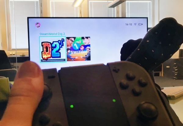
Image & Form promised to change the icon for Steamworld Dig 2, but on the day the game was officially released, a taunted post appeared on the Reddit community's Switch forum titled "Steamworld Dig 2 is expected to win the jackpot in the contest for the worst icon."
In a sense, it's not surprising that Steamworld Dig 2 has taken a hit, it's really hard to watch... According to Image & Form CEO Brjann sigurgeirsson, due to negligence, they also mistakenly sent the windows/mac icon data when sending the final version of the game to Nintendo.
But what happened to image & form is not alone. Over the past few months, there have been stories of switch games being criticized by players for their icons. One of the earliest examples stemmed from the "Snake Pass" produced by developer Sumo Digital.
When Snake Pass was launched in March, its icons were relatively standard, including a logo and some of the game's art assets, which looked similar to many of the game icons on the Switch platform and other consoles — in fact, Nintendo suggested that the developers include a logo and an image that would showcase the game.

On June 21, the icon for Snake Pass changed.
The logo was removed and the snake's head was designed to be larger and more conspicuous. Sumo Digital told Kotaku that the reason they changed snake pass's switch icon was to make it consistent with the icons of the game ps4, Xbox One, and PC versions.
The official Snake Pass tweet mentioned the icon change when announcing the 1.2 version update of the game, which also triggered a condemnation of the redesigned icon. One player's comment was typical: "Seriously, you guys have to change the icon back... I don't want my Switch home screen to look like a trash can full of f2p mobile games. ”
Many switch game icons have been criticized by players for this reason. In iTunes or Google Play, many game icons don't have logos because of limited screen space and logos that are so small that they are difficult to read. Clash of Clans developer Supercell is adept at using angry man faces as icons, and other mobile game developers have followed suit.
But on switch, there is no shortage of display space for game icons - in contemporary mainstream game consoles, switch game icons occupy the largest amount of space. With this in mind, the "big head" icon may not be a reasonable use of space. As neogoaf user Neitieo said of the icon changes for Snake Pass, they are "cheap and tacky, like pop-up ads for those junk games." ”
Switch players loudly expressed their dissatisfaction with the "bad" game icons, and developers seemed surprised by this drastic reaction from players.
"It's been very interesting to react to the icon changes, and since Snake Pass was our first self-published game, it was definitely an important lesson we learned." A representative for sumo digital said in a statement, "It also shows that players are passionate about Nintendo and Switch, and even details like icons are part of their gaming experience." ”
The steamworld dig 2 development team was more enthusiastic about the player response to the icon.
"Several of my colleagues are in a very bad mood." Brjann sigurgeirsson said of what players were saying about the game's icon on social media, "What exactly are these people talking about? An icon!? Why not talk about a game we spent 15 months making? Talk about style rather than substance... I'm also not right to say that, because the style of the game is also great. ”
Even more frustrating to image & form is that players were already bashing steamworld dig 2 before it was released. "When people started talking about it, the game wasn't even released yet, so they couldn't have said, 'The icons suck, but the game is great.'" Bad icons are their only impression of the game. ”
Sigurgeirsson admits that he originally planned to spend the night filming an ironic-style "new icon announcement" video — he thought the process would be fun, but it was like "shooting mosquitoes with a bazooka." ”
"What happened next: our artistic director Tobias Nilsson read the video script I wrote, he was worried about my mental state, and almost immediately designed a wonderful new icon... Instead of asking a video company to make a video that cost $20,000 or $30,000, we posted the tweet. ”
"I heard that people have a lot of opinions about our current switch icon!? Although many people like it, we are considering replacing it, what do you think? ”
Steamworld Dig 2 will use the new icon in an update soon.
image & form isn't the first company to change switch game icons based on feedback from the player community. Prior to that, lego worlds publisher tt games had also changed its icon due to strong protests from players. Lego World landed on the Switch on September 5, and on the day of the game's release, a staff member at tt games released a photo of a new icon that had been optimized. After a recent update, LEGO World began using new icons.
While the minimalist icon design of the strategy adventure game Kingdom: New Lands fits the game's style, many Switch players don't like it. On September 15, publisher Raw Fury promised to revise the icon's design at reddit's "ask a questions and answers" (ama) campaign. "So far, we've been using the Crown logo that all other versions are using, but we've read the feedback from Nintendo players and will be modifying it."
For Snake Pass, developer Sumo Digital also plans to change the game's icon on the switch.
"We plan to update the icon in the next version of the game, which is expected to be released early next year. While this can lead to a lack of alignment in our brand, players and communities are the focus of our attention, so we're happy to do it. ”
This article is compiled from: kotaku.co.uk
原文标题:《nintendo switch owners really, really care about the game icons》
Originally written by Mike Fahey