Driving China, February 17, 2022 NEWS BYD Group officially announced today that it has renewed its brand and released a new logo. At the same time, its BYD automobile has also upgraded its logo.
According to the official introduction, the logo is renewed, on the basis of retaining the passionate red color and the ring circumference, through the adjustment of the round frame lines and font details, the original sharp angle of the glyph is changed to a more mathematical and beautiful rounded corner, and the overall is more rounded and generous, showing a sense of affinity and openness. The rings in the logo represent BYD's global vision and sustainable development concept.
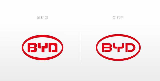
In addition, the BYD automobile brand has also optimized the logo from a visual point of view, starting from the specific scene needs of the business and the consumer perception interaction, which is in line with the current graphic design trend, with a more three-dimensional sense and design aesthetics, and stronger recognition.
