1、案例一
trace = go.Funnel(
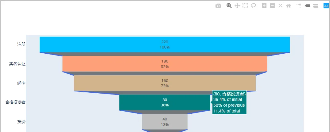
y = ["注冊", "實名認證", "綁卡", "合格投資者", "投資", "複投"],
x = [220, 180, 160, 80, 40, 20],
textinfo = "value+percent initial",
marker=dict(color=["deepskyblue", "lightsalmon", "tan", "teal", "silver", "yellow"]),
connector = {"line": {"color": "royalblue", "dash": "solid", "width": 3}})
data =[trace]
fig = go.Figure(data)
fig.show() 結果如下:
2、案例二:繪制不同網站的對比轉化率漏鬥圖
import plotly.express as px
import pandas as pd

df = pd.read_excel("funnel.xlsx")
display(df)
fig = px.funnel(df, x='數值', y='狀态', color='網站')
fig.show()

df1 = df[df["網站"] == "A"]
df2 = df[df["網站"] == "B"]

fig = go.Figure()

trace0 = go.Funnel(x = df1["數值"],y = df1["狀态"],name = 'A網站',
                   textinfo = "value+percent initial",
                   marker=dict(color=["red"]*5),
                   connector = {"line": {"color": "lightsalmon", "dash": "solid", "width": 3}},
                   opacity=0.49)

trace1 = go.Funnel(x = df2["數值"],y = df2["狀态"],name = 'B網站',
                   textinfo = "value+percent previous",orientation = "h",
                   marker=dict(color=["deepskyblue"]*5),
                   connector = {"line": {"color": "lightsalmon", "dash": "solid", "width": 3}})


fig.add_trace(trace0)
fig.add_trace(trace1)

fig.show() ![Python繪制漏鬥圖之可視化神器pyecharts[圖]](data:image/gif;base64,R0lGODlhAQABAIAAAP///wAAACwAAAAAAQABAAACAkQBADs=)