经常在项目中使用shape在XML中绘制各种形状,简单整理了一下shape的属性与用法。
shape的图形选项有四种:
- rectangle(长方形)默认的形状,可以画出直角矩形、圆角矩形、弧形等
- oval(椭圆) 用得比较多的是画正圆
- line(线条) 可以画实线和虚线
- ring(圆环)可以画环形进度条
注意:定义ring圆环的时候需要用到shape的几个属性
android:innerRadius 尺寸,内环的半径。
android:thickness 尺寸,环的厚度
android:useLevel boolean值,官方建议设置false.
其中innerRadius和innerRadiusRatio同时出现时以innerRadius为准,thickness和thicknessRatio同时出现以thickness 为准
除了以上四种图形外,shape还包含了6个子标签
1、corners 圆角
android:radius 整型 半径
android:topLeftRadius 整型 左上角半径
android:bottomLeftRadius 整型 左下角半径
android:bottomRightRadius 整型 右下角半径
2、solid内部填充
android:color
3、padding 内边距
android:bottom
android:left
android:right
android:top
4、stroke描边
android:width
android:color
android:dashWidth 虚线的宽度
android:dashGap 虚线之间的间隔 这两个属性不设置则为实线
5、size 大小
android:width 宽度
android:height 高度
6、gradient 渐变
android:startColor 颜色值 起始颜色
android:centerColor 渐变中间颜色,即开始颜色与结束颜色之间的颜色
android:endColor 颜色值 结束颜色
android:useLevel 设置为true无渐变。false有渐变色
android:angle 渐变角度(当angle=0时,渐变色是从左向右。 然后逆时针方向转,当angle=90时为从下往上。angle必须为45的整数倍)
android:type 渐变类型 linear 线性渐变,这是默认设置;radial 放射性渐变,以开始色为中心;sweep 扫描线式的渐变
android:centerX渐变中心X点坐标的相对位置
android:centerY渐变中心Y点坐标的相对位置
android:gradientRadius渐变色半径.当 android:type=“radial” 时才使用。单独使用 android:type="radial"会报错。
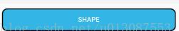
shape的使用也比较简单,在drawable文件夹中创建名称为button_shape_bg.xml的文件,然后在文件中配置shape的属性,以下为例子。
圆角矩形
<?xml version="1.0" encoding="utf-8"?>
<shape xmlns:android="http://schemas.android.com/apk/res/android">
    <solid android:color="@android:color/holo_blue_light"/>
    <stroke android:width="2dp" android:color="@android:color/black"/>
    <corners android:radius="10dp"/>
</shape>
在布局中引用
<Button
    android:layout_width="match_parent"
    android:layout_height="wrap_content"
    android:layout_margin="10dp"
    android:background="@drawable/button_shape"
    android:textColor="#ffffff"
    android:text="shape"/>
效果图:
虚线
<?xml version="1.0" encoding="utf-8"?>
<shape xmlns:android="http://schemas.android.com/apk/res/android" android:shape="line">
    <stroke
        android:width="2dp"
        android:color="@android:color/black"
        android:dashGap="2dp"
        android:dashWidth="5dp"/>
</shape>
红绿灰渐变的圆
<?xml version="1.0" encoding="utf-8"?>
<shape xmlns:android="http://schemas.android.com/apk/res/android" android:shape="oval">
    <size android:width="10dp" android:height="10dp"/>
    <gradient
        android:startColor="@android:color/holo_red_light"
        android:centerColor="@android:color/holo_green_light"
        android:endColor="@android:color/darker_gray"
        android:angle="270"/>
</shape>
圆环
<?xml version="1.0" encoding="utf-8"?>
<shape xmlns:android="http://schemas.android.com/apk/res/android"
    android:shape="ring"
    android:innerRadius="50dp"
    android:thickness="10dp"
    android:useLevel="false">
    <solid android:color="@android:color/darker_gray"/>
</shape>
shape也可以结合selector一起使用
分别在drawable中创建3个文件button_bg.xml、button_press_bg.xml、button.xml
button_bg.xml
<?xml version="1.0" encoding="utf-8"?>
<shape xmlns:android="http://schemas.android.com/apk/res/android">
    <solid android:color="@android:color/holo_blue_light"/>
    <stroke android:width="2dp" android:color="@android:color/black"/>
    <corners android:radius="10dp"/>
</shape>
button_press_bg.xml
<?xml version="1.0" encoding="utf-8"?>
<shape xmlns:android="http://schemas.android.com/apk/res/android">

    <solid android:color="@android:color/holo_red_light"/>
    <stroke android:width="2dp" android:color="@android:color/black"/>
    <corners android:radius="10dp"/>

</shape>
button.xml
<?xml version="1.0" encoding="utf-8"?>
<selector xmlns:android="http://schemas.android.com/apk/res/android">
    <item  android:drawable="@drawable/button_press_bg" android:state_pressed="true"/>
    <item android:drawable="@drawable/button_bg"/>
</selector>
在布局中引用
<Button
    android:layout_width="match_parent"
    android:layout_height="wrap_content"
    android:layout_margin="10dp"
    android:background="@drawable/button"
    android:textColor="#ffffff"
    android:text="shape_selector"/>
![与专家面对面:Android开发入门问与答[图]](data:image/gif;base64,R0lGODlhAQABAIAAAP///wAAACwAAAAAAQABAAACAkQBADs=)