The picture below is a painting that inspired Apple, and Jobs asked Apple's product managers and designers to take a good look at the painting. This painting is from Picasso and is called "The Bull."
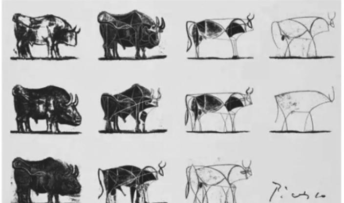
Picasso's Bull
From top to bottom, from left to right, Picasso's modifications to his paintings within 3 years, we find that the first complete cow was replaced by simple lines. However, even the simplest line you can still see that it is a bull, and you can see that it is a bull. Picasso through the continuous observation and simplification of the cow form, with the simplest brushwork to express his meaning, in the final simplified version of a line can not be less, and a line does not appear redundant, this is the highest state of simplicity.
Simplicity is to use the fewest elements to reflect the greatest effect, and if you can achieve the goal, don't continue to draw snakes.
Japan's UNIQLO and MUJI, The American Apple... These familiar brands are loved all over the world. Products designed with the concept of simplicity and beauty are by no means the result of accidents and randomness, they show an attitude to life and an aesthetic value.
UNIQLO: Basic combinations

The inherent meaning of UNIQLO is to abandon those warehouse-type stores full of unnecessary decoration and decoration, and provide customers with the goods they want in a simple way and reasonably and crediblely, and its products are also based on simple and practical as the main concept, focusing on simple, happy, fast selling and other elements, while maintaining the overall unity, there are some changes. Uniqlo emphasizes that "clothes are supporting roles, and the person who wears clothes is the protagonist". Using ingenious, transparent and distinctive design, the simple, high-quality and modern clothing effects are presented to consumers in the most intuitive way for the first time. Its versatile clothing features are also loved by many people.
The red square base plate with white, simple and atmospheric letters "UNIQLO" is the brand logo of Uniqlo. Its choice of colors uses a contrast of red and white to enhance the attractiveness of the logo. The combination of red and white has always been an ageless matching color, just like black and white, always so fashionable and will not be abandoned by time. UNIQLO's logo design not only highlights the culture of the company and reflects the characteristics of the brand's clothing, but also tells people that simplicity is also a kind of strength and beauty. Seemingly bland, in fact, it is rich in content, which invisibly coincides with UNIQLO's "people-oriented" clothing design concept, making the overall design more relevant. Uniqlo logo design participant Koshi Sato and repeatedly stressed that UNIQLO is not a fast fashion brand, but a media brand that sells fashion elements: "We just provide some objects, so that customers are free to combine and create." It represents a simple, joyful power. ”
MUJI: Back to basics
MUJI was founded in 1980, when world economic growth was in a downturn and Japan experienced a serious energy crisis, so Japanese consumers at that time hoped that the goods would have good quality, and the prices could be relatively good. In this context, the concept of "unbranded" was born in Japan and the first unbranded products were introduced to the market. These products are packaged in a simple package that reduces costs and uses the slogan "Value for Money".
From products to packaging, MUJI pays attention to the concepts of simplicity, simplicity, environmental protection, and people-oriented, giving people a simple feeling without deliberate modification. There is no modification in the product design, focusing on presenting the texture of the product, giving people a fresh and pure feeling, returning to the most authentic functionality. The same is true of the choice of wrapping paper. The wrapping paper selected by MUJI is made of unbleached pulp and has a light brown color, which is also used for labels. Such a unique and aesthetically conscious product was in stark contrast to the over-packaged goods at that time and won the favor of the market.
MUJI has no brand logo in packaging and product design, its original meaning is "no trademark and quality", this concept is Mr. Tanaka Kazumitsu from the aesthetic consciousness of daily life, it advocates the natural, simple, simple lifestyle is also highly respected by tasteful people. Under the influence of minimalist aesthetic consciousness, MUJI continues to simplify the shape, but also further simplifies the production process, creating a number of simple, simple and moderately priced goods.
Masaaki Kanai, the current president of Good Products Project Co., Ltd., once said: "There are many commodities in the world, not to be more convenient to use, but to sell better and more popular. The pursuit of the essence of the commodity makes MUJI products not obsolete in the rush of coming and going. ”
Apple: Simplify the complex
Apple is probably the most familiar brand, whether it is product design, marketing, or brand, the concept of minimalism is applied to the extreme.
Apple does not launch a variety of grades (quality) products like other companies, will not lead to inconsistencies in the experience of products at different price points (quality), and Apple only has a series of high-end and low-end products in one phase, consumers only need to choose their own according to the budget. Compared with its competitors, such as Samsung and other brands of complex naming and multi-series products, it is simpler and easier for people Apple is probably the most familiar brand, whether it is product design, marketing, or brand, the concept of minimalism is applied to the extreme.
In terms of operation, the Apple mobile phone has very few buttons, and there is no need to remember too many operation steps. In terms of design, the parameters of Apple product design are constantly fixed, which makes the user experience of all Apple products consistent. This is the most essential source of a concise impression of a brand. In fact, there is no shortage of products that are simpler than Apple, and we think that Apple is concise, which lies in the unity of experience. Moreover, Apple's old products and new product styles are always the same, and the launch of each generation of products has deepened the Apple product experience.
Apple designer Jonathan Yves explained simplicity when Apple's new system was released, saying: "True simplicity is far more than just simplification, but to establish order in the midst of complexity." That is to say, the process of designing Apple's products is complex, but Apple has managed these complexities well, so that the products presented tend to be perfect and easy to use, that is, minimalist.
Qi Baishi, a master of Chinese painting, also has a profound interpretation of minimalist design, he believes that "artistic creation should be simple and not complicated, and it should be hidden rather than exposed", which expounds the essence of concise thinking. The same rules of artistic creation apply in the business world.
These companies, who are well versed in simplicity, have done the opposite in an era of complexity and have achieved good results. Their success is not accidental, and behind the business lies a deep insight into human nature.
If you are inspired by reading it, please like and follow!
Wang Yong
Author of best-selling books "Concise Negotiation", "The Power of Simplicity", and "Five-Dimensional Learning"