#01
Black Pine Sands

As a classic soda brand in Taiwan, Black Pine Sands has also had many fresh attempts in recent years. When Eslite Bookstore's new Eslite App was launched last year, the two cooperated to launch a limited edition co-brand bottle, which was created by the cool design team HOUTH.
Both bottles are designed with the original intention of "making people feel happy", and in terms of design performance, they are geometric vases and flowers, representing "the practice place of a better life" and "the flower of enthusiasm for chasing dreams". The two bottles can spell out four combinations, visually bringing people direct happiness.
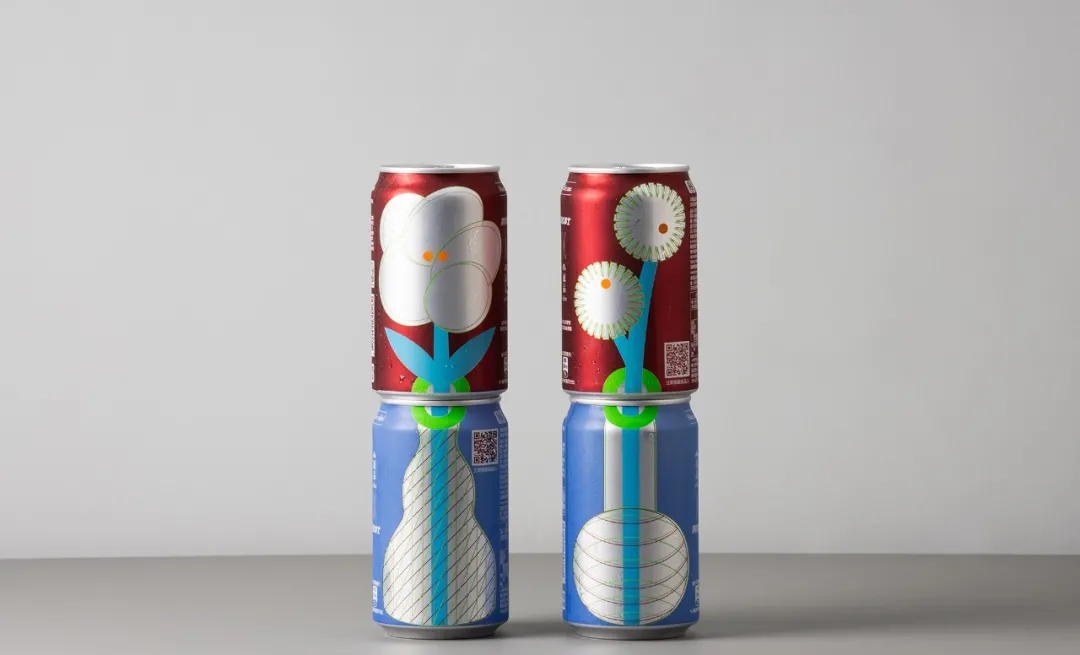
The year before, Black Pine Sands and the beer industry's red Man Taihu Craft Brew played the story of "Wusong Fighting Tiger". The two souls are exchanged, Taihu Craft Brewing has created a "Black Pine Sands FlavorEd Beer", and Black Pine Sands has launched "Black Pine Sand Plus Hop Flavor" for diners who want to taste beer but can't drink.
The can has both "Black Pine Brother" representing Black Pine Sands, and a tiger that symbolizes the Taihu craft brew, the story of "Wusong Fighting Tiger" becomes "Black Pine Brother Teasing Big Cat", and the two cans also have a lot of Easter eggs about each other's brands, which is intriguing.
▲ Black Pine Sands Refreshing der Transparent Limited Edition
When Black Pine Sars earlier launched the reduced sugar version of "Black Pine Sands Refreshing Der", it collaborated with cutting-edge designer Peng Xingkai to design a new packaging for minimalist vision, which was called "successfully subverting the old baggage of 68 years".
#02
Taiwanese beer
▲ Gold Medal Taiwan Beer, 2016 Christmas Edition
▲ Taiwan Beer Fruit Series Seoul Limited Edition
▲ Taiwanese beer, Autumn grapefruit beer
Peng Xingkai, co-designer of Black Pine Sands, has made many packaging innovations for another old brand, Taiwanese beer, whether it is the Christmas-limited "red-nosed polar bear" or a fresh grapefruit illustration, which has pierced the hearts of young people.
In 2018, Peng Xingkai's limited new product "Spring Green Beer" designed for Taiwan Beer was launched at the time of the spring equinox, and the bottle body was decorated with a golden combination of lake water green, neutral gray and symbolic hops, with the story of graphic writer Xie Donglin", "Spring is not waiting for the beginning but waiting for the end", the whole package is like a poetic literary and artistic romance. In the same year, several other seasons of limited beer were introduced.
During the 2019 Romantic Taiwan Third Line Art Season, Taiwan Beer invited zou Junsheng, a visual artist who has won many international illustration awards, to create a main vision with the "Shi Hu" who mainly inhabits the third line area of Taiwan as the protagonist, which is used as a packaging for the limited edition of Taiwan beer, and the use of mountain forest green and Hakka blue makes this beer grow in situ no matter where it is placed on the exhibition site.
▲ https://www.twbeer.com.tw/
#03
Lin Jinshengxiang
Lin Jin Sheng Xiang is a pastry shop that has been passed down for 153 years, and now in its fifth generation, the shop still retains its ancient techniques and presents a demand that conforms to modern health concepts.
Lin Jinshengxiang has launched New Year's pastry gift boxes for several consecutive years, all designed by the design company "Kawayashi Shisaku". The gift box in 2021 is different from the previous theme, after a year of isolation and seclusion, everyone's gifts also contain a longing, so the 2021 Spring Festival gift box is based on the concept of vinyl albums, named "Long time no see".
In Lin Jinshengxiang's introduction, this gift box is a vinyl record, which is for the thoughts of hometown and friends, scanning the QR code on the package can hear a specially produced song "Love You Wholeheartedly".
On the outer packaging are mountains and oceans, "intertwined stitches lead to the throbbing of encounters, and the lines of palm prints are the extension of life, meeting on paper cards and reflecting the city or street on the land.".
Some time ago, Lin Jinshengxiang launched a happy cake, the newcomers held hands into the same door hole, and their fingers checked out the word "囍", which was an extremely happy moment, and also became the packaging design of Lin Jinshengxiang Cake.
Also innovative is Lin Jinsheng's suncakes. Suncakes got their name because of the early packaging of similar and fruit, unwrapped wrapping paper, round golden suncakes shining in the center. "Kawayashi Shisaku" deliberately retains the traditional impressions engraved in the heart in the early days, opening the carton layer by layer and seeing the golden circle and the suncake appearing in turn, similar to the process of the rising sun.
"The great blessing is like the sun shining, opening layer by layer, from the dawn of dawn to the light that warms the earth, implying the 'heart of blessings' and 'the guidance of hope'."
The pineapple crispy box, which won the C2A Creative Communication Award Winner, "Tells the Story of the Land with Centennial Cakes", and the young people with the main vision are dressed as farmers, which fit the wrapped waist seal and rope. The seal image symbolizes the cake-making ceremony, reinforcing the good luck of "Jinwang". On the gray copper paper, there are reliefs of the flowers symbolizing luck, the blessing is immutable, and the form is very fashionable.
▲ https://www.1866.com.tw/
#04
Hexing Yijiu is rampant
The confectionery brand Hexing Yijiu, which made its fortune in Shanghai in 1947, is now also taken over by the third generation, and the young operators not only make the old-fashioned pastries light, but also integrate more youthful thinking into the packaging. For two consecutive years last year and this year, Hexing Yijiu has partnered with paper-cutting artist Fafa to make packaging design tell the story of the New Year.
Hexing Yijiu invited artist Fafa to use paper cuts to restore the scene of people dancing dragons and lions during the Spring Festival, which was lively and peaceful, interspersed with the busy scene in the Hexing Yijiu shop, where adults made pastries and children played on the side. Such authentic New Year memories are reproduced in a traditional and fresh way. And the paper-cut pattern can also be cut down to make window flowers, so that good design can be used to the maximum.
Recently, Mother's Day is coming, Hexing Yijiu qiqi has found wool felt artist Tiger Milk to cooperate, launched a festival-exclusive peach gift box, composed of four bean paste small peach and a wool felt small peach, Hexing Yijiu Qiqi uses the wool felt production process to imply that the mother will raise the child to a little hard work.
▲ http://www.hoshing1947.com.tw/
#05
Guo Yuanyi
Guo Yuanyi, a pastry brand spanning three centuries, also created a music-themed packaging at the end of last year, and the designer of "Three Golds" Fang Xuzhong created it. This music cake gift box "Little Music" uses two layers of irregular design to reflect the flow of the river and the cascading of mountains, and the dotted "pineapple crisp" floats down with the wind and falls on the stave to play a small piece.
The classic pineapple crisps in the box also turn into the shape of leaves and notes, making the sense of hearing, sight and taste one. As long as you scan the QR code in the gift box, you can listen to three songs", "That Slight Cool Breeze", "Near Homesickness" and "Sunrise", which are all composed by the brand spokesperson Feng Xiaoyue after tasting all the pineapple crisps, and the song is produced by Chen Jianqi, the producer of the Gold Award.
On the occasion of the brand's 150th anniversary, Guo Yuanyi specially invited 8 designers to create from the perspective of packaging design and pastry design, reinterpreting the classics.
Designer Tian Xiuquan's mini series of packaging for Guo Yuanyi is full of childlike fun, using illustrations to restore the production process of pastries, which not only conveys information, but also attracts the good feelings of consumers.
▲ https://shop.kuos.com/
#06
Fuzhong font size
The village is a special type of architecture and residence between 1949 and the 1960s, and the food and drink of the village carries the memories and life of a generation. The "Fuzhong Brand", formerly known as the long-established restaurant in the village, has taken over the stick of inheriting culture and strives to pass on the food culture of the village to young people.
This set of brand image packaging design of Fuzhong Brand not only retains the impression of Taiwan's old family village, but also integrates into the modern art style. The striking red bricks hint at the sense of age, and the illustrations of food and village objects make young people look familiar and fresh. The work also won an award in the Visual Communication Design category at the 2015 Golden Dot Design Awards.
▲ https://www.fuchung.com/
#07
There is a named tea
Founded in 1890, Named Tea won the Golden Dot Design Award last year for this dynamic and conceptual set of packaging.
"Different abstract totems converge into a continuous picture like the aroma of smoky tea and the endless flow of tea fields in the mountains", compared with tea tasting, the packaging design is also worth savoring before opening the packaging box.
This set of packaging designs makes the "drink joy-me" series of tea bags suitable for both full gifts and single bags. Striking a balance between deliciousness and convenience, affordability and texture is the goal of named tea.
▲ https://wangtea.com.tw/giftboxes/#enjoyme-2019
#08
National Park
national park
Unlike the old brands mentioned above, the National Park Cake Shop is actually a young brand, but the packaging design of the "Double Absolute Island Spring Festival Gift Box Series" launched at the beginning of this year was inspired by the "Eight Views of Taiwan" postcard drawn by Hatsaburo Yoshida in 1935, which can also be regarded as reshaping the old soul with the freshest visual language.
Chusaburo Yoshida's signature bird's-eye view, fusion of ukiyo-e and realistic brushstrokes are inherited in this design, and the more abstract imagery and color gradients, and the collision of the edges of objects are the language of the new era. Introducing such a fresh and crisp package at the beginning of the new year brings too much hope.