With the Tokyo Olympics going smoothly, people are already looking forward to the 2024 Summer Olympics in Paris in three years. Last Friday, we took stock of the "best Olympic emblem ever", and today we will talk about the Olympic emblem to see what controversial Olympic emblem designs are in the history of the Olympic Games.
<h1 class="pgc-h-arrow-right" data-track="2" > London 2012</h1>
On June 5, 2007, the London Organising Committee announced the emblem of the 2012 Olympic Games. The emblem is deformed into four numbers in 2012, and different oblique blocks are combined into an irregular shape. The emblem is available in four colours: pink, blue, green and orange. The emblem embodies the Olympic spirit and encourages all people to participate in the Olympic Games, and includes more aspects such as culture.

Emblem of the London Olympic and Paralympic Games
Point of contention: The emblem was designed by the famous brand design company Wolff Olins, and the design cost was 400,000 pounds (about 3.61 million yuan). But in one poll, 80 percent of respondents didn't like the emblem.
London Olympic bid and Olympic emblem
Some commentators have said that the new emblem design, like the "broken Nazi symbol", "monkey going to the toilet", "sexual innuendo", etc., is the worst way to embarrass the Uk. Less than four hours after the emblem was released, about 5,000 people protested, demanding that the badge of London's bid for the Olympic Games be used as the emblem of the 2012 Olympic Games.
London Olympics emblem
2012 London Olympic Games emblem (left) netizen prank (right)
<h1 class="pgc-h-arrow-right" data-track="10" > Rio de Janeiro, 2016</h1>
On January 1, 2011, the emblem of the 2016 Rio Olympic Games was released. The emblem is connected by three abstract humanoid figures connected by hands and legs, forming The famous image of The Bread Mountain in Rio. Embodying the character of Rio and the diverse culture of the city, it showcases the warm and friendly Rio people and this beautiful city of God.
Rio Olympic bid and Olympic emblem
Emblem of the Rio Olympic and Paralympic Games
The Rio Olympic emblem looks very "safe", so it is jokingly called the Olympic emblem that most resembles a condom by the majority of netizens. To make the Olympics more "safe", the Rio Olympics also set a record, giving athletes more condoms for free during the Olympic Games than at any Olympic Games, almost three per person per day.
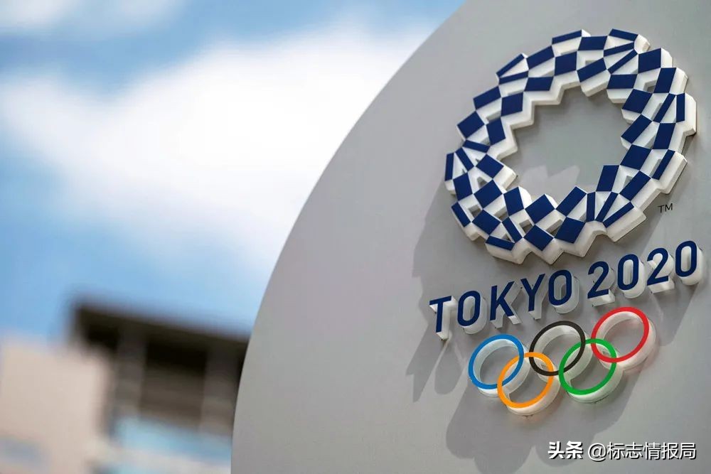
<h1 class="pgc-h-arrow-right" data-track="15" > Tokyo, 2020</h1>
Tokyo 2020 can be described as the most difficult Olympic Games in history, with the emblem plagiarized, postponed, and the opening ceremony director dismissed...
Tokyo Olympic and Paralympic Emblem (1st Edition)
On July 24, 2015, the emblem of the Tokyo Olympic and Paralympic Games, designed by Japanese designer Kenjiro Sano, was released. The emblem is designed with the prefix "T" symbolizing the three English characters "TOKYO", "TEAM" and "TOMORROW" as an image, symbolizing the strength of unity. Surprisingly, soon after the release of the emblem, it was exposed that the emblem design was very similar to the logo of the famous Belgian theater THEATRE DELIEGE, and began to be questioned whether the emblem was an original design.
Emblem of Tokyo's Olympic bid and Olympic Games
On September 1, 2015, the Tokyo Olympic Committee announced the retirement of the Tokyo Olympic emblem, which was also the first time in the history of the Olympic Games that the established LOGO had been abandoned due to a plagiarism scandal. It also features the "Kusuichi Matsuru" blue logo designed by Japanese designer Asao Tokolo.
Tokyo Olympic and Paralympic Emblem (Final Edition)
Although the design was never officially used, the footprints it left behind in olympic history will never go away.
<h1 class="pgc-h-arrow-right" data-track="23" >2024 Paris</h1>
On October 21, 2019, the emblem of the 2024 Paris Olympic and Paralympic Games was released at the Grand Rex Theatre in Paris, becoming the first Olympic and Paralympic Games in the history of the Olympic Games to use the same LOGO design for the Olympic and Paralympic Games.
Emblem of the Paris Olympic and Paralympic Games
Although it is not yet known what will happen in the next three years, the emblem of the 2024 Paris Olympic Games has once again become a hot topic on social media in recent days, and everyone has begun to discuss the design of the Paris Olympic Games emblem. Although the emblem of the Olympic Games is a tribute to Marianne, the national symbol of the French Republic, netizens can't help but compare it to the hairstyle of the lady.
I don't know if you saw the gold medal and the Olympic flame in the Paris Olympic emblem, but 80% of netizens have always believed that they only saw a woman with a lipstick and flowing hairstyle. Interestingly, everyone who sees the Paris emblem has a designated female reference object in their minds, and the following is a selection of the Paris Olympic Emblem and the corresponding hairstyles selected by the Logo Intelligence Bureau:
Tony Gomez: The 2024 Paris Olympics emblem is actually a tribute to Carly Rae Jepsen's hairstyle.
Felipe Vieira: You're all wrong, the Paris 2024 logo is based on Victoria Beckham (British singer and fashion designer) in 2007.
Some people feel like Ruth Jones (British actor and writer)
Others feel like Kelendria Kelly Rowland (African-American singer, model and TV host)
There's also the character Gina Vendetti from the animated film The Simpsons
More like the character claire (played by Sian Clifford) in the British TV series Life in London
Sorry, seeing the Paris Olympics emblem, all I can think of is her:
Joel: The logo of the Paris Olympics comes from Rachel Karen Green, the golden lady in Friends
There is no sense of discord in putting an L'Oréal
The copyrights of the trademarks and images appearing herein belong to their rightful holders and are for informational purposes only, not for commercial purposes. If you do not intend to infringe on your rights and interests, please contact us in time to deal with it.