Playing with the MUJI aesthetic set
——A netizen
It's our classic "changed equals no change" design column!
The design protagonist of this "changed is equal to unchanged" is the women's CLOTH LESS under Jiangnan Cloth. Thinking about it carefully, this time should be after Mengniu, Xiaomi, Taobao spent millions of dollars to change the LOGO, and the fourth brand LOGO was replaced by tens of millions of passers-by question mark faces.
Then it is better to choose the day than to hit the sun, this... The fourth "changed is equal to unchanged" design column, let's start with LESS!

Jiangnan Clothing's LESS women's wear, the brand image upgrade
Speaking of Jiangnan Cloth's LESS women's clothing should not be unfamiliar, say a few keywords everyone understands, "simple, exquisite, independent, rational", yes, these four words are the design concept that the LESS brand has been adhering to since its establishment.
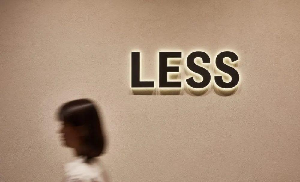
Less women's clothes before the replacement
LESS women's clothes after the new
The core concept of life it advocates, "less is more", is also the architectural design philosophy of the world-renowned architect Mies van Der Rohe.
Then, when it comes to the brand LOGO replacement, of course, it is also highly consistent.
· Logo lowercase to uppercase ·
First of all, from the small "less" to the uppercase "LESS", the evolution process is from small to large, but also symbolizes the process of the brand from initial shaping to enriching itself.
Less evolved into LESS, which also better reflects the concept of independent women strengthening the "sense of strength".
At the same time, it also maintains the "exquisite and elegant" part of the brand style.
In addition, along with the LOGO, it was also changed to its peripheral design, the combination of black characters on a white background, and also completely unified to achieve a minimalist style.
· Designer behind: Yoshiaki Sabe ·
And this whole set of designs is from the popular Japanese designer Yoshiaki Saebe.
· Most netizens are not optimistic ·
In the face of the LOGO that seems to have only changed the case, netizens have their own attitudes. Most netizens think that the previous LOGO looks better.
Some netizens believe that the revised LESS has no characteristics, but blindly imitates the design ideas of MUJI and Uniqlo.
All walks of life are upgrading their own brands
No matter what the attitude of netizens, in the clothing industry, there are still a large number of brands that continue to change their image, such as the MO&CO women's clothing that we are familiar with.
· MO&CO Womenswear ·
Earlier, MO&CO Women's Wear changed the original serif font to bold italic. Such changes are mainly to better meet today's market demand and highlight the youthfulness.
MO&CO Womenswear (Old)
MO&CO Womenswear (New)
However, such a modification does not have any splash, nor does it win the favor of consumers, and it has also been complained that "after bolding, it has been changed and not changed."
If we follow the clothing industry and begin to change the LOGO line, we can find that in recent years, not only the clothing manufacturing industry, but also all walks of life are upgrading their own brand image.
· The traditional enterprise Mengniu has also changed! ·
Last year, what surprised Rizhan Jun the most was that the traditional enterprise Mengniu actually took this step first.
Moreover, the new icon was personally created by Rob Janoff (the designer of Rainbow Apple), who designed apple logo!
The design master changed the background color "green" from the "361C" color number used earlier to "7481C".
And changed the arc ratio of the two symbols, following the classic golden rule of aesthetics, and it is more visually comfortable!
Although the new LOGO was complained that "changed is equal to not changed", it was also said by netizens that "although the design process is like this, I always feel that I can earn this money!" ”
And "it looks like a matcha cake".
That being said, small changes are also significant.
· Xiaomi flower 2 million please Hara Kenya ·
Let's talk about the field of science and technology, last spring Xiaomi bore the brunt of a big move, spending 2 million yuan to ask Hara Kenya to design the LOGO.
It was fried!
Xiaomi LOGO (old)
Xiaomi LOGO (New)
However, unsurprisingly, the complaints of netizens also followed.
It can be said that we have "changed equals not changed" design column, the most powerful member of the fierce general.
By the way, Sensei Sabe and Sensei Hara are both a design company, and this wave can also be said to be in the same vein.
· Taobao spent 3 million to change the LOGO ·
In addition, the big brother of the e-commerce platform industry, Taobao, also came to a big change at the beginning of last year.
The 3 million design fee is not much and no less.
But the effect can only be said to be the same as Xiaomi, which is the degree that needs to "find different level ten players" to challenge.
Don't blame netizens for saying: "I can earn this money!" ”
It's okay to seek change, but don't converge
It is not difficult to find that now whether it is the clothing industry, the field of science and technology, e-commerce brands or traditional enterprises, they have opened the stage of self-brand upgrading.
In recent years, the brand LOGO upgrade case
Many netizens analyzed that more and more consumers began to lose their freshness in the oversaturated market, so it prompted the gushing out of a large number of rising star brands, and also made those old brands that rose in the 80s and 90s full of crisis, and began to seek changes and cater to the market.
It seems that a more vivid, sharper, and more recognizable image is a panacea for maintaining the brand's appeal. But as netizens complained about LESS women's clothing said: "Playing is still MUJI aesthetic set", yes, the convergence of brand image is also one of the big problems.
Nichiren Jun feels that it is good to update or iterate, but it is also necessary to maintain diversity. After all, a game can be played for a while, not a lifetime, and the era of selling products with good-looking packaging is over.
bibliography:
"Japan Design Center Color Department Design Research Institute designs a new image for the women's clothing brand LESS under Jiangnan Cloth Clothing" Public Number: Lu Junyi_Design Scene (id: designerlujunyi)
Image Material:
Public number: Lu Junyi_Design scene (id:designerlujunyi)
Some of the image material comes from the Internet