Although we often say that "words are not as good as tables, tables are not as good as charts", what kind of charts should be used to display data in what scenarios is always a balding problem. Similarly, in real work, many people often misuse charts when expressing data with charts, resulting in a halving of the expression effect of charts, but this is a very normal situation, because I often make this mistake in the early days, and more experience can be avoided to a certain extent.
Well, directly into the main topic, Lao Li today listed 3 of the most typical chart errors for everyone to learn and reference.
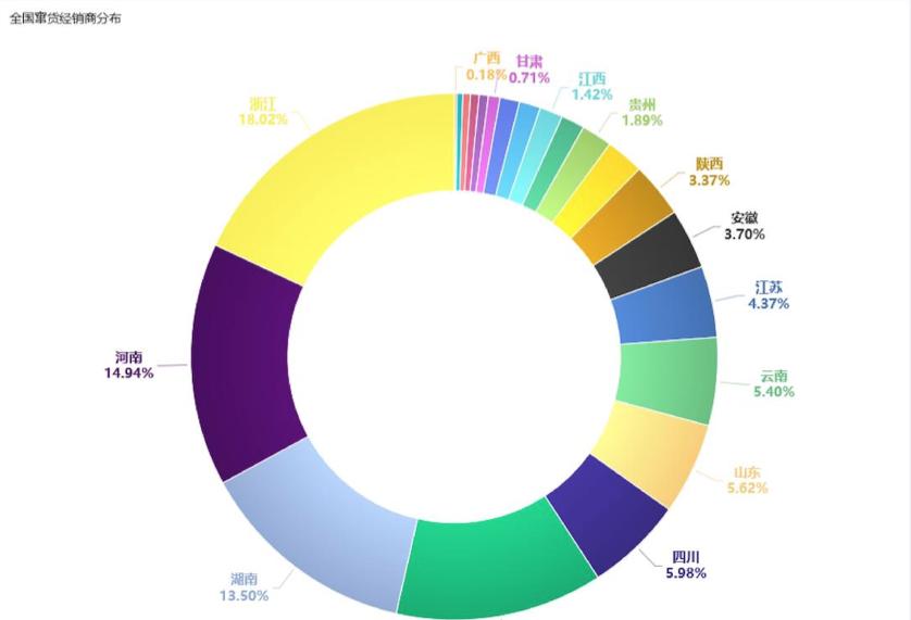
Do not have more than 5 categories in the pie chart
For pie charts, if there are too many categories and the percentages are small, it will be difficult to distinguish between categories, which is not conducive to reading.
Error example

But if there are too many kinds and you want to express them with pie charts, there are two feasible ways,
1. Merge some unimportant variables into "other" terms while avoiding more than 5 sectors;
2. Use bar charts or tables instead.
Do not use two pie charts to compare
Compare the composition relationship of multiple classifications, such as comparing the proportion of products in each city here, do not use a pie chart, because it is difficult to directly compare the direct differences between different cities, as shown in the following figure:
The correct approach is to use a percentage stacked column chart for comparison, as shown below:
Line charts are often used to show how data changes over a continuous time interval or span of time, and are characterized by trends that reflect the trend of things changing over time or ordered categories.
But there is no trend that changes with time, but for the sake of comparison and ranking, you can use column charts, bar charts, bullet charts, radar charts, word cloud charts, dumbbell charts, and lollipops charts.
The funnel chart has a logical sequential relationship from top to bottom, showing the completion of business objectives as the business process progresses.
But the funnel chart here has no process logic, just to compare the ranking, you can use the column chart, bar chart, bullet chart.
I am "data analysis is not a thing", sharing data analysis dry goods all year round, and sharing useful workplace skills tools from time to time.