作為編碼者,美工基礎是偏弱的。我們可以參考一些成熟的網頁PS教程,提高自身的設計能力。套用一句話,“熟讀唐詩三百首,不會作詩也會吟”。
本系列的教程來源于網上的PS教程,都是國外的,全英文的。本人嘗試翻譯這些優秀的教程。因為翻譯能力有限,翻譯的細節上還有待推敲,希望廣大網友不吝賜教。
約定:
1、本文的軟體是Photoshop CS5版本
2、原教程的截圖是英文的,本人在重新制作的基礎上,重新截了中文版的圖
3、原文中有些操作沒有給出參數。本人在反複測試的情況下測定了一些參數,以紅色的文字顯示。有些錯誤的參數,直接以紅色文字顯示正确的參數
例如:(90,22,231,77),表示矩形的左上角的坐标是(90,22),寬231,高77
例如:(90,22),表示矩形的左上角的坐标是(90,22),矩形的其他兩個參數教程裡已經指定
4、在教程的最後會附上本人的心得。有些是對教程中的一些步驟的優化等。
In this web design tutorial, we’ll be creating a light textured web page layout. I will show you how apply subtle textures in web layouts, how to create a seamless diagonal mosaic pattern and how to create a tabbed content area design for the “Services” section.
在本網頁設計教程中,我們将建立一個光質感的網頁布局。我會告訴你如何在網頁布局中添加微妙的紋理,如何建立一個無縫的對角拼接模式,以及如何建立一個“服務”部分的頁籤的内容區。
In this tutorial, we will use the 960 Grid System to organize and arrange the elements of our web layout. Before we begin, download it to your computer.
在本教程中,我們将使用960網格系統,來組織和安排我們的網頁布局的元素。在開始之前,将其下載下傳到您的計算機。
Unzip the archived file you downloaded, go to the “templates” folder and then go to the “photoshop” folder. You will find three .PSD files. Each of these files contains a grid with 12, 16 and 24 columns. In this tutorial we will be using the 12 columns grid.
解壓下載下傳好的檔案,點到templates檔案夾下的photoshop檔案夾。你會發現有3個.PSD檔案。它們分别包含了12列、16列、24列網格。在本教程中,我們使用12列網格
The .PSD files have some guides already set up, which will be very useful. To activate the guides, go to View > Show > Guides, or use the shortcut Ctrl/Cmd + ;.
.PSD檔案已經包含了一些設定好的網格,這會是非常有用。為了激活網格點選:視圖 > 顯示 > 網格,或者用快捷鍵,Ctrl/Cmd + ;
During this tutorial you will need to create shapes with specific dimensions. To see the exact size of a shape or selection while you are creating it, open the Info Panel by going to Window > Info. The width and the height of your shapes and selections will be displayed in this panel.
在本教程中,您将需要建立具有特定尺寸的形狀。當你在建立過程中要檢視确切的大小,點選:視窗 > 資訊,打開資訊面闆。你的形狀或選擇的寬度和高度的将被顯示在此面闆中。
Now that we covered the basics of using the 960 Grid System, we can move on to creating the web layout. Let’s get started!
現在,我們讨論了使用960網格系統的基礎知識,我們可以繼續建立的網絡布局。讓我們開始吧!
Step 1: Creating the Background of the Web Layout
步驟1:建立網頁布局的背景
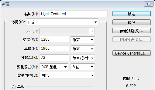
Open the "960_grid_12_col.psd" file in Photoshop. Then go to Edit > Canvas Size and set the width to 1200px and the height to 1900px. You can adjust the height later on if you need more space for the web layout.
在PS中打開960_grid_12_col.psd檔案。然後點選:編輯(應該是圖像) > 畫布尺寸,然後設定寬度為1200px,高度為1900px。如果網頁布局需要更多的空間,你可以在後面調整網頁高度。
由于翻譯教程不使用960布局系統,故本步改為,建立文檔,尺寸:1200px*1900px
Now we will change the color of the background from white to a light gray. With the "Background" layer selected, click on the little black lock icon from the top of the Layers panel to unlock this layer. Then change the color of the background layer to #ededed.
現在,我們要把背景色從白色改為亮灰色。當Background圖層選中的時候,單擊圖層面闆上方的小黑鎖的圖示去解鎖該圖層。然後把背景圖層的顔色改為: #ededed
由于是建立文檔,故改為輕按兩下背景圖層,去解鎖它
Right-click on this layer and select Convert to Smart Object. Then go to Filter > Noise > Add Noise and set the Amount to 1%, the Distribution to Gaussian and tick the Monochromatic box.
在該圖層上右鍵,選擇轉換為智能對象。然後點選:濾鏡 > 雜色 > 添加雜色。設定數量為1%,設定為高斯分布,勾選上“單色”。

Step 2: Creating the Header
步驟2:建立頭部區域
We will create a simple header with the name of the web layout and some social media icons. Create a new group and name it "Header". Then select the Type Tool (T) and write the name of your layout. I used the font Gotham Bold with the size 42pt and the color #707679. Align this layer with the grid, as you see in the image below.
我們将用網站的名字和一些社會媒體圖示建立普通的頭部區域。建立新組Header。然後用文字工具書寫你的布局的名字。我用的字型:Gotham Bold,字号:42pt,顔色: #707679。按照下圖對齊你的布局
Double-click on your text layer to open the Layer Style window and use the settings from the following image.
輕按兩下你的文字圖層打開圖層樣式視窗,按照下圖設定圖層樣式
Now we will add the social media icons. Download this set of icons and open the RSS, Twitter and Facebook icons in Photoshop (or any other icons you want to include in your design). Use the Move Tool (V) to move these icon into your web layout document and put them in the right side of the web layout. Leave a distance of 10px between icons.
現在,我們要添加一些社會媒體圖示。下載下傳該圖示集,然後在PS中打開RSS、Twitter和Facebook圖示(或者是其他你想要的圖示)。用移動工具移動這些圖示到你的網頁布局文檔,然後擺放他們在網頁布局的右邊。保持每個圖示間有10px的間距
Select all these layers, hit Ctrl/Cmd + G to group them and name the group "social icons".
選擇這些圖示的圖層,按Ctrl/Cmd + G把他們歸為一組,命名組為social icons
Step 3: Creating a Diagonal Stripe Pattern
步驟3:建立一個對角條紋圖案
Now we will create a pattern that we will use for the navigation bar and other areas of the web layout. Create a new document (Ctrl/Cmd + N) with the dimensions 5px by 5px. Select the Rectangular Marquee Tool (M), hold down the Shift key and create five square selections, as you see in the image below.
我們要建立一個用于導航欄和網頁布局其他部分的圖案。建立文檔(Ctrl/Cmd + N),尺寸:5px*5px。選擇矩形選框工具,按住Shift鍵建立5個正方形選區,如下所示
Create a new layer (Ctrl/Cmd + Shift + N) and fill the selection with black. Then hide the "Background" layer by clicking on its eye icon.
建立一個新的圖層(Ctrl/Cmd + Shift + N),用黑色填充選區。點選Background圖層前的眼睛圖示去隐藏該圖層
建議:建立文檔的時候選擇背景色為透明,然後用鉛筆工具制作如下的圖案比較簡單
To create the pattern, go to Edit > Define Pattern and click OK. Now you can close this document.
建立圖案,點選:編輯 > 定義圖案,然後點選确定。現在你可以關閉該文檔
Step 4: Creating the Navigation Bar
步驟4:建立導覽列
Create a new group and name it "Navigation". Select the Rectangle Tool (U) and create a rectangle with the height 50px and the same width as your document. Use the color #b8c0c3. Right-click on this layer and select Convert to Smart Object.
建立新組Navigation。用矩形工具建立一個矩形(0,111),高度為50px,寬度和文檔的寬度一樣,顔色: #b8c0c3。右鍵該圖層選擇轉換為智能對象
Double-click on this layer to open the Layer Style window and use the settings from the following image. Then go to Filter > Noise > Add Noise and add a 0.59% Gaussian Monochromatic noise.
輕按兩下該圖層打開圖層樣式視窗,按照下圖設定樣式。然後點選:濾鏡 > 雜色 > 添加雜色。設定數量為0.59%,高斯分布,單色。
Select the Line Tool (U), set the Weight to 1px and create a horizontal line at the top of your navigation bar using the color #cdd3d7. Name this layer "1px line".
用直線工具,設定寬度為1px,在你的導航欄的頂部建立一條水準線(0,111),顔色: #cdd3d7。命名圖層為1px line
Duplicate this layer (Ctrl/Cmd + J), select the Move Tool (V) and hit the up arrow key on your keyboard to move this layer 1px upwards. Set the color of the new line to #818b91.
複制該圖層(Ctrl/Cmd + J),用移動工具并按住鍵盤上的上方向鍵,向上移動該圖層1px。設定新線(0,110)的顔色: #818b91
Now add two more horizontal lines at the bottom of the navigation bar using the same colors.
現在在導航欄的底部添加更多的水準線,用同樣的顔色。兩條直線的位置為(0,161)和(0,162)
Step 5: Adding the Navigation Menu Items
步驟5:添加導航菜單的菜單項
Select the Type Tool (T) and write the name for your navigation menu items. I used the font Helvetica Bold with the size 14pt and the color #ffffff.
Add a drop shadow effect to these text layers using the settings from the image below.
用文字工具書寫你的導航欄菜單的文字。我用的字型:Helvetica Bold,字号:41pt,顔色: #ffffff
Select the Rounded Rectangle Tool (U), set the Radius to 4px and create a black rounded rectangle with the dimensions 70px by 26px and the color #1d2d34 over the first navigation menu item. Name this layer "active menu item", put it underneath the text layer and set its opacity to 35%.
用圓角矩形工具,設定半徑為4px,建立一個黑的圓角矩形(130,124)在導航欄的第一個菜單處,尺寸:70px*26px,顔色: #1d2d34。命名此圖層為active menu item,把該圖層置于文字圖層的下方,設定不透明度為35%
Step 6: Creating a Pattern for the Slider
步驟6:建立滑動欄的圖案
Now I will show you a technique for creating a seamless mosaic pattern for the image slider background. Create a new document (Ctrl/Cmd + N) with the dimensions 200px by 200px.
現在,我會告訴你一個技術,創造一個無縫的拼接圖案的滑動欄的背景。建立文檔(Ctrl/Cmd + N),尺寸:200px*200px
Hit the "D" key on your keyboard to reset the foreground and background colors to black and white. Create a new layer (Ctrl/Cmd + Shift + N) and go to Filter > Render > Clouds.
按鍵盤上的D鍵,重置前景色為白色和背景色為黑色。建立新的圖層(Ctrl/Cmd + Shift + N),然後點選:濾鏡 > 渲染 > 雲彩
Right-click on the "Layer 1" layer and select Convert to Smart Object. Then go to Filter > Pixelate > Mosaic and set the Cell Size to 40.
在該圖層上右鍵選擇轉換為智能對象。然後點選:濾鏡 > 像素化 > 馬賽克,設定單元格大小為40
Duplicate the "Layer 1" layer (Ctrl/Cmd + J). Then go to Filter > Other > High Pass and set the radius to 5px. Set the blend mode of this layer to Hard Light. This will make mosaic effect sharper and add some shadow around the squares.
複制該圖層(Ctrl/Cmd + J)。然後點選:濾鏡 > 其他 > 高反差保留,設定半徑為5px。設定混合選項為強光。這将使得馬賽克效果更清晰,在方格的周圍添加一些陰影。
Now we will make the mosaic effect even sharper. Create a new layer above all the other ones (Ctrl/Cmd + Shift + N). Then go to Image > Apply Image and click OK. This will create a rasterized image from all the current layers, but keep all the other layers intact. You can also use the shortcut Ctrl/Cmd + Alt/Option + Shift + E.
現在,我們将使馬賽克效果更清晰。建立一個在所有其它層上方的新層(Ctrl / Cmd+ Shift+ N)。然後點選:圖像 > 應用圖像,在出現的對話框點“确定”。這将從目前所有的層建立一個栅格化圖像,但所有其他層保持不變。您也可以使用快捷鍵Ctrl/Cmd + Alt/Option + Shift + E。
Right-click on the layer that you created and select Convert to Smart Object. I usually like to use Smart Object whenever I can so I know what filters I have previously applied and to play around with the filters.
您建立的圖層上單擊滑鼠右鍵,選擇轉換為智能對象。我通常喜歡使用智能對象,是因為我可以知道以前應用的濾鏡。
Now go to Filter > Sharpen > Sharpen. Hit Ctrl/Cmd + F to apply this filter one more time. Two times should be enough for the image to get those nice highlights between squares.
點選:濾鏡 > 銳化 > 銳化。按Ctrl/Cmd + F應用該濾鏡多次。要使正方形之間出現足夠的亮光的話,兩次就足夠了
Go to Layer > New Adjustment Layer > Brightness/Contrast and use the settings from the following image. Then create a new layer above all the other ones and go to Image > Apply Image to create a rasterized image of all the layers.
點選:圖層 > 建立調整圖層 > 亮度/對比度,并按照下圖進行設定。然後建立一個新層在其他層的上方,點選:圖像 > 應用圖像,建立一個所有層的栅格化圖像。
To create the first pattern go to Edit > Define Pattern and click OK. In the next steps I will show you how to use this pattern to create a diagonal mosaic pattern. Do not close this document, we will it later.
建立第一個圖案,點選:編輯 > 定義圖案,并按确定。在接下來的步驟中,我将向您展示如何使用這種圖案建立一個對角線的馬賽克圖案。不要關閉這個檔案,我們會在以後步驟裡使用。
Now comes the tricky part – creating the diagonal mosaic pattern. I tried a few different techniques in order to achieve this, but only one was successful and I will explain it to you in the following steps. I am not sure this is the best way to do it, but it does work.
現在到了棘手的部分 - 建立對角線馬賽克圖案。為了實作這一目标,我嘗試了一些不同的技術,但隻有一個是成功的,我會解釋接下來的步驟。我不确定這是最好的方式,但它的确做的很好。
Create a new document (Ctrl/Cmd + N) with the dimensions 800px by 800px. Create a new layer (Ctrl/Cmd + Shift + N) and fill it with white. Double-click on this layer to open the Layer Style window and apply the pattern you created at the previous step.
建立檔案(按Ctrl / Cmd+ N),尺寸:800x800px。建立圖層(Ctrl / Cmd+ Shift + N),并用白色填充它。輕按兩下層,打開圖層樣式視窗,應用你在上一步中建立的圖案。
Right-click on the "Layer 1" layer and select Convert to Smart Object. Then go to Edit > Free Transform (Ctrl/Cmd + T), hold down the Shift key and rotate this layer 45°.
在該圖層上右鍵,選擇轉換為智能對象。然後點選:編輯 > 自由變換(Ctrl/Cmd + T),按住Shift鍵旋轉該圖層45度
Go back to the document where you created the initial mosaic effect and move the rasterized layer ("Layer 4") into this new document.
傳回之前建立的馬賽克效果的文檔,移動最後的栅格化的圖層到本文檔。(可以在圖層上右鍵選擇複制圖層,目标選擇建立的文檔)
Right-click on this layer and select Convert to Smart Object. Then use Free Transform (Ctrl/Cmd + T) to rotate this layer 45° as well.
右鍵該圖層,選擇轉換為智能對象。然後用自由變換,旋轉45度
Select the Move Tool (V) and move this layer around to integrate it in the background pattern. I used the darker square from pattern as reference in order to find the right position for this layer. You can also use the arrow keys while having the Move Tool (V) selected in order to move the layer pixel by pixel. In the image below I highlighted the small pattern with red so you can see it.
選擇移動工具(V),将其層左右移動,對齊到背景圖案。我用的是暗方塊的方式式作為參考,以便找到合适的位置,這一層。您也可以使用移動工具(V)同時用方向鍵,以使圖層一個像素一個像素。在下圖中,我給圖案添加了紅色的顔色疊加,就像你看到的一樣。
Tip: to test if the small pattern is integrated in the background pattern, you can make its layer invisible and then visible again. If you don’t see any differences in your image, the layer is in the right position.
提示:測試對齊背景圖案的小圖案,可以使這一層隐藏,然後再次可見。如果您沒有看到任何圖像中的差異,該層是在正确的位置。
Hold down the Ctrl/Cmd key and click on the thumbnail of "Layer 2" to create a selection of the small pattern. Then activate the Rulers (Ctrl/Cmd + R) and drag some guides from the rulers towards each corner of the selection, as you see in the image below.
按住Ctrl/Cmd鍵單擊該圖層的縮略圖,去建立一個小的圖案的選區。然後激活标尺(Ctrl/Cmd + R),并從标尺上拖動一些參考線緊挨着選區的每一個角,如下圖所示
Now the square that was formed using the guides will be our new pattern. Hit Ctrl/Cmd + D to deselect. Then delete the layer of the small pattern. We don’t need it anymore.
現在參考線包圍的正方形會是我們新的圖案。按Ctrl/Cmd + D取消選擇。然後删除小圖案的圖層。我們不再需要它了。
Select the Rectangular Marquee Tool (M) and select the square between guides.
用矩形選框工具選擇參考線之間的正方形
With the "Layer 1" layer selected go to Edit > Copy (Ctrl/Cmd + C). Create a new document (Ctrl/Cmd + N). Photoshop will use the dimensions of the selection you made as dimensions for the new document. Click OK and paste (Ctrl/Cmd + V) the image you selected.
在該圖層選中的情況下,點選:編輯 > 複制(Ctrl/Cmd + C)。建立新文檔(Ctrl/Cmd + N)。PS會用你選區的尺寸作為新文檔的尺寸。點去頂并粘貼(Ctrl/Cmd + V)你選擇的圖像
Now go to Edit > Define Pattern, give your pattern a name and click OK.
現在點選:編輯 > 定義圖案,給你的圖案一個名字,并點确定
Step 7: Creating the Image Slider Background
步驟7:建立圖檔滑動欄的背景
Now we will apply the pattern to the image slider background. Create a new group and name it "Image Slider". Select the Rectangle Tool (U) and create a rectangle with the height 410px and the same width as your document. Use the color #81aaba. Name this layer "slider_bg", right-click on it and select Convert to Smart Object.
現在我們要給圖檔滑動欄添加背景圖案。建立新組Image Slider。用矩形工具建立一個矩形(0,163),高度為410px,寬度和你的文檔一緻,顔色: #81aaba。命名該圖層為slider_bg,右鍵選擇轉換為智能對象。
Double-click on this layer to open the Layer Style window and use the settings from the following image. Then go to Filter > Noise > Add Noise and add a 0.6 Gaussian Monochromatic noise.
輕按兩下該圖層打開圖層樣式視窗按照下圖設定樣式。然後點選:濾鏡 > 雜色 > 添加雜色,設定數量為0.6%,高斯分布,單色
Use the Line Tool (U) to create two horizontal lines with the weight 1px at the bottom of the image slider background. For the first line use the color #b8c8ce and for second one use #849ba4.
用直線工具在圖檔滑動欄背景的底部建立兩條寬度為1px的直線。第一條直線(0,571)的顔色: #b8c8ce,第二條直線(0,572)的顔色: #849ba4
Step 8: Creating the Image Slider
步驟8:建立圖像滑動欄
Create a rectangle with the dimensions 620px by 340px and the color #d2dade. Double-click on this layer to open the Layer Style window and use the settings from the following image. For the Stroke effect I used the color #819098.
建立一個矩形(450,185),尺寸:620px*340px,顔色: #d2dade。輕按兩下該圖層打開圖層樣式視窗,按照下圖設定樣式。描邊的顔色: #819098。命名該圖層為Border
Create a new rectangle with the dimensions 600px by 320px and put it in the middle of the previous rectangle that you created. Name this layer "image_holder", double-click on it to open the Layer Style window and use the settings from the following image for Inner Glow.
建立一個矩形(460,195),尺寸:600px*320px,并把它放在之前的建立的矩形的中間。命名此圖層為Image_Holder,輕按兩下打開圖層樣式視窗,按照下圖設定内發光的樣式
Open an image in Photoshop that you want to display in your image slider. Use the Move Tool (V) to move it into your initial document and put it over the "image_holder" layer.
在PS中打開你想顯示在圖檔滑動欄中的圖檔。用移動工具移動到你的文檔,并把它放在Image_Holder圖層的上方
Name this layer "image", right-click on it and select Create Clipping Mask to make it visible only over the area of the "image_holder" layer.
命名此圖層Image,在其上右鍵并選擇建立剪貼蒙版,是之隻顯示在Image_Holder圖層上方的部分
Now we will create a shadow at the bottom of the image slider. Select the Ellipse Tool (U), hold down the Shift key and create a black circle in the middle of the bottom edge of the image slider (1).
現在我們要在圖檔滑動欄底部的建立陰影。用橢圓工具,按住Shift鍵建立一個黑色的圓在圖檔滑動欄底邊的中間
Name this layer "shadow", right-click on it and select Convert to Smart Object. Then go to Filter > Blur > Gaussian Blur and set the Radius to 3px. Then go to Edit > Free Transform, hold down the Alt/Option + Shift keys and drag the right edge of the layer until it reaches the right edge of the image slider. Take a look at the following image for reference (2).
命名此圖層為shadow,右鍵選擇轉換為智能對象。然後點選:濾鏡 > 模糊 > 高斯模糊,設定半徑為3px。然後點選:編輯 > 自由變換,按住Alt/Option + Shift鍵拖動右邊的邊直到圖檔滑動欄的右邊。可以參考下面的圖檔
Put this layer underneath the "border" layer and set its opacity to 15% (3, 4).
把該圖層移到Border圖層的下方,設定不透明度為15%
Now we will create some radio buttons to indicate how many images does the slider contain and which is the active one. Create a new group and name it "radio buttons". Then select the Ellipse Tool (U), hold down the Shift key and create a circle shape with the color #f6f6f6 and the diameter 10px. Name this layer "radio button".
現在,我們将建立一些圓按鈕來表示滑動欄包含多少張圖像,和目前是哪一張。建立一個新組radio buttons。然後用橢圓工具(U),按住Shift鍵并建立一個圓,顔色:#f6f6f6,直徑10px的。命名此層為radio button。
Duplicate this layer (Ctrl/Cmd + J) a few times and arrange your circle shapes as you see in the following image.
複制該圖層(Ctrl/Cmd + J)幾次,并按照下圖擺放這些圓
Now create another circle in the middle of the first one using the color #8bb2bf and the diameter 6px. Name this layer "active".
在第一個圓的中間建立另一個圓,顔色: #8bb2bf,直徑:6px。命名此圖層為active
Step 9: Creating the Image Slider Arrows
步驟9:建立圖檔滑動欄的箭頭
Create a new group and name it "right arrow". Then select the Ellipse Tool (U), hold down the Shift key and create a circle with the color #e7edef and the diameter 45px. Name this layer "circle" and put it in the right side of the image slider. Double-click on this layer to open the Layer Style window and use the settings from the following image.
建立新組right arrow。然後選擇橢圓工具(U),按住Shift鍵并建立一個圓,顔色: #e7edef,直徑:45px。命名此層為circle,并把它放在圖像滑動欄的右側。輕按兩下層打開圖層樣式視窗,按照下圖設定圖層樣式。
描邊的顔色: #95a2a8
Copy this symbol "»" go back to Photoshop, select the Type Tool (T) and paste it. I used the font Gotham Bold with the size 32pt and the color #727e84. Put this arrow in the middle of the circle.
複制符号»回到PS,選擇文字工具(T),并将其粘貼。我使用的字型:Gotham Bold,字号:32pt,顔色: #727e84。把這個箭頭擺放在圓的中間。
Duplicate the "right arrow" group (right-click on it and select Duplicate Group). Then go to Edit > Transform > Flip Horizontal. Put this new group in the left side of the image slider and name it "left arrow".
複制right arrow組(在其上右鍵選擇複制組),然後點選:編輯 > 變換 > 水準翻轉。把新組擺放到圖檔滑動欄的左邊,命名為left arrow
Step 10: Adding Content for the Image Slider
步驟10:添加圖像滑動欄的内容
Now we will create an area for the description of the current image presented in the slider. Select the Rounded Rectangle Tool (U) and create a rectangle with the width 300px and the color #2c5a6b. The height depends on how much content you will include in this area. Name this layer "text bg" and set its opacity to 30%.
現在,我們将建立一個區域來描述目前圖像滑動塊。選擇圓角矩形工具(U)建立一個圓角矩形(130,185),寬度:300px,顔色: #2c5a6b。高度取決于包括多少内容。命名此層text bg,并設定其不透明度為30%。
Select the Type Tool (T) and add some content in this area. For the headline I used the font Futura Bold with the size 26pt and the color #ebebeb. For the block of text I used Helvetica Regular with the size 15pt and the color #ffffff. Add a Drop Shadow effect to these text layers using the settings from the image below.
用文字工具在此區域中添加一些内容。對标題文字,我用字型:Futura Bold,字号:26pt,顔色: #ebebeb。對文本塊,字型:Helvetica Regular,字号:15pt,顔色: #ffffff,按照下圖對這些文本添加投影的圖層樣式。
Step 11: Create Web Buttons
步驟11:建立網頁按鈕
Create a new group and name it "Description". This area can be used for a short bio of the freelancer. Select the Type Tool (T) and add a short paragraph of text. I used the font Helvetica Bold with the size 16pt and the color #555555. I also centered the text and set the leading (the distance between the lines of text) to 25pt from the Character panel (Window > Character).
建立新組Description。這個區域可以用來做自由職業者的很短的說明。選擇文字工具(T),并添加一段簡短文字。用字型:Helvetica Bold,字号:16pt,顔色: #555555。我設定行間距(文本行之間的距離)為25pt,從字元面闆(視窗 > 字元)。
Now we will add some call-to-action buttons underneath the paragraph of text. Create a new group and name it "buttons". Then select the Rounded Rectangle Tool (U), set the Radius to 4px and create a rounded rectangle with the color #bbbbbb, as you see in the image below. Name this layer "button", double-click on it to open the Layer Style window and use the settings from the following image. For the Stroke effect I used the color #a7a7a7.
現在我們要添加一些指令按鈕在文本段落的下方。建立新組buttons。然後用圓角矩形工具(430,662,160,42),設定半徑為4px,建立一個圓角矩形,顔色: #bbbbbb,就像你看到的一樣。命名該圖層為button,輕按兩下打開圖層樣式視窗按照下圖設定圖層樣式。描邊的顔色: #a7a7a7
Select the Type Tool (T) and add some text to your button such as "View Portfolio »". I used the font Helvetica Bold with the size 15pt and the color #fafafa.
用文字工具在按鈕上添加View Portfolio »。字型:Helvetica Bold,字号:15pt,顔色: #fafafa
并對文字添加投影樣式
Create another button using the same settings, but change its color to #7fb6cd and the Stroke effect color to #6799ad.
建立另一個按鈕(610,662),用同樣的設定,不過顔色改為 #7fb6cd,描邊效果的顔色為 #6799ad
Step 12: Creating a Separator
步驟12:建立分割符
Create a new group and name it "separator". Select the Line Tool (U), set the Weight to 1px and create a horizontal line with the width 940px and the color #c8c8c8. Name this layer "1px line".
建立新組separator。用直線工具,設定粗細為1px,建立一條水準線(130,744,940,1),寬度為940px,顔色: #c8c8c8,命名此圖層為1px line
Duplicate this layer (Ctrl/Cmd + J), move it one pixel upwards and change its color to #f2f2f2.
複制該圖層(Ctrl/Cmd + J),把它上移一個像素(130,743,940,1),更改顔色為 #f2f2f2
Now we will add a gradient to the separator. Select the Rectangular Marquee Tool (M) and create a selection above the two horizontal lines with the dimensions 940px by 18px. Create a new layer and fill the selection with black. Name this layer "gradient" and hit Ctrl/Cmd + D to deselect (1).
現在我要給分隔符添加漸變。選擇矩形選框工具建立一個選區在兩條水準線的上方,尺寸:940px*18px。建立一個新的圖層,用黑色填充選區。命名此圖層為gradient,按Ctrl/Cmd + D取消選擇
Double-click on the "gradient" layer to open the Layer Style window and use the settings from the following image (2).
輕按兩下打開gradient圖層打開圖層樣式視窗,按照下圖設定圖層樣式
Add a mask to the "separator" group (Layer > Layer Mask > Reveal All). Then select the Gradient Tool (G), hold down the Shift key and drag a black to transparent gradient in the left side of the separator to make it fade out. Do the same for the right side of the separator. Take a look at the following image for reference.
給separator組添加蒙版(圖層 > 圖層蒙版 > 顯示全部)。然後選擇漸變工具,按住Shift鍵拖動一個黑色——透明的漸變在分隔符的左邊,使其看起來像是淡出。做同樣的操作在分隔符的右邊。看看下面的圖檔,以供參考。
Then right-click on the "separator" group and select Convert to Smart Object.
在separator組上右鍵選擇轉換為智能對象
Step 13: Creating the "Services" Area
步驟13:建立Services區域
Create a new group and name it "Main Content". We’ll design this area using tabs to showcase services that a freelancer might offer to their clients.
建立新組Main Content。我們會設計這個領域,用标簽來展示一個自由職業者,可能會為他們的客戶提供的服務。
Select the Rectangle Tool (U) and create a white rectangle with the dimensions 940px by 300px. Name this layer "main content bg" and add a 1px stroke effect to it using the color #bfc5c8.
用矩形工具建立一個白色的矩形(130,795),尺寸:940px*300px。命名此圖層為main content bg,添加1px的描邊,描邊的顔色: #bfc5c8
Create a new group and name it "tabs". Select the Rectangle Tool (U) and create a rectangle with the height 44px at the top of the white rectangle using the color #b5bdc1. Name this layer "title bar", double-click on it to open the Layer Style window and use the settings from the following image.
建立新組tabs。選擇矩形工具在白色矩形的頂部建立一個矩形(130,795),高度為44px,寬度為940px,顔色: #b5bdc1。命名此圖層為title bar。輕按兩下該圖層打開圖層樣式。按照下圖設定圖層樣式
Select the Rectangle Tool (U) again and create a rectangle with the height 4px and the color #9da5a9 at the top of the title bar. Name this layer "top line".
再次用矩形工具在title bar的頂部建立一個矩形(130,791),高度為4px,寬度為940px,顔色: #9da5a9.命名此圖層為top line
Select the Rectangle Tool (U) and create a white rectangle, as you see in the following image. This will be the active tab. Make sure this rectangle does not go over the "top line" layer and the stroke from the left side of the big white rectangle.
用矩形工具建立一個白色的矩形(131,795,219,40),就像你看到的下圖。這會是活動的選項。確定這個矩形沒有遮住top line圖層和大白色矩形左邊的描邊
Select the Type Tool (T) and add the name of the service you want to display in this area. In my case, I put "Web Design" using the font Futura Bold with the size 17pt and the color #9ba3a8. I also added a Drop Shadow effect to this text layer.
用文字工具添加你想顯示在其中的内容。我的選擇,我用Web Design,字型:Futura Bold,字号:17pt,顔色: #9ba3a8。我也給文字圖層添加投影的效果
Download this set of icons and open the .PSD file in Photoshop. Then move an icon that suits the name of the service into your initial document. I used the iMac icon. Put the icon in front of the service name, double-click on its layer and use the settings from the following image. The gradient that I used is from #b5bdc1 to #a1aab0.
下載下傳該圖示集,并在PS中打開.PSD檔案。然後移動複合我的服務名字的圖示到我的檔案上。我用的是iMac圖示。把圖示擺放在服務名字的前面,輕按兩下打開該圖層按照下圖設定樣式,漸變的顔色我用的是從 #b5bdc1到 #a1aab0。
Tip: to select the icon that you want without having to look through all the layers, select the Move Tool (V) and from the drop-down menu from the option bar above your image select ‘Layer’. Now hold down the Ctrl/Cmd key and click on the icon that you want to use. The layer of that icon will be automatically selected and you can move it into your web layout document.
提示:選擇你想要的圖示,而無需翻閱所有的層,選擇移動工具(V),從圖像上方的選項欄中的下拉菜單中選擇“層”。現在按住Ctrl / Cmd的鍵,然後單擊要使用的圖示層,該圖示将被自動選擇,您可以将它移動到您的網頁布局檔案。
Select the Type Tool (T) and add the name of other services to the title bar, such as "web development" or "iPad/iPhone apps". Use the same font that you used for the first service name (in my case Futura Bold), but change the color to white. Then add a Drop Shadow effect to these text layers using the settings from the image below.
用文字工具在标題欄上添加其他服務的名字,就像web development或iPad/iPhone apps。用和第一個服務名字相同的字型(我的選擇是Futura Bold),不過改顔色為白色。然後按照下圖添加投影樣式給這些文字圖層。
Now add some icons for these services from the icons pack you downloaded earlier. Use the same layer style that you used for the first icon, but change the gradient colors to #f8f8f8 and #f0f0f0.
現在給這些服務添加一些圖示,這些圖示是之前你下載下傳的。用和第一個圖示的同樣的圖層樣式,不過漸變顔色改為 #f8f8f8和 #f0f0f0。
Step 14: Adding the Content to the "Services" Area
步驟14:給Services區域添加内容
We will split the content for the "web design" service into two columns: "about" and "case studies". Create a new group and name it "column 1". Select the Type Tool (T) and write the word "About". I used the font Futura Book with the size 19pt and the color #9ba3a8.
我把web design服務的内容分成兩列:about和case studies。建立組column 1.用文字工具書寫文字About。我用的字型:Futura Book(用Frutiger LT 75 Black代替),字号19pt,顔色: #9ba3a8
Download this iMac vector and open the .AI file in Illustrator. Select the iMac using the Selection Tool (V), copy it (Ctrl/Cmd + C), go back to Photoshop and paste it as smart object (Ctrl/Cmd + V). Name this layer "imac" and use Free Transform (Ctrl/Cmd + T) to change its size. Take a look at the following image for reference.
下載下傳這個iMac矢量圖,并在Illustrator中打開.AI檔案。用選擇工具選擇iMac,複制它(Ctrl/Cmd + C),回到PS并粘貼為智能對象(Ctrl/Cmd + V)。命名此圖層為iMac,并用自由變換(Ctrl/Cmd + T)改變它的大小。看看下面的圖檔,以供參考。
Select the Rectangle Tool (U) and create a rectangle over the computer screen. Name this layer "image_holder". Then open in Photoshop an image that you want to display on the screen and move it into your initial document using the Move Tool (V). Name this layer "image", put it over the screen, right-click on it and select Create Clipping Mask.
用矩形工具建立一個矩形覆寫計算機圖像的螢幕。命名此圖層為image_holder。在PS中打開你想顯示在螢幕中的圖像,用移動工具移到你的文檔。命名此圖層為image,把它移到螢幕的上方,右鍵選擇建立剪貼蒙版。
Select the Type Tool (T) and add a paragraph of text next to the image. I used the font Helvetica Regular with the size 13pt and the color #333333. Set the width of this text layer to 460px. Also, set the leading to 20pt from the Character panel to make the text more readable.
選擇文字工具(T)和添加圖檔旁邊的文字段。我用字型:Helvetica,字号:13pt,顔色:#333333。将這個文本層的寬度為460像素。另外,設定行間距為20pt,使文本更具可讀性。
Now we will create a call-to-action button for the "services" area. First, select the Rounded Rectangle Tool (U), set the Radius to 5px and create a rounded rectangle with the dimensions 600px by 50px and the color #f3f3f3. Name this layer "button border", double-click on it to open the Layer Style window and use the settings from the following image. For the Stroke effect I used the color #d1d1d1.
現在我要給Services區域建立一個指令按鈕。首先,選擇圓角矩形工具,設定半徑為5px,建立一個圓角矩形(150,1015),尺寸:600px*50px,顔色: #f3f3f3。命名此圖層為button border,輕按兩下圖層打開圖層樣式視窗,并按照下圖設定圖層樣式。描邊樣式用的顔色: #d1d1d1
Select the Rounded Rectangle Tool (U), set the Radius to 4px and create a rounded rectangle with the dimensions 586px by 36px and the color #7fb6cd in the middle of the gray rectangle. Name this layer "button", double-click on it to open the Layer Style window and use the settings from the following image. For the Stroke effect I used the color #6698ad.
用圓角矩形工具,設定半徑為4px,建立一個圓角矩形,尺寸:586px*36px,顔色: #7fb6cd,在灰色矩形的中間。命名此圖層為button,輕按兩下打開圖層樣式視窗,按照下圖設定樣式,描邊樣式用的顔色: #6698ad
Select the Type Tool (T) and add some text to your button. I used the font Helvetica with the size 17pt and the color #fafafa. Add a Drop Shadow effect to this layer using the settings from the image below.
用文字工具在按鈕上添加一些文本。字型:Helvetica,字号:17pt,顔色: #fafafa。按照下圖添加投影的圖層樣式
Step 15: Designing an Area for Case Studies
步驟15:設計Case Studies區域
Create a new group and name it "column 2". Select the Type Tool (T) and write the words "Case Studies". I used the font Futura Book with the size 19pt and the color #9ba3a8.
建立組column 2。用文字工具添加文字Case Studies,我用的字型:Futura Book(用Frutiger LT 75 Black代替),字号:19pt,顔色: #9ba3a8
Select the Rectangle Tool (U), hold down the Shift key and create a square with the dimensions 80px by 80px and the color #f7f7f7. Name this layer "border", double-click on it to open the Layer Style window and use the settings from the following image. For the Stroke effect I used the color #a3b2b9.
用矩形工具,按住Shift鍵建立一個正方形(770,885),尺寸:80px*80px,顔色: #f7f7f7。命名此圖層為border,輕按兩下打開圖層樣式視窗,并按照下圖設定樣式。描邊的顔色: #a3b2b9
Create another square with the dimensions 70px by 70px in the middle of the "border" square shape. Name this layer "image_holder". Then open an image in Photoshop that you want to display in this area and move it into your initial document. Name this layer "image", put it over the "image_holder" layer, right-click on it and select Create Clipping Mask.
在border正方形中間建立另一個正方形(775,890),尺寸:70px*70px。命名此圖層為image_holder。然後在PS中打開你想顯示的圖檔,并移到你的文檔。命名此圖層image,把它擺放到image_holder圖層的上方,右鍵選擇建立剪貼蒙版
Hold down the Ctrl/Cmd key, select the "border", "image_holder" and "image" layers, and duplicate them five times (to duplicate these layers drag them over the "Create a new layer" button from the bottom of the Layers panel). Then arrange all your images as you see in the following image.
按住Ctrl/Cmd鍵,選擇border,image_holder和image圖層,并且複制他們5次(為了複制這些圖層,拖動它們到圖層面闆底部的建立新圖層按鈕)。擺放你們的圖像按照下圖所示。
這六個方塊的位置分别是(770,885)、(870,885)、(970,885)、(770,985)、(870,985)、(970,985)
Step 16: Creating the "Portfolio" Area
步驟16:建立Portfolio區域
Create a new group and name it "Portfolio". Then create a background for this area just like you did for the "services" section.
建立新組Portfolio。然後建立該區域的背景,就像你建立的Services區域一樣
Make this area 620px wide and 280px high. Copy the colors and layer styles for the background, title bar and top line from the "services" area. Then add a headline for this area and an icon.
這個區域有620px寬,280px高,白色矩形的位置(130,1128),從Services區域複制Background、title bar、top line的顔色和圖層樣式。然後添加這個區域的标題和圖示
Now we will create a highlight for the title bar. Select the Line Tool (U), set the Weight to 1px and create a horizontal white line at the bottom of the title bar. Leave a distance of 1px between the bottom edge of the title bar and this layer (1).
現在,我們将建立的标題欄的一大亮點。選擇直線工具(U),粗細設定為1px,并在标題欄的底部建立水準白線(130,1166)。标題欄的底邊和本層之間的距離為1px。
Add a mask to this layer (Layer > Layer Mask > Reveal All). Select the Gradient Tool (G), hold down the Shift key and drag a black to transparent gradient in the left side of the white line to make it fade away. Do the same for the right side of the line. Name this layer "highlight" and set its opacity to 70% (2).
添加蒙版層(圖層 > 圖層蒙版 > 顯示全部)。選擇漸變工具(G),按住Shift鍵并拖動一個黑色到透明的漸變在白線的左邊,使其消失。該直線的右側做相同的步驟。命名此層為highlight,并設定其不透明度為70%。
Now we will add some images for the latest projects and a short description of each project. Add an image like the ones you created for the "case studies" area.
現在我們将添加一些最新項目的圖檔,每個項目的簡短說明。像您建立的case studies區域一樣添加圖像。
Select the Type Tool (T) and add some text next to it. For the headline I used the font Futura Book with the size 17pt and the color #9ba3a8. For the paragraph of text I used the font Helvetica Regular with the size 13pt and the color #9ba3a8. Also, set the leading for the paragraph to 18pt from the Character panel.
選擇文字工具(T),并在它旁邊添加一些文字。标題的字型:Futura Book(用Frutiger LT 75 Black代替),字号:17pt,顔色: #9ba3a8。對于一段文字,字型:Helvetica Regular ,字号:13pt,顔色: #9ba3a8。同時,在字元面闆中設定行間距為18pt。
The width of this project area should be 280px. Put all these layers inside a group (Ctrl/Cmd + G) and name it "project #1". Duplicate this group three times and arrange them as you see in the image below.
本項目區的寬度是280px。把所有這些層(按Ctrl / Cmd+ G)歸為一組,并将其命名為project #1。重複此組三次,并按照下圖擺放他們。
四個内容塊的正方形的位置分别是(150,1188)、(450,1188)、(150,1298)、(450,1298)
Step 17: Creating the "Blog" Area
步驟17:建立Blog區域
Create a new group and name it "Blog". Then create a content background just like you did for the "portfolio" section. Add a headline in the title bar and a suitable icon from the icons pack you downloaded.
建立新組Blog。建立内容背景,就像你之前做的Portfolio區域一樣。在标題欄添加一個頭線,和合适的圖示之前你下載下傳中的。
該區域的白色背景的矩形的位置為(770,1128,300,280)
Select the Type Tool (T) and add a couple of posts to this area using the same fonts and colors that you used for the projects in the "portfolio" area. For the "Continue reading »" links I used the color #7fb6cd.
選擇文字工具(T),并添加一對部落格,這方面使用的字型和顔色和之前你使用的Portfolio區域中一樣。對于Continue reading »連結,顔色: #7fb6cd。
Now we will create a dashed line pattern which we will use for a horizontal separator. First, create a new document (Ctrl/Cmd + N) with the dimensions 10px by 1px.
現在,我們将建立一個虛線的圖案,用在一個水準分隔上。首先,建立一個新檔案(Ctrl / Cmd+ N),尺寸:10px*1px。
Create a new layer (Ctrl/Cmd + Shift + N) and use the Rectangular Marquee Tool (M) to create a selection with the dimensions 6px by 1px. Fill this selection with black.
建立一個新層(Ctrl / Cmd+ Shift + N),使用矩形選框工具(M)建立一個選區,尺寸:6px*1px。用黑色填充選區。
Hide the Background layer and go to Edit > Define Pattern. Give your pattern a name and click OK. Now you can close this document.
隐藏背景層,點選:編輯 > 定義圖案。給你的圖案的名稱,然後單擊确定。現在,您可以關閉此檔案。
Go to your initial web layout document, select the Line Tool (U) and create a horizontal line with the dimensions 260px by 1px. Set the Fill of this layer to 0% and the Opacity to 20%.
轉到您的網絡布局文檔,選擇直線工具(U)建立一個水準線(790,1277),尺寸:260px*1px。設定該圖層的填充為0%,不透明度為20%。
Double-click on this layer to open the Layer Style window and use the settings from the following image for Pattern Overlay.
輕按兩下層打開圖層樣式視窗,并按照下圖設定圖案疊加樣式。
Step 18: Creating the Footer
步驟18:建立頁腳
Create a new group and name it "Footer". Then duplicate the "separator" layer from the "Description" group and move it to the "Footer" group. Use the Move Tool (V) to move this layer underneath the "portfolio" and "blog" areas.
建立新組Footer。然後複制Description組中的separator圖層,并移到Footer組。用移動工具移動該圖層到Portfolio和blog區域的下方
Now we will create an area for the Twitter feed. Create a new group and name it "recent tweets".
現在我們要建立一個Twitter feed區域。建立新組recent tweets
Move the bird icon from the icons pack you downloaded into your web layout document. Right-click on this layer and select Clear Layer Style. Then double-click on it to open the Layer Style window and use the settings from the following image. For the gradient I used the colors #8b8b8b and #c7c7c7.
移動之前下載下傳的圖示集中的鳥的圖示到你的網頁布局中。在該圖層上右鍵選擇清除圖層樣式。然後輕按兩下打開圖層樣式視窗按照下圖設定樣式。漸變填充用的顔色分别是: #8b8b8b和 #c7c7c7
Select the Type Tool (T) and write "Recent Tweets" next to the icon. I used the font Futura Bold with the size 15pt and the color #585858.
用文字工具書寫Recent Tweets在圖示的右側。字型:Futura Bold,字号:15pt,顔色: #585858
Select the Type Tool (T) and add a couple of tweets to this area. Make sure that the width of the text is 300px. I used the font Helvetica Regular with the size 12pt and the color #333333. For the links I used the color #7fb6cd.
用文字工具添加一對tweets在這個區域。確定文本的寬度為300px。我用的字型:Helvetica Regular,字号:12pt,顔色: #333333;連結的顔色: #7fb6cd
I also added separators for the tweets using the Line Tool (U). I created two lines for each separator using the colors #c8c8c8 and #fefefe.
我也用直線工具給tweets添加分隔符。我給每條分隔符建立兩條直線,顔色分别是 #c8c8c8和 #fefefe
一共四條直線,分别是(130,1515,300,1)、(130,1516,300,1)、(130,1615,300,1)、(130,1616,300,1)
Add a button underneath the tweets that reads "Follow us »". Style this button just like the "Work With Me" button from the "description" area.
添加一個按鈕(131,1724,100,30)在tweets的下方,文字Follow us »。這個按鈕的樣式就像Description區域中的Work with me按鈕
Step 19: Creating the "About" Area
步驟19:建立About區域
Create a new group and name it "about". Then add an icon from the icons pack you downloaded. Copy the layer style from the "bird icon" layer and paste it to this layer.
建立新組About。添加之前下載下傳的圖示集中的一個圖示,複制bird icon圖層的圖層樣式,并粘貼到本圖層樣式
Select the Type Tool (T) and write "About" next to the icon using the same font and color that you used for "Recent Tweets" headline.
用文字工具書寫About在圖示的右側,用和Recent Tweets相同的字型和顔色
Now add a paragraph of text that is 300px wide.
現在添加一段文字,寬度為300px
Step 20: Creating a Contact Form
步驟20:建立聯系表單
Create a new group and name it "contact". Then add the envelope icon from the icons pack you downloaded. Copy the layer style from the "bird icon" layer and paste it to this layer.
建立新組contact。添加之前下載下傳的圖示集中的郵件圖示,複制bird icon圖層的圖層樣式,并粘貼到本圖層樣式
Select the Type Tool (T) and write "Contact" next to the icon using the same font and color that you used for "Recent Tweets" and "About" headlines.
用文字工具書寫Contact在圖示的右側,用和Recent Tweets和About相同的字型和顔色
Select the Rectangle Tool (U) and create the rectangles of the contact form using the color #f7f7f7. Add a 1px Stroke effect to these layers using the color #8c9295. Then select the Type Tool (T) and write inside each box what it represents. I used the font Helvetica Regular with the size 13pt and the color #676f73.
用矩形工具給聯系表單建立一些矩形,顔色: #f7f7f7。添加1px的描邊樣式,顔色: #8c9295。然後用文字工具在每個矩形中書寫其代表意義。我用的字型:Helvetica Regular,字号:13pt,顔色: #676f73
Name對應的矩形為(770,1514,220,36)、Email對應的矩形為(770,1560,220,36)、Subject對應的矩形為(770,1606,220,36)、Message對應的矩形為(770,1652,299,130)
Create a "Send" button underneath the contact form just like you created the "Follow us" button from the "Recent tweets" area.
在聯系表單的下方建立Send按鈕(771,1792,80,30),就像你在Recent Tweets區域中的Follow us按鈕一樣
Step 21: Adding Copyright Information
步驟21:添加版權資訊
Create a new group and name it "Copyright". Duplicate the "separator" layer from the "Footer" group and move it into the "Copyright" group.
建立組Copyright。從Footer組複制separator圖層,并移到Copyright組
Flip this layer vertically by going to Edit > Transform > Flip Vertical. Use the Move Tool (V) to move this layer underneath the footer area.
垂直翻轉該圖層,點選:編輯 > 變換 > 垂直翻轉。用移動工具把該圖層移到Footer區域的下方
Select the Type Tool (T) and write a copyright statement. I used the font Helvetica Regular with the size 12pt and the color #5a5a5a.
用文字工具添加一些版權資訊。字型:Helvetica Regular,字号:12pt,顔色: #5a5a5a
最後完成的作品
後記:
本教程是非常詳細的教程。特色主要有兩點,一是斜紋圖案的制作,二是頁籤的制作,這在其他的教程中不常見的
本文轉自萬倉一黍部落格園部落格,原文連結:http://www.cnblogs.com/grenet/archive/2012/12/24/2820473.html,如需轉載請自行聯系原作者