1.水平方向的auto值
html
<div class="father">
    <div class="child"></div>
  </div>
常规流块盒的总宽度,等于其包含块的宽度,也就是其父元素的内容区域
不设置width,width的默认值为auto,表示吸收掉块盒的剩余空间
css
.father {
      height: 200px;
      border: 5px solid red;
      padding: 30px;
      background: lightblue;
    }
    .father .child {
      border: 5px solid red;
      height: 100px;
      background: lightcoral;
      /* 不设置width等同于width为auto */
      /* width: auto; */
    }
显示效果
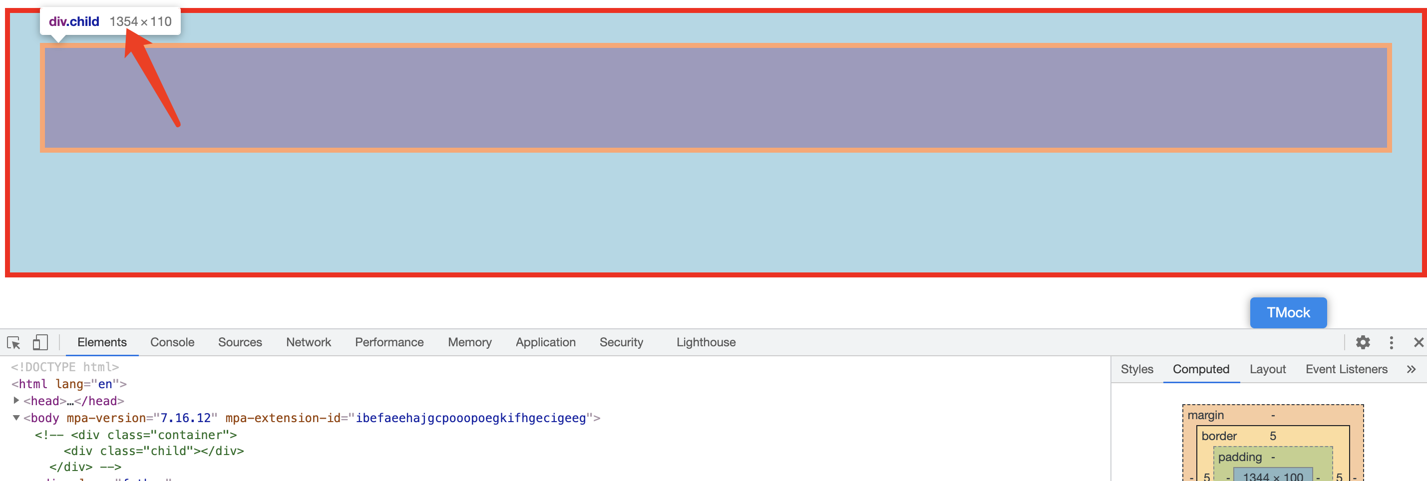
此时child块盒的总宽度为1354px,减去左右border的10px,还剩余1344px,因此width的具体值为1344px

child的包含块的宽度,也就是father的content部分,也为1354px
margin的默认值为0,值为auto也是吸收掉剩余空间的意思
但如果给块盒同时设置了width和margin,width的优先级更高
若设置了width,且width border padding margin计算过后 仍然有剩余空间 由于块盒总宽度需要等于其包含块的宽度 所以该剩余空间默认情况下会被margin-right全部吸收
.father {
      height: 200px;
      border: 5px solid red;
      padding: 30px;
      background: lightblue;
    }
    .father .child {
      border: 5px solid red;
      height: 100px;
      background: lightcoral;
      /* 设置width为100px */
      width: 100px;
} 若设置margin-left:auto; 就表示剩余空间全被margin-left吸收 块盒就排列到包含块的最右边了
.father .child {
      border: 5px solid red;
      height: 100px;
      background: lightcoral;
      /* 不设置width等同于width为auto */
      width: 100px;
      /* 设置margin-left为auto,吸收剩余空间 */
      margin-left: auto;
} 所以我们经常使用的常规流块盒width固定,设置margin: auto; 就表示左右margin平均吸收掉剩余空间 因此就能实现水平居中了
css
.father .child {
      border: 5px solid red;
      height: 100px;
      background: lightcoral;
      /* 不设置width等同于width为auto */
      width: 100px;
      /* 设置margin左右都为auto,两边平均吸收剩余空间 */
      margin: auto;
    }