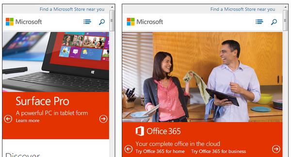
这款由 Matt Kersley 开发的响应式网页测试工具能够帮助你测试在网页设计和构建过程中的界面效果。
目前提供了 240、320、480、768 和 1024 五种宽度的显示效果测试,以及 240 x 320 (small phone)、320 x 480 (iPhone)、480 x 640 (small tablet)、768 x 1024 (iPad - Portrait) 和 1024 x 768 (iPad - Landscape) 五种设备尺寸的显示效果测试。
您可能感兴趣的相关文章
<a href="http://www.cnblogs.com/lhb25/archive/2012/06/12/8-free-tools-for-testing-website-speed.html" target="_blank">推荐8款很棒的测试网站速度的免费工具</a>
<a href="http://www.cnblogs.com/lhb25/archive/2011/07/18/testing-cross-browser-compatability-tools.html" target="_blank">12款很棒的浏览器兼容性测试工具推荐</a>
<a href="http://www.cnblogs.com/lhb25/archive/2013/01/29/2476578.html" target="_blank">构建杀手级应用 JavaScript 工具和技术</a>
<a href="http://www.cnblogs.com/lhb25/archive/2010/12/28/1918491.html" target="_blank">推荐25款提高网站可用性和转化率的工具</a>
<a href="http://www.cnblogs.com/lhb25/archive/2012/12/18/best-tools-for-web-development-a.html" target="_blank">2012年最佳 Web 前端开发工具和框架</a>
<a href="http://www.cnblogs.com/lhb25/archive/2012/12/14/top-css-sites.html" target="_blank">2012年排名前20位的 CSS 网站作品</a>
<a href="http://www.cnblogs.com/lhb25/archive/2012/02/20/fresh-fluid-responsive-design-for-your-inspiration.html" target="_blank">25佳优秀的流体和响应式布局网页设计</a>
<a href="http://www.cnblogs.com/lhb25/archive/2012/12/28/best-tools-for-web-development-a.html" target="_blank">2012年最佳 Web 前端开发工具和框架</a>
<a href="http://www.cnblogs.com/lhb25/archive/2011/07/23/ecommerce-website-designs.html" target="_blank">25个国外优秀的电子商务网站设计案例</a>
<a href="http://www.cnblogs.com/lhb25/archive/2012/01/16/amazing-showcase-of-responsive-web-design-one.html" target="_blank">85个很优秀的响应式网页设计作品范例</a>
欢迎任何形式的转载,但请务必注明出处。
![今日头条iOS客户端启动速度优化 技术调研 实测数据[图]](data:image/gif;base64,R0lGODlhAQABAIAAAP///wAAACwAAAAAAQABAAACAkQBADs=)