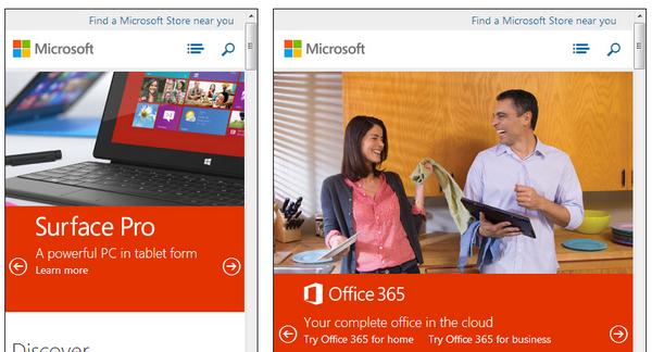
這款由 Matt Kersley 開發的響應式網頁測試工具能夠幫助你測試在網頁設計和建構過程中的界面效果。
目前提供了 240、320、480、768 和 1024 五種寬度的顯示效果測試,以及 240 x 320 (small phone)、320 x 480 (iPhone)、480 x 640 (small tablet)、768 x 1024 (iPad - Portrait) 和 1024 x 768 (iPad - Landscape) 五種裝置尺寸的顯示效果測試。
您可能感興趣的相關文章
<a href="http://www.cnblogs.com/lhb25/archive/2012/06/12/8-free-tools-for-testing-website-speed.html" target="_blank">推薦8款很棒的測試網站速度的免費工具</a>
<a href="http://www.cnblogs.com/lhb25/archive/2011/07/18/testing-cross-browser-compatability-tools.html" target="_blank">12款很棒的浏覽器相容性測試工具推薦</a>
<a href="http://www.cnblogs.com/lhb25/archive/2013/01/29/2476578.html" target="_blank">建構殺手級應用 JavaScript 工具和技術</a>
<a href="http://www.cnblogs.com/lhb25/archive/2010/12/28/1918491.html" target="_blank">推薦25款提高網站可用性和轉化率的工具</a>
<a href="http://www.cnblogs.com/lhb25/archive/2012/12/18/best-tools-for-web-development-a.html" target="_blank">2012年最佳 Web 前端開發工具和架構</a>
<a href="http://www.cnblogs.com/lhb25/archive/2012/12/14/top-css-sites.html" target="_blank">2012年排名前20位的 CSS 網站作品</a>
<a href="http://www.cnblogs.com/lhb25/archive/2012/02/20/fresh-fluid-responsive-design-for-your-inspiration.html" target="_blank">25佳優秀的流體和響應式布局網頁設計</a>
<a href="http://www.cnblogs.com/lhb25/archive/2012/12/28/best-tools-for-web-development-a.html" target="_blank">2012年最佳 Web 前端開發工具和架構</a>
<a href="http://www.cnblogs.com/lhb25/archive/2011/07/23/ecommerce-website-designs.html" target="_blank">25個國外優秀的電子商務網站設計案例</a>
<a href="http://www.cnblogs.com/lhb25/archive/2012/01/16/amazing-showcase-of-responsive-web-design-one.html" target="_blank">85個很優秀的響應式網頁設計作品範例</a>
歡迎任何形式的轉載,但請務必注明出處。
![今日頭條iOS用戶端啟動速度優化 技術調研 實測資料[圖]](data:image/gif;base64,R0lGODlhAQABAIAAAP///wAAACwAAAAAAQABAAACAkQBADs=)