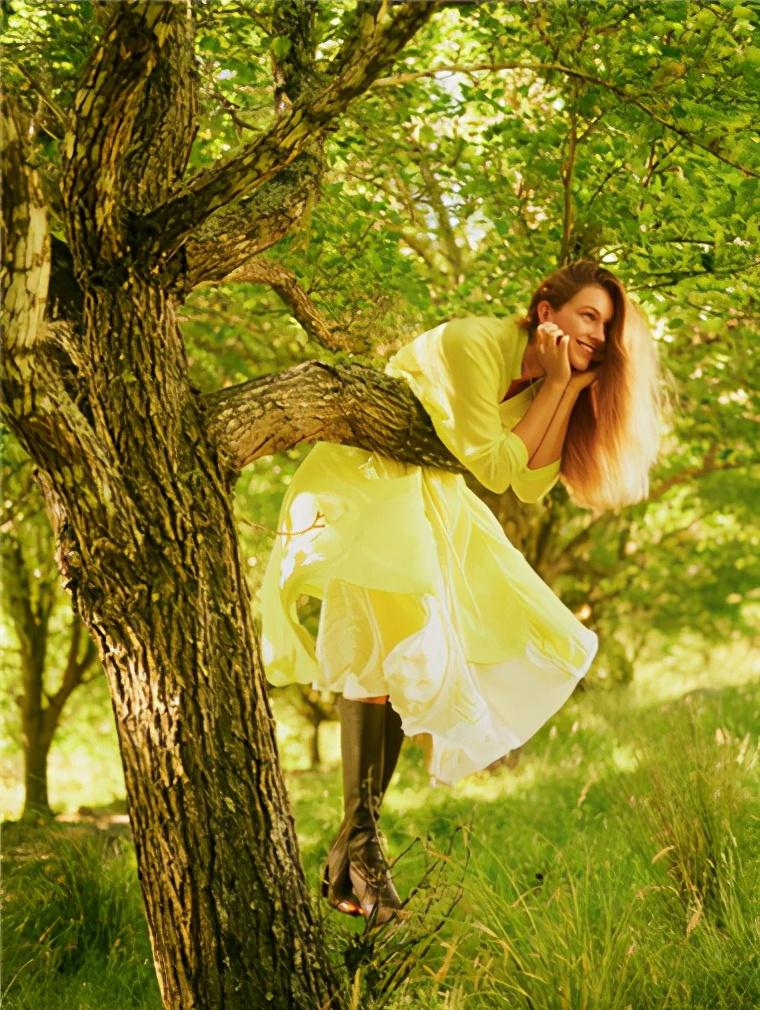
Yellow is a color with a very strong sense of existence, is the hue with the highest brightness in color, and is also one of the three primary colors, which is a color that is very popular among men, women and children. Yesterday, we shared "yellow and black, white, gray, brown so matched, advanced and temperamental", today mainly share the combination of yellow and colored blue, purple, green, red.

Yellow is a bright color, everyone may take more yellow and neutral color collocation, and dare not go to red, green, purple, why? I'm afraid of being tacky. In fact, again, yellow can be matched with any color, and what is important is a matter of tone.
Yellow + purple
The complementary color of yellow is purple, but also the contrast difference is large, mysterious, psychedelic purple meets bright yellow, bringing an active and eye-catching feeling, whether it is as a clothing color or a flat color, it will bring a strong and distinct feeling.
The lemon yellow long horse style with a light purple long skirt is suitable for the pure color type who can most control the high degree of brilliance.
The following satin material of the cold fog powder shirt and lemon yellow trousers, the collision of material and color into a delicate light, cold luster, the color of the scarf and belt is also used skillfully, this color matching is very suitable for cold, soft, light cold.
When purple and yellow are used in flat design, it is recommended to use one color as the main color and the other as a secondary color, alleviating the conflict between them by contrasting the area of the disparity or reducing the brightness and saturation of the two.
Yellow + green
Due to the adjacency on the hue ring, the combination of yellow and green is a fairly harmonious color combination, due to the relationship between poor brightness, yellow can jump out of green very well, is a common color combination in nature, giving people a fresh, energetic feeling, but through the change of tone, you can also build a sense of maturity in late autumn.
Amber yellow with color, warm and rich like oil painting collocation, very beautiful, suitable for warm, soft, deep warm type of people.
The combination of primrose yellow and bodhi green, like a bright color like spring, can be worn with light warmth, warmth, deep warmth, and warmth.
Yellow is the highest brightness of the color system, when you design the plane to brighten the entire picture, yellow is the best choice, bright yellow once appears, will inevitably give the picture more vitality.
If your design wants to create a spring and natural wilderness visual effect, try the combination of yellow and green!
Yellow + Blue
Yellow can awaken the low-key blue to create high contrast, yellow warmth and blue coolness, yellow cheerfulness and blue melancholy, together will compete with each other, set off each other, so that their respective color attributes are more prominent.
Light soft powder blue with white background warm yellow flowers skirt, yellow although with warm tone, but there is a white background color, the overall more suitable for light cold, soft cold, cold soft type of people to wear.
Yellow with Chinese blue check coat, this set of colors is very pure, bright, net color type people, warm and bright type people can wear.
Since the ancient yellow and blue OUT of CP, the combination of yellow and blue has a fairly high contrast, and they are all bright colors, so it is easy to create a high chromaticity and lively feeling.
Although adjacent to the hue ring, the resulting color is called green, but the combination of yellow and blue does not have a harmonious nature, on the contrary, their collocation is close to the color combination of complementary colors, very bright and lively.
Many home designers will choose yellow and blue to match, blue is full of vitality and energy, yellow is full of personality and sunshine, visually bringing us a distinct sense of impact. Rich and light, everything is in the grasp of tone.
Yellow + Red
Yellow is warm with red and has a neighboring common color on the color ring. If you want to match yellow and red with unchanging soil, you must choose the brightness and saturation of the color, so that the commonly known "tomato scrambled egg" color has become fashionable.
Ghost designer Jeremy Scott's first release show after taking over Moschino allowed the red and yellow to encroach on the entire fashion circle.
We can use one of these colors as the main color, the other color as an embellishment color, and in terms of tone, we can also choose the tone that suits your color season.
In the traditional Chinese color matching, it is often used to visually feel the gold that is close to yellow, to use with red, which is easy to make people feel the gorgeous and festive atmosphere.
In fact, yellow is easier to control than you think, it is brisk, full of hope and vitality, and it is also a noble color used by the royal court, it can be worn every day and can be worn amazingly. In the next issue of color analysis, what colors do you want to see? Welcome to leave a message.
This article is the original article of Qixin Color. Thank you for liking this article and welcome to forward it, but whether it is the full text, interception of fragments, or change the forwarding of individual text, please indicate the source in a conspicuous place, otherwise the relevant legal responsibilities will be pursued. In addition, some of the pictures in this article come from the Internet, if it involves your copyright, please contact us to delete.