The seventeenth side of the Qin Seal, let us shift our attention from the Qin Official Seal to the Qin Private Seal, and introduce this side of the "Wang Surprise":
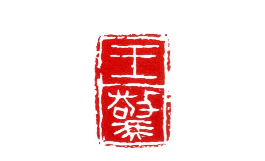
(Wang Shu)
As early as the Qin Dynasty, lishu was already a popular book, this point, we can find a sample of Qin Dynasty lishu in "Yunmeng Sleeping Tiger Land QinJian", "Tianshui Put Ma Tan QinJian", "Qingchuan Mumu", but QinLi is different from Han Li, we generally call Qin Li as Gu Li.

(National Treasure: Yunmeng Sleeping Tiger Di Qin Jian)
There is a difference between Gu li's brushwork and Han Li: the difference between Qin Gu Li and Han Li: Qin Gu Li still preserves the shape of a part of the small seal, and some of the partial sides of the seal book are changed to the li written method, and the brush picks the pen with the wave on the pen has begun to take shape, the pen is heavy and the pen is exposed, the pen is sharp, the knot is relatively square, and the font is thick; Han Li takes the horizontal posture as a whole, highlights the horizontal painting, horizontal and vertical, and has the beauty of waves and bricks. Qin Guli is closer to the seal book, and its overall evolution is also close to the seal book, as shown in the figure:
(Variations in the History of Chinese Calligraphy)
The production of Qin Li and the slow and inconvenient writing of small seals are related to the fact that at the beginning of the founding of the Qin Dynasty, there were a large number of official affairs and correspondence exchanges, because the amount of writing was large, and the small seals with many round strokes were very unfavorable to fast writing. In the long period of quick writing, the Qin people gradually formed a conventional font, which was named Lishu in the Han Dynasty.
"Hanshu Yiwenzhi": "It was the beginning of the creation of the Lishu, which began with the troubles of the official prison and the ease of saving. Give to the disciples. Wei Heng's "Four-Body Calligraphy" says: "Qin used seals, played a lot of things, and the seal characters were difficult to achieve, that is, the subordinate people were adjutant, and the characters were li. ”
Since Qin Li is popular among the people, then, in the Qin private seal, there are a large number of seals with obvious intentions, especially for martyrdom, such as this "Wang Zhen", which is more typical.
(Obvious affiliation)
We see that the horizontal line in the print shows a clear waveform, and at the end of the horizontal line, there is also a clear goose tail closing pen. This is the characteristic of the Lishu.
The subordination of Qin Yin all presents the characteristics of high antiquity, and even it is more simple in the treatment of many stroke lines, it is not clumsy, showing extremely simple and simple aesthetic characteristics. Because, the inscriptions in India are "guli", and the ancient li retains more seal structures. To put it simply, there are two kinds of seal methods used in qinyin's lishu into printing: 1. The text structure of the seal book and the stroke characteristics of the lishu. 2. The text structure of some lishu and the stroke characteristics of some lishu.
There are many examples of qin seals containing affiliation, both those with prominent affiliation, from the structure to the strokes, such as this side; there are also those whose affiliation is not obvious, or it is only a partial structure affiliation, or only a partial stroke affiliation, such as:
(The "female" department with obvious subordination)
The "female" department here is simply a book directly into print.
Of course, we used to study the Han seal, which also has a large number of Lishu into the Printing Case, but that is the development of Han li mature and stylized Lishu, and even to some extent has become a "Lishu seal", here into the Qin seal of the "ancient Li", it is more in line with the "simple" modern aesthetics, so there is a broader space for development in the creation, to learn the creation of Qinyin, you can start from understanding the "Qin Guli":
(Qin Chisel seal without subordination: Wang Xiang)
Qin Guli, in fact, is a major change in the history of Chinese writing and even the history of calligraphy, starting from Qin Guli, Lishu has gradually become the dominant official style. In fact, Qin Guli can be understood in such a simple way: Qin Guli is scrawled in the seal book, and it can even be said that it is like the stroke of the seal with the lishu. In the Qin Dynasty, the knot body and the pen all had a strong seal book meaning, the glyphs were long and flat, and the strokes were not obvious.
Since the beginning of Qin Li, Chinese characters have gradually changed from graphics to strokes in shape, from pictograms to symbols, from complex to simple, and in principle, in the principle of character creation, from phenotes and ideographs to shapes and sounds, the font structure no longer has the meaning of the pictograms of ancient characters, but is completely symbolized.
([Seal Engraving Operation] No. 287, some of the pictures originate from the Internet, the copyright belongs to the original copyright owner)