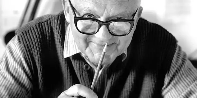
Paul Rand was a prominent graphic designer, thinker, and educator of the 20th century. He has been engaged in design work for more than 60 years and has won countless honors in his lifetime. In this article, we will take a look at the legendary designer's life experience, major works, and some of his views and thoughts on the design industry.

Born in 1914 in New York, Paul Rand has been working in design for more than 60 years, serving as the artistic director of Costume Art, Direction, and Mr. Fashion, a business consultant for IBM, and a professor of design at prestigious institutions such as yale College of Art and Design, Pratt School of Design, and Cooper School of Design.
He is the designer of IBM, Next, ABC, UPS, Westinghouse Electric, Yale University and other well-known enterprises and institution logos, his works involve book binding design, advertising posters, illustrations, type design and corporate image design, etc., excellent works have been collected by many museums in Europe and Japan. He has also been honored by the Society of Art Designers in New York, the Royal Society of Designers in the United Kingdom, Yale University, Harvard University and other institutions.
Because of paul Rand's outstanding contributions and status in the field of graphic design, he is also known as the "Picasso of graphic design". He was the "godfather" of graphic design in the eyes of Steve Jobs, the great graphic designer of all time.
The reason why Paul Rand has received so much praise in the industry and outside the industry is that his work is excellent on the one hand, and this is the foundation. On the other hand, he has also won the respect of clients, designers and even partners through his outstanding contributions to the field of design and business.
After paul rand returned from his studies in Europe, he introduced constructivism and cubism in the avant-garde art movement into the field of American graphic design, and the new forms enriched the design techniques and forms of expression at that time, strengthened the visual impact of design works, and injected new vitality into the unchanged advertising industry.
Deeply influenced by the Bauhaus style and European type art, his works had a very strong visual effect and functionality at that time. He proposed in the logo design that the basic role played by the logo is to indicate, conciseness is its means, and realism will only make the information more obscure. The utility of the logo depends on uniqueness, visibility, adaptability, memorability, universality, and durability. These design principles seem to us to be very basic now, and at that time almost subverted the concept of logo design around the world.
In the IBM project, Paul Rand extended the image of the logo to every scene related to the company, in order to make the audience familiar with and remember the visual image of the company. Finally, this logo with standard diagrams, standard words, and standard colors has been highly evaluated, and it has achieved the achievement of IBM, a blue giant, but also paul Rand himself. As one of the first designers to use an enterprise visual identity system, IBM's visual identity is one of the most important examples of our learning about corporate identity design today.
Paul Rand also did something very important for us designers, and through his collaboration with Bernback, he formed the concept of an art director and copywriter team in our advertising industry, a collective idea that both makes design more expressive and integrates creativity. In the previous advertising industry, copywriting was the king in the office, and the status of designers at that time was almost indistinguishable from that of artists now, which can also be seen as an improvement in the status of designers.
His books Thoughts on Design, Design and the Play instinct, and Paul Rand: A Designer's Art are no less well-known than his designs, influencing generations of designers. Paul Rand has made great contributions to the export of his work, the spirit of exploration, the business field, the educational concept, and even the promotion of the status of the entire designer community, which has had a profound impact on the entire industry. The praise he received was fully worthy of his dedication to society as a whole.
Paul Rand had some interactions with Jobs when designing the Next logo, and the process of cooperation and some small stories were very interesting and could be shared with you.
Next was founded by Jobs to beat Apple. Jobs was kicked out of Apple for a while, and one of the reasons for his eviction was because of his notorious temper, looking down on people, and almost all employees didn't like him. Another reason is that Apple's performance at that time was not very good, and there were many internal problems. Legend has it that Bill Gates just wanted to give Apple a little brother and develop office with peace of mind, but Apple did not give people compatible technical support, and finally the little brother could not stand it, and could only develop the operating system, Windows.
At that time, the board of directors also wanted to adjust the company's structure, and finally Jobs was personally hired by the CEO Sculley, along with the board of directors. (PS: Sculley joined Apple in 1983, and Jobs said the phrase that is still talked about today in order to get Pepsi President John Sculley to join Apple— "Do you want to sell sugar water for a lifetime, or change the world with us") The honeymoon period is always short. In short, the Next brand is a tool for Jobs's revenge on Apple.
Jobs spent a lot of money to find Paul Rand's design logo, not because they were familiar with it, but because he had seen paul Rand's IBM logo, and he liked it so much that when he was building a brand for a new company, he didn't think about finding any other designer, he just wanted Paul Rand. In the process of cooperation, Paul Rand topped it twice. The first time was when Jobs asked Paul Rand, the money is all given to you, how many options can you hand me over? You can think about how you would generally answer if a customer asked you this question. Rand's answer to him was, just one, if you want to plan more, you go to someone else, I will provide you with the best way to solve your problem, you love to use it, but you have to pay me the money.
The second time is that this plan has come out, Jobs is particularly satisfied, but hope to make a little change, that is, to make the yellow of the lowercase letter e in the logo brighter. This change was replaced by us, and we must have adjusted it for him, adjusted a little bit, and everyone was happy. But Paul Rand strongly disagreed with the change because he knew his design was the best, and Jobs gave in again this time.
The process of collaboration was mentioned in an interview with Jobs, who said Rand's approach had a "refreshing clarity." Every customer should remember not to let the other person give you options. You hire someone who knows better than you how to solve a problem – just like you hire an accountant or a marketing expert." He also learned some important lessons about the brand in this collaboration, which had a lot of influence on his later work.
It is said that Jobs has a bad temper, but it is not difficult to see that his evaluation of Paul Rand is very high, after Jobs returned to Apple, in 1997 Apple's famous series of advertising think different, Paul Rand is a genius juxtaposed with Picasso, Einstein, Gandhi, Edison and other characters. His assessment of Paul Rand is one of the pure qualities of an artist, but a master of solving business problems. He's tough on the outside, like a stubborn old man, but on the inside he's like a teddy bear.
NEXT
Since Next was mentioned in the previous story, let's take a closer look at the design ideas of this logo to see how designers with real levels can create logos and express their creativity.
Let's look at the design idea of the Next logo. Paul Rand believes that choosing a basic font for logo design is a convenient beginning for designing a logo. At the beginning of the project, a large number of different fonts were tried, observing the relationship between different letter combinations, looking for visual similarities and differences, and trying to find innovative inspiration from the design of a letter or a group of letters.
But since the word Next is used too often, no matter what form of font is used, it still feels like a word we are very familiar with, rather than a logo. If you want him to look like a logo, you have to find a way to make him strange, make him look different, so that he can evoke more associations than just a preposition or adverb, which is the core of the problem.
There's a simple way to solve this problem, which is to make all the letters capitalized, and the capital letters she can make the word itself more unfamiliar, because the uppercase letters are more difficult to identify than the lowercase letters, and this is true for us Chinese, and it is the same for foreigners. However, when NEXT becomes capitalized, it is easy to confuse with EXIT, that is, the word for security exit, which may be because the combination of EXT is too conspicuous. To avoid this problem, Paul Rand used a method that can be seen in many of today's logos, combining uppercase and lowercase letters.
In the uppercase combination of NeXT words, the lowercase e is highlighted, making him a focal point for visual contrast. And the prominent letter e can also represent a lot of positive meanings, e-starting words are education, excellent, expertise, excellence, excitement, etc., which is equivalent to adding a lot of positive meaning to the logo. Through this case comparison, it also produces an effect that is both interesting and easy to understand.
The font chosen for this logo is a geometric sans-serif font, because compared with complex serif fonts like Caslon, the letters of the geometry are easier to express and adjust visual creativity. In the case of NeXT, the lowercase e is the visual focal point, the element that people can remember.
In order to strengthen the idea of the company name, Paul Rand designed a black cube, the letters of the logo are divided into two rows, packed inside, this cube and letter combination has a considerable visual presentation, easy to remember, and has the ability to show the meaning, let people easily identify. The letters divided into two rows increase the size and recognition of the letters, and at the same time, they also give the words a new look. The word is almost never misread because it is so common, even if it is divided up and down. If we encounter less common words or combinations of Chinese characters, then we must pay attention to the readability of the text itself when dividing.
This is the birth process of the classic logo Next. Unfortunately, Next was acquired by Apple in December 1996, and although the logo is great, its commercial significance is dispensable, but the basic standard set by Paul Rand to test this logo is the 6 principles mentioned earlier, which subverts the concept of the global logo design community. After next was acquired, Jobs also returned to Apple, and then Apple re-emerged, and Jobs began to change the story of the world.
IBM
In the mid-twentieth century, the "International Business Machines Corporation" in the United States was a company whose main business was to produce typewriters, computers and timers, and paul Rand abbreviated his name as IBM (International Business Machines) to better disseminate the company's image.
When designing these words, combined with IBM's history of starting with transaction machines and typewriters, the image characteristics of the three letters of "IBM" were designed into a typewriter printing style, and the negative shape of the middle of the "B" letter was designed into two square holes, which was closely related to its business of operating a punching machine. The logo is eye-catching, simple and relevant, conveying ibm's most basic business content through this new shape.
In 1976, Paul Rand designed an eight-striped variant logo for IBM and chose the standard color blue. The horizontal isometric composition process makes people feel the dynamic of electromagnetic wave vibration in their hearts, which not only conveys the nature of the company's high-tech industry, but also implies the company's development concept, rigorous, scientific, avant-garde and passionate. The logo is concise, innovative and has a strong visual impact.
Education First EF
EF Education, whose full name is "Education First", was founded in 1965 by Bertil Hult. It has 16 affiliated institutions and non-profit organizations offering a variety of educational programs, including language learning, study abroad tourism and degree programs, and cultural exchange.
Paul Rand believes that the logo is a graphic sublimation of the company's beliefs, management and products. Its main purpose is to attract attention, point out, and identify. Like a signature or fingerprint, a logo is unique. EF Education's services are mainly based on language and communication, so it is appropriate to place abstract graphics of sound waves into the letters of EF. Moreover, the abstract graphics of the sound wave will also provide decoration for the original bland letters, so that the graphics and words are naturally combined, providing the logo with the function of auxiliary memory.
Morningstar Morningstar
Founded in 1984 in Chicago, USA, Morningstar aims to provide investors with professional financial information, fund and stock analysis and rating, as well as convenient, practical and functional analysis application software tools, is currently one of the most important investment research institutions in the United States and the authority of international fund rating. On February 20, 2003, Morningstar China headquarters was established in Shenzhen, and the current number of employees in China is about 1,000.
The name Morningstar is a combination of two words, and it is neither short nor easy to read. To solve this problem, Paul Rand tightened the kerning and elongated the text, saving space for each letter and ensuring compactness, making the name shorter and easier to handle. Although this reduces the readability of the text, it improves the uniqueness and recognition, and as a logo, it can make people quickly remember, far more important than being able to read it quickly. The letter "O" is processed as the feeling of the sun slowly rising, existing as a visual focal point, which also increases the interest of the logo and strengthens the meaning of the logo - the morning star, the newborn star.
American courier company UPS
Founded in 1907 as a courier company in Seattle, Washington, UPS Express (United Parcel Service) is a global company whose trademark is one of the most well-known trademarks in the world. As the world's largest express carrier and parcel delivery company, it is also a leading provider of transportation, logistics, capital and e-commerce services.
Paul Rand designed the logo in the same way that letters and graphics were used, isomorphic ups, coats of arms and parcels. ups is the abbreviation of the name of the enterprise, the coat of arms represents protection and protection, which is the continuation of the corporate philosophy, and the parcel is the embodiment of the services provided by the enterprise. Due to the expansion of the company's business, the package in this version has been removed, but Paul Rand's design will still be passed on as a classic case in our designer circle.
Design is a commentary, a point of view, a perspective
It is also a social responsibility
Design is both a noun and a verb
Good design has no fixed standards for every problem
Each solution is unique
Forms are mere sparks, there are no such sparks
The content loses its meaning
The relationship between designers and clients is mutually beneficial
What reconciles them is mutual respect, apology, and money
Design is a personal act
It is the result of individual creative inspiration
Good ideas are not docile
They only choose to appear at a time or place of their choice
Judge the intrinsic value of a design
The decisive factor is not the period of use, but the quality
A design can endure because of its excellence, adaptability and unforgettable charm
As a symbol of good reputation
The importance of the logo is not overestimated at all
Only the right method is mastered
In order to truly express yourself
Paul Rand argues that design and business face equal ethical issues. A poorly designed but easy-to-use product is more unethical than a product that has no appearance but is useless. The former does not respect consumers, the latter deceives consumers. Good design should never be used to promote a bad product. There are three main reasons why there are more and more bad designs on the market. First, management's ignorance or neglect of good design; second, the vested interests of market researchers; third, the lack of voice or ability of designers. Because most people see designers as a set of drawing tools, a supplier, rather than an important part of a business.
Good design, whether it is valuable to designers, to enterprises, or to the whole society, and this value gives us the most intuitive return is credibility. The way for enterprises to establish credibility is not only to provide good products, good services, and win good reputation, but also to add points to the image of the enterprise. Because it is easier for the audience to remember the beautiful design rather than the bad image, good design can reflect a well-thought-out, well-targeted company from the side, reflecting the quality of his products and services. It shows a good social relationship – a sign of good credibility. It's saying to consumers, "We care a lot."
Exhibited in Kenmori