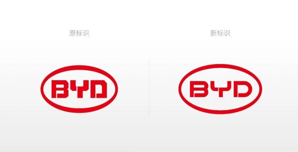
(Caimi, February 18, 2022) -- On February 17, BYD Group announced that it has renewed its brand and released a new logo, in addition to its BYD automobiles. BYD Group said that adhering to the brand mission of "using technological innovation to meet people's yearning for a better life", the logo renewal is based on retaining the red color and the ring circumference, through the adjustment of the round frame lines and font details, the original glyph sharp angle is changed to a more mathematical and aesthetic rounded corner; at the same time, the whole is more rounded and generous, showing a sense of affinity and openness, realizing the perfect combination of technical aesthetics and humanistic feelings, highlighting BYD's concept of "people-oriented", and using technology to solve social problems. Determination to create a better life for mankind.
BYD Group's new logo will be used in its electronics, new energy, rail transit and automotive industries, while each brand in the passenger car segment of the automotive industry will use its own brand logo. The "BYD Auto" brand fits the current graphic design trend, has a more three-dimensional sense and design aesthetics, and is more recognizable. The upgraded logo continues to implement the concept of "link, build together, move forward".

For this brand change, some netizens said that because the change between the new and old logos is too small, from "right angle to rounded corner", is it the designer who invited Xiaomi to design a new LOGO? In March last year, Xiaomi released a new logo, invited to japan and international famous designer Hara Kenya design, for the Xiaomi brand vision into the thinking of oriental philosophy. The new logo has changed from the previous square angle to a rounded corner, which has not changed much, causing heated discussion among netizens.