Very Peri is not purple, but a warmer blue, the blue of Barto Durgazapov
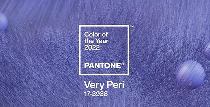
At the end of 2021, Pantone, an American color consulting provider, released the 2022 representative color Pantone 17-3938 Very Peri, which was fascinating, as Pantone pointed out: Evergreen Blue is based on blue, injecting a vibrant purple red, showing a clever, pleasant attitude and vibrant style, and more wonderfully, this is the first time that Pantone has put aside the pre-selection file and developed a new color for the annual representative color.
Very Peri is not purple, but a warmer blue, the blue of Barto Durgazapov
Very Peri is not purple, but a warmer blue
Blue and purple are indispensable colors for expressing the Internet, the virtual world, and the unknown, and the periwinkle blue created in this impression of distance and inability to give people a sense of tranquility, care, and response, and the fashion of this color system is really beautiful:
Very Peri is not purple, but a warmer blue, the blue of Barto Durgazapov
Very Peri is not purple, but a warmer blue, the blue of Barto Durgazapov
Very Peri is not purple, but a warmer blue, the blue of Barto Durgazapov
Very Peri is not purple, but a warmer blue, the blue of Barto Durgazapov
Very Peri is not purple, but a warmer blue, the blue of Barto Durgazapov
The warm periwinkle blue in the blue tone is reminiscent of the Russian neo-Impressionist painter Bato Dugarzhapov 's wisteria at dusk, the blue-purple sky, his paintings are always sunny, wet and wet brushwork makes the bright blue tones and purple tones move each other, creating a subtle and flowing sense of air, making people feel quiet and close.
Very Peri is not purple, but a warmer blue, the blue of Barto Durgazapov
Very Peri is not purple, but a warmer blue, the blue of Barto Durgazapov
Very Peri is not purple, but a warmer blue, the blue of Barto Durgazapov
Very Peri is not purple, but a warmer blue, the blue of Barto Durgazapov
Very Peri is not purple, but a warmer blue, the blue of Barto Durgazapov
Very Peri is not purple, but a warmer blue, the blue of Barto Durgazapov
Very Peri is not purple, but a warmer blue, the blue of Barto Durgazapov
Very Peri is not purple, but a warmer blue, the blue of Barto Durgazapov
Very Peri is not purple, but a warmer blue, the blue of Barto Durgazapov
Very Peri is not purple, but a warmer blue, the blue of Barto Durgazapov
Very Peri is not purple, but a warmer blue, the blue of Barto Durgazapov
Very Peri is not purple, but a warmer blue, the blue of Barto Durgazapov