The 1990s were the last decade of the 20th century, an era of rapid economic development, unprecedented prosperity in art and technology, and an era when the Internet began to spread and gradually change people's lifestyles. With the advent of digital design tools, traditional graphic design methods have ushered in new opportunities and challenges. New technologies and new ideas led to many experimental and innovative visual explorations at the time, and various trendy design styles were constantly being defined.
Although the logo design is only a small part of graphic design, it fully reflects the designer's skill and can also reflect the aesthetic taste of the industry at that time. We may wish to start from the logo design of the most popular classic American drama in the 90s, and get a glimpse of the popular trend of American type design in that era.
Gabriel Weiss – Friends
"Friends" is one of the most popular shows in the history of American television drama, from 1994 to the tenth season in 2004, each season was in the top ten of the year. The ten years of ups and downs that six friends living in Manhattan, New York, have walked hand in hand is a precious memory that accompanies the growth of a generation of Americans. At the same time, as a classic and necessary material for Chinese people to learn spoken English, "Friends" also carries the youth memories of many Chinese youth.
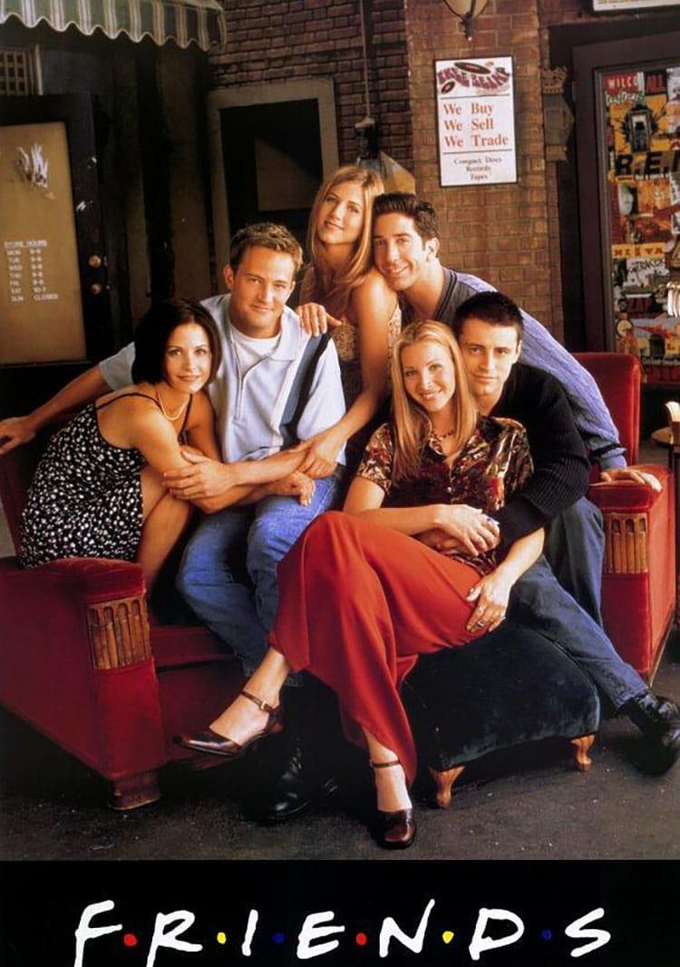
Handwritten font design was very popular in the United States in the 90s, and the logo of "Friends" is typical of this design style. This handwritten font, called Gabriel Weiss, is relaxed and casual, which is very much in line with the positioning of the "Friends" life sitcom. In addition, the logic behind the logo design is also very interesting: the 6 colored dots separating the 7 letters of the word "Friends" just symbolize the 6 friends in the play, which is a wonderful echo.

X-Files – 《X档案》The X-Files
The antique classic American drama "X-Files" is the enlightenment drama of many post-80s and post-90s American dramas on science fiction themes. Although the age is relatively old, whether it is the scope of knowledge covered by the plot, the classic dialogue of the characters in the play or the depth of the portrayal of human nature, it is far higher than the level of science fiction films in the same period and even many current science fiction films.
The logo design of "X-Files" is also very careful, simulating the effect of text printed by the typewriter to echo the concept of "archives". The mottled brushstrokes show the mystery of science fiction suspense dramas just right, and it is a classic representative of the design of the American drama logo in the 90s.
Unlike the retro texture of the mottled isospaced font of the letter "X" in the logo, the most used title font in The X-Files is a slender, neat, angular sans-serif font, full of a strong sense of futurism and sci-fi. The title font and logo font form a strong contrast in temperament, which also echoes with the rules of font combination and contrasts with each other.
Simpsonfont – The Simpsons
The Simpsons is a familiar animated sitcom produced by Fox Broadcasting and titled by Time magazine as one of the greatest television shows of the 20th century. Through the depiction of the life of the protagonist Homer's family of five, he humorously mocks American culture and society from multiple angles in a funny way.
The Simpsons logo type design is typical of Matt Groening's design. As the author of the comic, Matt designed this set of logo fonts that perfectly fit the character of the Simpson family. The mixed form of uppercase and lowercase fonts adds personality to the presentation of the logo. The bubble font effect created by the black shadow and highlight style is very similar to the style of early digital design. The playful glyphs seem to be the words that The Simpsons themselves jumped out of the screen to write.
Gloucester – Seinfeld
NBC's "Seinfeld," which aired 180 episodes between 1989 and 1998, tells the ordinary life of four ordinary people without glamorous clothes and extraordinary talents. Unlike other sitcoms, Seinfeld is a truly themed, no-thread repertoire. It may be precisely because of the authenticity of its "about NOTHING" character that it has received critical acclaim from critics and audiences, and has been named "the greatest drama of the 21st century".
The logo font of Seinfeld, Gloruser, was designed by Monotype and was a fashionable classic font at the time. The italic form of the font is used in the logo, which adds a sense of liveliness and interest to the design effect. The yellow oval background sets off the red text, and replaces the dots of the letter "i" in the word Seinfeld with a triangular shape, allowing the overall logo design to find a good balance between seeking beauty and expressing humor. The design method of superimposing shadows on the text also reflects the pursuit of the design trend of the time.
Buffied – Buffy The Vampire Slayer
Compared with the same type of drama now, "Buffy the Vampire Hunter" has long been surpassed in terms of visual effects and story background setting. However, as an early vampire-themed youth drama, there are still many remarkable points, and it is also a classic in the youth memories of many early American drama fans.
The logo "Buffy" of "Buffy the Vampire Slayer" is a typical 90s type design style. During this period, due to the emergence of new digital design software, everyone began to pursue a more decorative and aesthetic font design style, rather than being limited to the classic neat and concise font type. Buffied This font is a typical Gothic font, with a mysterious, grotesque temperament, which makes people naturally associate it with the story of the vampire, and presents a sense of story in the font design.
Friz Quadrata – Law & Order
Law & Order is a long-form drama about The New York Police and Prosecutors, running live from 1990 to 2010, with 20 seasons and 456 episodes. It integrates police and legal drama, rigorous and true, solidly telling the case and analyzing the moral ethics and legal theory behind it. The story is originally based on real life, and directly hits the sensitive propositions of the society at that time. It is the most magnificent series in the history of NBC and even in the history of American cinema.
The logo "Law & Order" of "Law & Order" uses a rigorous and elegant font Friz Quadrata, which meets the aesthetic needs of the temperament of legal dramas, and appears to be official and rational emotions. The logo design uses the effect of 3D stereoscopic characters and adds a colorful luminous style to the text, which is a unique word design style in the 90s. The glowing shadows of the red and blue colors of the text symbolize the duality of the law and the court, which is impressive.
Florentine – Frasier in Happy Family
Just as "I Love My Home" pioneered Chinese scene comedy, "Frasier", which was broadcast on the other side of the ocean in 1993 and the same year, is also a pioneer of American sitcoms. This television comedy, one of the greatest in American history, accompanied Americans through 22 spring and autumn seasons. The show revolves around the family story of a Boston psychiatrist named Frasier. I believe that the contrast between psychology and the real world will bring you another kind of fun that is different from "Friends".
Some critics have said that the logo of "Happy Family" can be regarded as one of the best logo designs in the American drama industry in the 90s. Just as the logo of "Seinfeld" is very good at grasping the seriousness and humor, florentine font thin font shape and lively and changeable corner processing, so that the logo design of "Happy Family" also finds a balance between seriousness and light-hearted and witty emotions. In different versions of the logo, whether it is the effect of the gradient or the three-dimensional style of monochrome superimposed black shadows, it is a unique word effect processing style of the 90s. The single-line outline of the city pattern combined with the text logo, which seemed modern and fashionable at that time.
Fontageous Rendition – Dawson's Creek in The Age of Love
Known as the "American TeenAge Development Textbook," Dawson's Creek began airing in 1998 and followed for six consecutive years. This old-school youth love drama revolves around the adolescent growth story and emotional entanglement between four high school life and death parties. Unlike many of today's youth dramas full of deception and hormones, "The Age of Love" is young and innocent and beautiful.
Like the logo design of "Friends", the logo font design of "Love Times" also conforms to the popular handwriting trend of the 90s. But unlike the former's relaxed and casual font style, the Fontagial Rendition used in the "Age of Love" logo looks more youthful and childish. This font is like handwritten text on a love letter, or a handwritten handwritten text on a small note secretly passed on by an ignorant teenager in a high school class to a favorite girl, and the design of the text cleverly conveys the atmosphere and emotions of the youth love drama.
Source: Youshe.com