當我們以<code>position:absolute</code>之名讓元素脫離Normal flow的控制後,以為通過<code>left</code>和<code>top</code>屬性值即可讓元素得以無限的自由時,卻發現還有各種神秘的力量左右着它的來去,于是我們意識到自己力量的微弱,開始迷茫不前。
後來有幸拾到各路前輩高人的秘笈,終于打通任督二脈,記錄在案以便日後查閱。
Q:不是說好以左上角為原點(0,0)嗎?怎麼<code>top:auto;right:auto;bottom:auto;left:auto;</code>時的效果和Normal flow中的是一樣的?
A:那是因為Absolute positioning在初始化狀态時(<code>top:auto;right:auto;bottom:auto;left:auto;</code>),浏覽器會生成一個看不見的采用Normal flow定位的虛拟盒子(hypothetical box),若虛拟盒子對應的盒子沒有設定top/right/bottom/left屬性值,則該盒子将與虛拟盒子重疊。
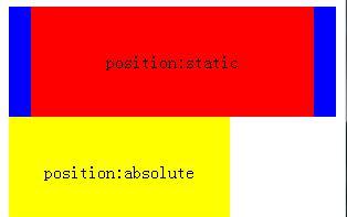
是以當我們僅僅設定<code>position:absolute</code>時,呈現出來的效果是跟<code>position:static</code>是無差別的。那這時我們會有兩個疑問了,1. 既然top/right/bottom/left等預設值為auto,那實際計算值是多少呢?2. 假如顯示設定top/right/bottom/left為特定數值後,那效果又是如何的呢?
若要回答上述問題,則先要了解定位參考系。一說起定位我們必須找到對應的參考系,如相對定位那樣望文生義就知道它對應着某個參考系,而絕對定位則隐晦得多,咋看之下會讓我們忽視參考系的重要性,然後糊裡糊塗地了解和解讀它呈現的效果。
絕對定位的參考系就是盒子所在的containing block,下面我們來深入一下吧!
不管采用的是Normal flow、Floats還是Absolute positioning,總之定位的參考系就是一個名為containing block的四方盒子,但不同的position scheme會對應不同containing block。就Absolute positioning而言,首先會尋找最近的一個<code>position:relative/fixed/absolute</code>的父容器元素,若找到且父容器為block-level element則以父容器的的padding box作為containing block,若父容器為inline-level element則根據父容器的<code>direction</code>CSS屬性值決定containing block;若一個都找不到則會以initial containing block作為其的containing block。
是以top/right/bottom/left的實際值則是相對于containing block而言,我們可以通過<code>el.offsetLeft/Top</code>來擷取top和left的實際值。
也許大家都見過以下這種水準垂直居中方式(IE7/6/5.5下均無效)

為啥簡單設定<code>top/right/bottom/left:0;margin:auto</code>就輕松搞定這麼難搞的水準垂直居中呢?請看下圖
當盒子采用絕對定位後,其top/right/bottom/left和box model以占滿整個containing block為目的,除非每個屬性均設定的特定數值導緻整體寬度或高度均小于containing block的寬度或高度。也就是得到以下兩個等式:
垂直方向:<code>'top' + 'margin-top' + 'border-top-width' + 'padding-top' + 'height' + 'padding-bottom' + 'border-bottom-width' + 'margin-bottom' + 'bottom' = height of containing block</code>
水準方向:<code>'left' + 'margin-left' + 'border-left-width' + 'padding-left' + 'width' + 'padding-right' + 'border-right-width' + 'margin-right' + 'right' = width of containing block</code>
然後一切玄機則蘊藏在auto這個屬性值上了。
其中垂直方向上top/margin-top/height/margin-bottom/bottom可以設定為auto,而水準方向上則是left/margin-left/width/margin-right/right可以設定為auto。
margin-top/bottom設定為auto時,實際值自動配置設定的情況
top/height/bottom均不為auto時,那麼margin-top/bottom兩者的實際值相等,且足以滿足等式1。
margin-top/bottom設定為auto時,實際值為0的情況
top/height/bottom均為auto時,height的值由其子元素決定。top/bottom的值則根據虛拟盒子來決定,最終讓定位效果如同采用<code>position:static</code>一般,反正要讓等式1成立。
top/bottom均不為auto,而height為auto時,height會自動計算以滿足等式1。
其他情況height由子元素或自身屬性值決定,top/bottom由自身屬性值或以滿足等式1來決定實際值。
注意:top/auto/bottom預設值為auto,而margin-top/bottom預設值為0。
margin-left/right設定為auto時,實際值自動配置設定的情況
left/width/right均不為auto時,那麼margin-left/right兩者的實際值相等,且足以滿足等式2。
margin-left/right設定為auto時,實際值為0的情況
left/width/right均為auto時,width的值由其子元素決定。left/right的值則根據direction的值來決定,最終讓定位效果如同采用<code>position:static</code>一般反,正要讓等式2成立。
left/right均不為auto,而width為auto時,width會自動計算以滿足等式2。
其他情況width由子元素或自身屬性值決定,left/right由自身屬性值或以滿足等式2來決定實際值。
注意:left/width/right預設值為auto,而margin-left/right預設值為0。
由于replaced element自身有固有的width/height,是以當設定<code>width:auto;height:auto</code>時,其實際值就是元素固有的width/height。也就是width/height不存在為滿足等式2和1動态擴充/縮小實際值的情況。結果就是除"2. top/bottom均不為auto,而height為auto時,height會自動計算以滿足等式1。"和"2. left/right均不為auto,而width為auto時,width會自動計算以滿足等式2。"兩條不滿足外,其他情況均一緻。
注意,IE5.5/6/7下會有以下例外:
left/margin-left/margin-right/right均不為auto而width為auto時,IE5.5下width的實際值将由子元素決定;
top/margin-top/margin-bottom/bottom均不為auto而height為auto時,IE5.5下height的實際值将由子元素決定;
left/width/right均不為auto,而margin-left/right為auto時,IE5.5/6/7下margin-left/right的實際值為0;
top/height/bottom均不為auto,而margin-top/bottom為auto時,IE5.5/6/7下margin-top/bottom的實際值為0.
對于<code>position:fixed</code>其實也屬于Absolute positioning,但它參考系永遠是由Viewport所産生的containing block而已,其他均與上述内容一緻。
注意:IE6不支援<code>position:fixed</code>
若有纰漏,望各位指正,謝謝!
<a href="http://www.cnblogs.com/xiaohuochai/p/5312917.html">深入了解CSS絕對定位</a>
<a href="https://www.w3.org/TR/CSS21/visudet.html">10 Visual formatting model details</a>
<a href="http://www.w3help.org/zh-cn/kb/012/">KB012: 絕對定位( Absolute positioning )</a>
<a href="https://www.w3.org/TR/CSS21/visuren.html#fixed-positioning">https://www.w3.org/TR/CSS21/visuren.html#fixed-positioning</a>
如果您覺得本文的内容有趣就掃一下吧!捐贈互勉!
<a href="http://home.cnblogs.com/u/fsjohnhuang/">^_^肥仔John</a>
<a href="http://home.cnblogs.com/u/fsjohnhuang/followees">關注 - 85</a>
<a href="http://home.cnblogs.com/u/fsjohnhuang/followers">粉絲 - 707</a>
<a>+加關注</a>
1
<a></a>
評論清單
ie7下不相容呢
position: absolute;
top: 0;
right: 0;
bottom: 0;
left: 0;
margin: auto;
哦?!謝謝指正!
http://pic.cnblogs.com/face/347002/20141205140116.png
<a href="http://www.ucancode.com/index.htm" target="_blank">【推薦】超50萬VC++源碼: 大型工控、組态\仿真、模組化CAD源碼2018!</a>
<a href="https://cloud.tencent.com/developer/support-plan?fromSource=gwzcw.710852.710852.710852" target="_blank">【推薦】加入騰訊雲自媒體扶持計劃,免費領取域名&伺服器</a>
<b>最新IT新聞</b>:
<b>最新知識庫文章</b>:
<a href="https://github.com/fsjohnhuang" target="_blank">肥仔John@github</a>
作品: