我們已經學習了如何處理混合效應模型。本文的重點是如何建立和可視化 混合效應模型的結果。
設定
本文使用資料集,用于探索草食動物種群對珊瑚覆寫的影響。
1.  knitr::opts_chunk$set(echo = TRUE)
2.
3.  library(tidyverse) # 資料處理
4.  library(lme4) # lmer glmer 模型
5.
6.
7.
8.  me_data <- read_csv("mixede.csv")
建立一個基本的混合效應模型:
該模型以珊瑚覆寫層為因變量(elkhorn_LAI),草食動物種群和深度為固定效應(c。 urchinden,c.fishmass,c.maxD)和調查地點作為随機效應(地點)。
。
注意:由于食草動物種群的測量規模存在差異,是以我們使用标準化的值,否則模型将無法收斂。我們還使用了因變量的對數。我正在根據這項特定研究對資料進行分組。
summary(mod) 1. ## Linear mixed model fit by maximum likelihood ['lmerMod']
2.
3. ##
4. ## AIC BIC logLik deviance df.resid
5. ## 116.3 125.1 -52.1 104.3 26
6. ##
7. ## Scaled residuals:
8. ## Min 1Q Median 3Q Max
9. ## -1.7501 -0.6725 -0.1219 0.6223 1.7882
10. ##
11. ## Random effects:
12. ## Groups Name Variance Std.Dev.
13. ## site (Intercept) 0.000 0.000
14. ## Residual 1.522 1.234
15. ## Number of obs: 32, groups: site, 9
16. ##
17. ## Fixed effects:
18. ## Estimate Std. Error t value
19. ## (Intercept) 10.1272 0.2670 37.929
20. ## c.urchinden 0.5414 0.2303 2.351
21. ## c.fishmass 0.4624 0.4090 1.130
22. ## c.maxD 0.3989 0.4286 0.931
23. ##
24. ## Correlation of Fixed Effects:
25. ## (Intr) c.rchn c.fshm
26. ## c.urchinden 0.036
27. ## c.fishmass -0.193 0.020
28. ## c.maxD 0.511 0.491 -0.431
29. ## convergence code: 0
30. ## boundary (singular) fit: see ?isSingular 繪制效應大小圖:
如果您有很多固定效應,這很有用。
plot(mod) 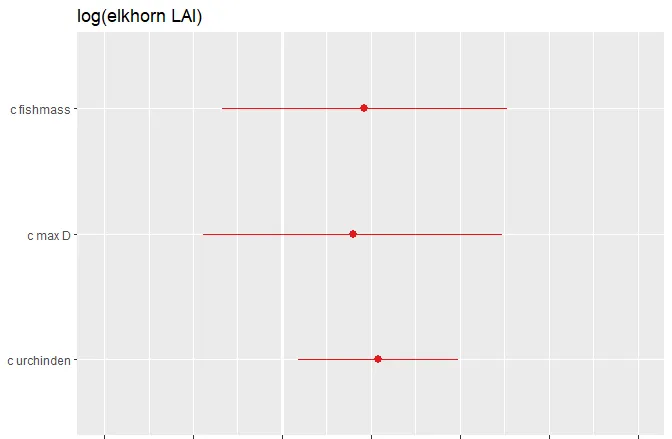
效應大小的格式化圖:
讓我們更改軸标簽和标題。
- # 注意:軸标簽應按從下到上的順序排列。
- # 要檢視效應大小和p值,設定show.values和show.p= TRUE。隻有當效應大小的值過大時,才會顯示P值。
- title="草食動物對珊瑚覆寫的影響")

模型結果表輸出:
建立模型摘要輸出表。這将提供預測變量,包括其估計值,置信區間,估計值的p值以及随機效應資訊。
tab(mod) 格式化表格
- # 注:預測标簽(pred.labs)應從上到下排列;dv.labs位于表格頂部的因變量的名稱。
- pred.labels =c("(Intercept)", "Urchins", "Fish", "Depth"),
用資料繪制模型估計
我們可以在實際資料上繪制模型估計值!我們一次隻針對一個變量執行此操作。注意:資料已标準化以便在模型中使用,是以我們繪制的是标準化資料值,而不是原始資料
步驟1:将效應大小估算值儲存到data.frame中
1.  # 使用函數。 term=固定效應,mod=你的模型。
2.
3.  effect(term= "c.urchinden", mod= mod)
4.  summary(effects) #值的輸出
5.  ##
6.  ## c.urchinden effect
7.  ## c.urchinden
8.  ## -0.7 0.4 2 3 4
9.  ## 9.53159 10.12715 10.99342 11.53484 12.07626
10.  ##
11.  ## Lower 95 Percent Confidence Limits
12.  ## c.urchinden
13.  ## -0.7 0.4 2 3 4
14.  ## 8.857169 9.680160 10.104459 10.216537 10.306881
15.  ##
16.  ## Upper 95 Percent Confidence Limits
17.  ## c.urchinden
18.  ## -0.7 0.4 2 3 4
19.  ## 10.20601 10.57414 11.88238 12.85314 13.84563
20.  # 将效應值另存為df:
21.  x <- as.data.frame(effects)
步驟2:使用效應值df繪制估算值
如果要儲存基本圖(僅固定效應和因變量資料),可以将其分解為單獨的步驟。注意:對于該圖,我正在基于此特定研究對資料進行分組。
1.  #基本步驟:
2.  #1建立空圖
3.
4.  #2 從資料中添加geom_points()
5.
6.  #3 為模型估計添加geom_point。我們改變顔色,使它們與資料區分開來
7.
8.  #4 為MODEL的估計值添加geom_line。改變顔色以配合估計點。
9.
10.  #5 添加具有模型估計置信區間的geom_ribbon
11.
12.  #6 根據需要編輯标簽!
13.
14.  #1
15.  chin_plot <- ggplot() +
16.  #2
17.  geom_point(data , +
18.  #3
19.  geom_point(data=x_, aes(x= chinde, y=fit), color="blue") +
20.  #4
21.  geom_line(data=x, aes(x= chinde, y=fit), color="blue") +
22.  #5
23.  geom_ribbon(data= x , aes(x=c.urchinden, ymin=lower, ymax=upper), alpha= 0.3, fill="blue") +
24.  #6
25.  labs(x="海膽(标準化)", y="珊瑚覆寫層")
26.
27.  chin_plot