1.介紹
tailwind 是一個流行的原子化 css 架構。本質上是一個工具集,包含了大量類似 flex、 pt-4、 text-center 以及 rotate-90 等工具類,可以組合使用并直接在 HTML 代碼上實作任何 UI 設計。
2、安裝
下方法是Vite + Vue模式下的安裝方法,其他腳手架與架構的使用同理。
// 建立項目
npm create vite app --template vue
// 安裝必要依賴
npm i -D tailwindcss postcss autoprefixer
// 使用tailwindcss的初始化指令建立TailwindCSS配置檔案
npx tailwindcss init -p
為了打包時TailwindCSS能生成對應的樣式檔案,需要在tailwind.config.js中正确配置content字段,如以下配置将掃描 src 目錄下所有以 vue/js/ts/jsx/tsx 結尾的檔案。
// tailwind.config.js
module.exports = {
  content: [
    './src/**/*.{vue,js,ts,jsx,tsx}'
  ],
    theme: {
    extend: {},
  },
  plugins: [],
}
注意:TailwindCSS并不會生成一個全量的樣式包,而是根據具體使用到的文法生成對應的樣式代碼,這樣可以確定打包産生的樣式包是最小的。
引入Tailwind的基本指令
/* tailwind.css */
/* tailwind base 相當于一份重置樣式表,包含了最基礎的樣式。 */
@tailwind base;
/* tailwind components 包含了一些元件類, 元件相當于複合樣式 */
@tailwind components;
/* tailwind utilities 包含了工具類,也就是 flex mx-auto 這些内置樣式 */
@tailwind utilities;


/*
這麼劃分的原因是因為 css 的優先級規則,tailwindcss 全部都是一級樣式,在類名權重相等的情況,
下面的樣式可以覆寫上面的樣式,是以工具類優先,元件類次之,基礎樣式兜底,生成的樣式順序尤為重要,
是以 上面三句指令的順序非必須建議不要修改。
*/
3、應用
傳統上,當我們需要在網絡上設計某些内容時,都會編寫 CSS。

// 傳統方案
<script setup>
</script>
<template>
    <div class="chat-notification">
        <div class="chat-notification-logo-wrapper">
            <svg class="h-12 w-12" viewBox="0 0 40 40" xmlns="http://www.w3.org/2000/svg"><defs><linearGradient x1="50%" y1="0%" x2="50%" y2="100%" id="a"><stop stop-color="#2397B3" offset="0%"></stop><stop stop-color="#13577E" offset="100%"></stop></linearGradient><linearGradient x1="50%" y1="0%" x2="50%" y2="100%" id="b"><stop stop-color="#73DFF2" offset="0%"></stop><stop stop-color="#47B1EB" offset="100%"></stop></linearGradient></defs><g fill="none" fill-rule="evenodd"><path d="M28.872 22.096c.084.622.128 1.258.128 1.904 0 7.732-6.268 14-14 14-2.176 0-4.236-.496-6.073-1.382l-6.022 2.007c-1.564.521-3.051-.966-2.53-2.53l2.007-6.022A13.944 13.944 0 0 1 1 24c0-7.331 5.635-13.346 12.81-13.95A9.967 9.967 0 0 0 13 14c0 5.523 4.477 10 10 10a9.955 9.955 0 0 0 5.872-1.904z" fill="url(#a)" transform="translate(1 1)"></path><path d="M35.618 20.073l2.007 6.022c.521 1.564-.966 3.051-2.53 2.53l-6.022-2.007A13.944 13.944 0 0 1 23 28c-7.732 0-14-6.268-14-14S15.268 0 23 0s14 6.268 14 14c0 2.176-.496 4.236-1.382 6.073z" fill="url(#b)" transform="translate(1 1)"></path><path d="M18 17a2 2 0 1 0 0-4 2 2 0 0 0 0 4zM24 17a2 2 0 1 0 0-4 2 2 0 0 0 0 4zM30 17a2 2 0 1 0 0-4 2 2 0 0 0 0 4z" fill="#FFF"></path></g></svg>
        </div>
        <div class="chat-notification-content">
            <h4 class="chat-notification-title">ChitChat</h4>
            <p class="chat-notification-message">You have a new message!</p>
        </div>
    </div>
</template>
<style>
    .chat-notification {
        display: flex;
        max-width: 24rem;
        margin: 0 auto;
        padding: 1.5rem;
        border-radius: 0.5rem;
        background-color: #fff;
        box-shadow: 0 20px 25px -5px rgba(0, 0, 0, 0.1), 0 10px 10px -5px rgba(0, 0, 0, 0.04);
    }
    .chat-notification-logo-wrapper {
        flex-shrink: 0;
    }
    .chat-notification-logo {
        height: 3rem;
        width: 3rem;
    }
    .chat-notification-content {
        margin-left: 1.5rem;
        padding-top: 0.25rem;
    }
    .chat-notification-title {
        color: #1a202c;
        font-size: 1.25rem;
        line-height: 1.25;
    }
    .chat-notification-message {
        color: #718096;
        font-size: 1rem;
        line-height: 1.5;
    }
</style>
使用 Tailwind,您可以通過直接在 HTML 中應用預先存在的類來設定元素樣式。
// Tailwind方案
<script setup></script>
<template>
    <div class="p-6 max-w-sm mx-auto bg-white rounded-xl shadow-lg flex items-center space-x-4">
      <div class="shrink-0">
          <svg class="h-12 w-12" viewBox="0 0 40 40" xmlns="http://www.w3.org/2000/svg"><defs><linearGradient x1="50%" y1="0%" x2="50%" y2="100%" id="a"><stop stop-color="#2397B3" offset="0%"></stop><stop stop-color="#13577E" offset="100%"></stop></linearGradient><linearGradient x1="50%" y1="0%" x2="50%" y2="100%" id="b"><stop stop-color="#73DFF2" offset="0%"></stop><stop stop-color="#47B1EB" offset="100%"></stop></linearGradient></defs><g fill="none" fill-rule="evenodd"><path d="M28.872 22.096c.084.622.128 1.258.128 1.904 0 7.732-6.268 14-14 14-2.176 0-4.236-.496-6.073-1.382l-6.022 2.007c-1.564.521-3.051-.966-2.53-2.53l2.007-6.022A13.944 13.944 0 0 1 1 24c0-7.331 5.635-13.346 12.81-13.95A9.967 9.967 0 0 0 13 14c0 5.523 4.477 10 10 10a9.955 9.955 0 0 0 5.872-1.904z" fill="url(#a)" transform="translate(1 1)"></path><path d="M35.618 20.073l2.007 6.022c.521 1.564-.966 3.051-2.53 2.53l-6.022-2.007A13.944 13.944 0 0 1 23 28c-7.732 0-14-6.268-14-14S15.268 0 23 0s14 6.268 14 14c0 2.176-.496 4.236-1.382 6.073z" fill="url(#b)" transform="translate(1 1)"></path><path d="M18 17a2 2 0 1 0 0-4 2 2 0 0 0 0 4zM24 17a2 2 0 1 0 0-4 2 2 0 0 0 0 4zM30 17a2 2 0 1 0 0-4 2 2 0 0 0 0 4z" fill="#FFF"></path></g></svg>
      </div>
      <div>
          <div class="text-xl font-medium text-black">ChitChat</div>
          <p class="text-slate-500">You have a new message!</p>
      </div>
    </div>
</template>
<style></style>
在上面的例子中,使用了
- Tailwind 的Flexbox和填充實用程式(flex、shrink-0和p-6)控制整體卡片布局
- 最大寬度和邊距實用程式 (max-w-sm和mx-auto) 限制卡片寬度并将其水準居中
- 設定卡片外觀樣式的背景顔色、邊框半徑和框陰影實用程式用(bg-white、rounded-xl和shadow-lg)
- 圖像寬度和高度實用程式用 (w-12和h-12)
- space-Between實用程式 (space-x-4) 處理圖像和文本之間的間距
- 設定卡片文本樣式的字型大小、文本顔色和字型粗細實用程式(text-xl、text-black、font-medium)
能夠實作完全自定義的元件設計,而無需編寫一行自定義 CSS。
TailwindCSS文法檢索技巧 TailwindCSS的基本原則是将每一個style文法轉換為一個class,是以,在官網檢索想要的樣式class時,按照樣式的文法來檢索是效率最高的。如想要擷取圓角的文法,隻需要搜尋Border Radius即可
<template>
    <div class="text-base p-1 border border-black border-solid"></div>
</template>
<style>
	.text-base {
    font-size: 16px;
}
.p-1 {
    padding: 4px;
}
.border {
    border-width: 1px;
}
.border-black {
    border-color: black;
}
.border-solid {
    border-style: solid;
}
</style>

image.png
懸停、焦點還有其他狀态
<script setup>
import { reactive } from 'vue';
const data = reactive({
list: [
{
name: '克裡斯汀·拉莫斯',
email: '[email protected]',
imageUrl: 'https://images.unsplash.com/photo-1550525811-e5869dd03032?ixlib=rb-1.2.1&ixid=eyJhcHBfaWQiOjEyMDd9&auto=format&fit=facearea&facepad=2&w=256&h=256&q=80'
},
{
name: '弗洛伊德·邁爾斯',
email: '[email protected]',
imageUrl: 'https://images.unsplash.com/photo-1550525811-e5869dd03032?ixlib=rb-1.2.1&ixid=eyJhcHBfaWQiOjEyMDd9&auto=format&fit=facearea&facepad=2&w=256&h=256&q=80'
},
{
name: '考特尼·亨利',
email: '[email protected]',
imageUrl: 'https://images.unsplash.com/photo-1550525811-e5869dd03032?ixlib=rb-1.2.1&ixid=eyJhcHBfaWQiOjEyMDd9&auto=format&fit=facearea&facepad=2&w=256&h=256&q=80'
},
{
name: '特德·福克斯',
email: '[email protected]',
imageUrl: 'https://images.unsplash.com/photo-1550525811-e5869dd03032?ixlib=rb-1.2.1&ixid=eyJhcHBfaWQiOjEyMDd9&auto=format&fit=facearea&facepad=2&w=256&h=256&q=80'
},
],
});
</script>
<template>
<!--
hover:
active:
focus:ring(帶有盒子陰影的輪廓環)
-->
<button class="bg-violet-500 hover:bg-violet-600 active:bg-violet-700 focus:outline-none focus:ring focus:ring-violet-300">儲存</button>
<!-- 第一個、最後一個、奇數和偶數 -->
<div class="max-w-md mx-auto bg-white shadow my-8">
<ul role="list" class="p-6 divide-y divide-slate-200">
<li class="flex py-4 first:pt-0 last:pb-0 odd:bg-white even:bg-slate-50" v-for="(item, index) in data.list" :key="index">
<img referrerPolicy="no-referrer" referrerPolicy="no-referrer" referrerPolicy="no-referrer" referrerPolicy="no-referrer" referrerPolicy="no-referrer" referrerPolicy="no-referrer" referrerPolicy="no-referrer" referrerPolicy="no-referrer" referrerPolicy="no-referrer" referrerPolicy="no-referrer" referrerPolicy="no-referrer" referrerPolicy="no-referrer" class="h-10 w-10 rounded-full" :src="item.imageUrl" alt="" />
<div class="ml-3 overflow-hidden">
<p class="text-sm font-medium text-slate-900">{{item.name}}</p>
<p class="text-sm text-slate-500 truncate">{{item.email}}</p>
</div>
</li>
</ul>
</div>
</template>
```
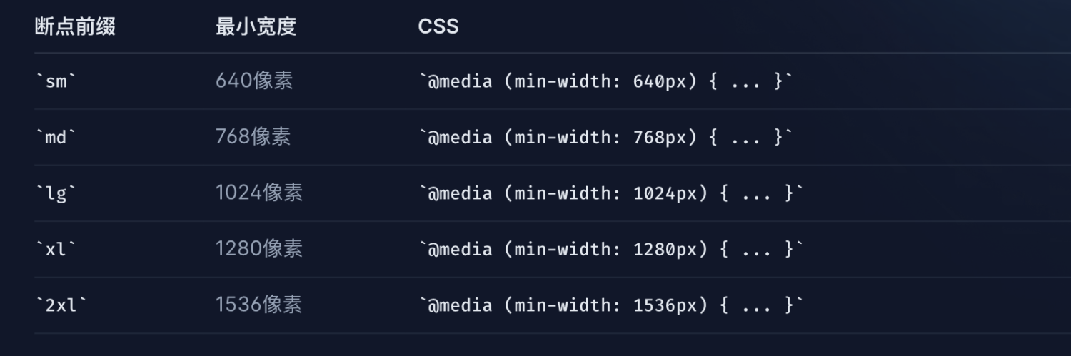
### 響應式設計
Tailwind 中的每個實用程式類都可以在不同的斷點處有條件地應用,這使得建構複雜的響應式界面變得輕而易舉,而無需離開 HTML。
受常見裝置分辨率的啟發,預設有五個斷點:
```html
<div class="max-w-md mx-auto bg-white rounded-xl shadow-md overflow-hidden md:max-w-2xl">
<div class="md:flex">
<div class="md:shrink-0">
<img referrerPolicy="no-referrer" referrerPolicy="no-referrer" referrerPolicy="no-referrer" referrerPolicy="no-referrer" referrerPolicy="no-referrer" referrerPolicy="no-referrer" referrerPolicy="no-referrer" referrerPolicy="no-referrer" referrerPolicy="no-referrer" referrerPolicy="no-referrer" referrerPolicy="no-referrer" referrerPolicy="no-referrer" class="h-48 w-full object-cover md:h-full md:w-48" src="/img/building.jpg" alt="Modern building architecture">
</div>
<div class="p-8">
<div class="uppercase tracking-wide text-sm text-indigo-500 font-semibold">Company retreats</div>
<a href="#" class="block mt-1 text-lg leading-tight font-medium text-black hover:underline">Incredible accommodation for your team</a>
<p class="mt-2 text-slate-500">Looking to take your team away on a retreat to enjoy awesome food and take in some sunshine? We have a list of places to do just that.</p>
</div>
</div>
</div>
比如要實作一個媒體查詢,根據不同的螢幕寬度實作不同的圖檔寬度。
按照之前的寫法,可能得這麼幹
@mediaonly screen and (max-width:1280px) {
  .img {
    width:196px;
  }
}
@mediaonly screen and (max-width:760px) {
  .img {
    width:128px;
  }
}
// tailwind方案
<img  referrerPolicy="no-referrer"   referrerPolicy="no-referrer"   referrerPolicy="no-referrer"   referrerPolicy="no-referrer"   referrerPolicy="no-referrer"   referrerPolicy="no-referrer"   referrerPolicy="no-referrer"   referrerPolicy="no-referrer"   referrerPolicy="no-referrer"   referrerPolicy="no-referrer"   referrerPolicy="no-referrer"   referrerPolicy="no-referrer"  class="w-16 md:w-32 lg:w-48" src="...">
深色模式
Tailwind 提供了一個dark變體,可在啟用暗模式時以不同的方式設計網站
<div class="bg-white dark:bg-slate-800 rounded-lg px-6 py-8 ring-1 ring-slate-900/5 shadow-xl">
  <div>
    <span class="inline-flex items-center justify-center p-2 bg-indigo-500 rounded-md shadow-lg">
      <svg class="h-6 w-6 text-white" xmlns="http://www.w3.org/2000/svg" fill="none" viewBox="0 0 24 24" stroke="currentColor" aria-hidden="true"><!-- ... --></svg>
    </span>
  </div>
  <h3 class="text-slate-900 dark:text-white mt-5 text-base font-medium tracking-tight">Writes Upside-Down</h3>
  <p class="text-slate-500 dark:text-slate-400 mt-2 text-sm">
    The Zero Gravity Pen can be used to write in any orientation, including upside-down. It even works in outer space.
  </p>
</div>
重用樣式
<div>
  <div class="mt-3 flex -space-x-2 overflow-hidden">
    <img  referrerPolicy="no-referrer"   referrerPolicy="no-referrer"   referrerPolicy="no-referrer"   referrerPolicy="no-referrer"   referrerPolicy="no-referrer"   referrerPolicy="no-referrer"   referrerPolicy="no-referrer"   referrerPolicy="no-referrer"   referrerPolicy="no-referrer"   referrerPolicy="no-referrer"   referrerPolicy="no-referrer"   referrerPolicy="no-referrer"  class="inline-block h-12 w-12 rounded-full ring-2 ring-white" src="https://images.unsplash.com/photo-1491528323818-fdd1faba62cc?ixlib=rb-1.2.1&ixid=eyJhcHBfaWQiOjEyMDd9&auto=format&fit=facearea&facepad=2&w=256&h=256&q=80" alt=""/>
    <img  referrerPolicy="no-referrer"   referrerPolicy="no-referrer"   referrerPolicy="no-referrer"   referrerPolicy="no-referrer"   referrerPolicy="no-referrer"   referrerPolicy="no-referrer"   referrerPolicy="no-referrer"   referrerPolicy="no-referrer"   referrerPolicy="no-referrer"   referrerPolicy="no-referrer"   referrerPolicy="no-referrer"   referrerPolicy="no-referrer"   class="inline-block h-12 w-12 rounded-full ring-2 ring-white" src="https://images.unsplash.com/photo-1550525811-e5869dd03032?ixlib=rb-1.2.1&auto=format&fit=facearea&facepad=2&w=256&h=256&q=80" alt=""/>
    <img  referrerPolicy="no-referrer"   referrerPolicy="no-referrer"   referrerPolicy="no-referrer"   referrerPolicy="no-referrer"   referrerPolicy="no-referrer"   referrerPolicy="no-referrer"   referrerPolicy="no-referrer"   referrerPolicy="no-referrer"   referrerPolicy="no-referrer"   referrerPolicy="no-referrer"   referrerPolicy="no-referrer"   referrerPolicy="no-referrer"  class="inline-block h-12 w-12 rounded-full ring-2 ring-white" src="https://images.unsplash.com/photo-1500648767791-00dcc994a43e?ixlib=rb-1.2.1&ixid=eyJhcHBfaWQiOjEyMDd9&auto=format&fit=facearea&facepad=2.25&w=256&h=256&q=80" alt=""/>
    <img  referrerPolicy="no-referrer"   referrerPolicy="no-referrer"   referrerPolicy="no-referrer"   referrerPolicy="no-referrer"   referrerPolicy="no-referrer"   referrerPolicy="no-referrer"   referrerPolicy="no-referrer"   referrerPolicy="no-referrer"   referrerPolicy="no-referrer"   referrerPolicy="no-referrer"   referrerPolicy="no-referrer"   referrerPolicy="no-referrer"  class="inline-block h-12 w-12 rounded-full ring-2 ring-white" src="https://images.unsplash.com/photo-1472099645785-5658abf4ff4e?ixlib=rb-1.2.1&ixid=eyJhcHBfaWQiOjEyMDd9&auto=format&fit=facearea&facepad=2&w=256&h=256&q=80" alt=""/>
    <img  referrerPolicy="no-referrer"   referrerPolicy="no-referrer"   referrerPolicy="no-referrer"   referrerPolicy="no-referrer"   referrerPolicy="no-referrer"   referrerPolicy="no-referrer"   referrerPolicy="no-referrer"   referrerPolicy="no-referrer"   referrerPolicy="no-referrer"   referrerPolicy="no-referrer"   referrerPolicy="no-referrer"   referrerPolicy="no-referrer"   class="inline-block h-12 w-12 rounded-full ring-2 ring-white" src="https://images.unsplash.com/photo-1517365830460-955ce3ccd263?ixlib=rb-1.2.1&ixid=eyJhcHBfaWQiOjEyMDd9&auto=format&fit=facearea&facepad=2&w=256&h=256&q=80" alt=""/>
  </div>
</div>
每個頭像的程式類重複了5次
<script setup></script>
<template>
	<div>
        <div class="mt-3 flex -space-x-2 overflow-hidden">
            <img  referrerPolicy="no-referrer"   referrerPolicy="no-referrer"   referrerPolicy="no-referrer"   referrerPolicy="no-referrer"   referrerPolicy="no-referrer"   referrerPolicy="no-referrer"   referrerPolicy="no-referrer"   referrerPolicy="no-referrer"   referrerPolicy="no-referrer"   referrerPolicy="no-referrer"   referrerPolicy="no-referrer"   referrerPolicy="no-referrer"  class="avator" src="https://images.unsplash.com/photo-1491528323818-fdd1faba62cc?ixlib=rb-1.2.1&ixid=eyJhcHBfaWQiOjEyMDd9&auto=format&fit=facearea&facepad=2&w=256&h=256&q=80" alt=""/>
            <img  referrerPolicy="no-referrer"   referrerPolicy="no-referrer"   referrerPolicy="no-referrer"   referrerPolicy="no-referrer"   referrerPolicy="no-referrer"   referrerPolicy="no-referrer"   referrerPolicy="no-referrer"   referrerPolicy="no-referrer"   referrerPolicy="no-referrer"   referrerPolicy="no-referrer"   referrerPolicy="no-referrer"   referrerPolicy="no-referrer"  class="avator" src="https://images.unsplash.com/photo-1550525811-e5869dd03032?ixlib=rb-1.2.1&auto=format&fit=facearea&facepad=2&w=256&h=256&q=80" alt=""/>
            <img  referrerPolicy="no-referrer"   referrerPolicy="no-referrer"   referrerPolicy="no-referrer"   referrerPolicy="no-referrer"   referrerPolicy="no-referrer"   referrerPolicy="no-referrer"   referrerPolicy="no-referrer"   referrerPolicy="no-referrer"   referrerPolicy="no-referrer"   referrerPolicy="no-referrer"   referrerPolicy="no-referrer"   referrerPolicy="no-referrer"  class="avator" src="https://images.unsplash.com/photo-1500648767791-00dcc994a43e?ixlib=rb-1.2.1&ixid=eyJhcHBfaWQiOjEyMDd9&auto=format&fit=facearea&facepad=2.25&w=256&h=256&q=80" alt=""/>
            <img  referrerPolicy="no-referrer"   referrerPolicy="no-referrer"   referrerPolicy="no-referrer"   referrerPolicy="no-referrer"   referrerPolicy="no-referrer"   referrerPolicy="no-referrer"   referrerPolicy="no-referrer"   referrerPolicy="no-referrer"   referrerPolicy="no-referrer"   referrerPolicy="no-referrer"   referrerPolicy="no-referrer"   referrerPolicy="no-referrer"   class="avator" src="https://images.unsplash.com/photo-1472099645785-5658abf4ff4e?ixlib=rb-1.2.1&ixid=eyJhcHBfaWQiOjEyMDd9&auto=format&fit=facearea&facepad=2&w=256&h=256&q=80" alt=""/>
            <img  referrerPolicy="no-referrer"   referrerPolicy="no-referrer"   referrerPolicy="no-referrer"   referrerPolicy="no-referrer"   referrerPolicy="no-referrer"   referrerPolicy="no-referrer"   referrerPolicy="no-referrer"   referrerPolicy="no-referrer"   referrerPolicy="no-referrer"   referrerPolicy="no-referrer"   referrerPolicy="no-referrer"   referrerPolicy="no-referrer"  class="avator" src="https://images.unsplash.com/photo-1517365830460-955ce3ccd263?ixlib=rb-1.2.1&ixid=eyJhcHBfaWQiOjEyMDd9&auto=format&fit=facearea&facepad=2&w=256&h=256&q=80" alt=""/>
        </div>
    </div>
</template>
<style scoped>
	@tailwind base;
@tailwind components;
@tailwind utilities;

@layer components {
  .avator-primary {
    @apply inline-block h-12 w-12 rounded-full ring-2 ring-white;
  }
}
</style>
功能和指令
@tailwind
使用@tailwind指令可以向css添加tailwind的base、component、utilities樣式
/**
 * This injects Tailwind's base styles and any base styles registered by
 * plugins.
 */
 @tailwind base;
/**
 * This injects Tailwind's component classes and any component classes
 * registered by plugins.
 */
 @tailwind components;
/**
 * This injects Tailwind's utility classes and any utility classes registered
 * by plugins.
 */
 @tailwind utilities;
@apply
使用 @apply 将任何現存的功能類内聯到自定義 CSS 中。如上面重複樣式的例子所用的方式。
@layer
使用 @layer 指令告訴 Tailwind 一組自定義樣式應該屬于哪個 “bucket”。可用的層有 base, components 和 utilities。
@tailwind base;
@tailwind components;
@tailwind utilities;

/*
如果想為特定 HTML 元素添加自己的預設基本樣式,使用指令@layer将這些樣式添加到 Tailwind
的base圖層中
*/
@layer base {
  h1 {
    @apply text-2xl;
  }
  h2 {
    @apply text-xl;
  }
}
/*
component更适合用于複雜的、需要在多個地方重複使用的樣式
*/

@layer components {
  .btn-blue {
    @apply bg-blue-500 hover:bg-blue-700 text-white font-bold py-2 px-4 rounded;
  }
}
/*
utilities更适合用于快速建立簡單的、僅在特定場景使用的樣式。
*/
@layer utilities {
  @variants hover, focus {
    .filter-none {
      filter: none;
    }
    .filter-grayscale {
      filter: grayscale(100%);
    }
  }
}
@screen
@screen 指令允許建立通過名稱引用斷點的媒體查詢,而不是在 CSS 中複制他們的值。
/* 假設有一個名為 sm 的 640px 的斷點,隻需要寫一些自定義的指向這個斷點的 CSS。 */
/* 而不是編寫一個複制那些值的原始的媒體查詢,如下所示: */
@media (min-width:640px) {
  /* ... */
}

@screen sm {
  /* ... */
}
screen()
screen 函數接受像 md 這樣的螢幕名稱并生成相應的媒體特征表達式:
/* Input */
@media screen(sm) {
  /* ... */
}

/* Output */
@media (min-width:640px) {
  /* ... */
}
theme()
使用 theme() 函數可以通過點符号來擷取 Tailwind 配置的值。 當想要引用一個主題配置中的一部分聲明的值時
@tailwind utilities;
@layer utilities {
    .div {
        border: 1px solid theme('colors.cyan');
    }
}
定制
tailwind.config.js配置任何自定義項:内容、主題、螢幕、顔色、間距、插件、預設
// tailwind.config.js
module.exports = {
  // 内容
  content: ['./src/**/*.{html,js}'],
  // 主題
  theme: {
    // 螢幕
    screens: {
      sm: '480px',
      md: '768px',
      lg: '976px',
      xl: '1440px',
    },
    // 顔色
    colors: {
      'blue': '#1fb6ff',
      'purple': '#7e5bef',
      'pink': '#ff49db',
      'orange': '#ff7849',
      'green': '#13ce66',
      'yellow': '#ffc82c',
      'gray-dark': '#273444',
      'gray': '#8492a6',
      'gray-light': '#d3dce6',
    },
    // 間距
    spacing: {
      '1': '8px',
      '2': '12px',
      '3': '16px',
      '4': '24px',
      '5': '32px',
      '6': '48px',
    },
    fontFamily: {
      sans: ['Graphik', 'sans-serif'],
      serif: ['Merriweather', 'serif'],
    },
    extend: {
      // 擴充預設間距比例
      spacing: {
        '13': '3.25rem',
        '15': '3.75rem',
        '128': '32rem',
        '144': '36rem',
      },
      borderRadius: {
        '4xl': '2rem',
      }
    }
  },
    /*
      使用可重用的第三方插件擴充 Tailwind。插件允許為 Tailwind 注冊新樣式
    */
    plugins: [
        require('@tailwindcss/line-clamp'),
    ],
}
4、原理
從TaiWindCss實踐的使用場景上來看,我們以 PostCSS 插件的形式安裝TaiWindCss,本質上講TaiWindCss是一個postCss的插件。 對于PostCSS的插件使用,我們在使用的過程中一般都需要如下步驟:
- PostCSS 配置檔案 postcss.config.js,新增 tailwindcss 插件。
- TaiWindCss插件需要一份配置檔案,比如:tailwind.config.js。
- 項目 引入的 less,sass,css 檔案中注入 @tailwind 辨別,并引入 base,components,utilities,是否全部引入取決你自己。
使用postcss做處理器
// `postcss-import`:用于處理 PostCSS 的規範插件
npm install postcss-import


// postcss.config.js
// 然後把它作為 PostCSS 配置中的第一個插件:
exportdefault {
  plugins: {
      tailwindcss: {},
      autoprefixer: {},
  },
}
了解什麼是postcss
通俗的講法:postCss 就是一個開發工具,是一個用 JavaScript 工具和插件轉換 CSS 代碼的工具。支援變量,混入,未來 CSS 文法,内聯圖像等等。
特性與常見的功能:
- 增強代碼的可讀性:
- 将未來的 CSS 特性帶到今天
- 避免 CSS 代碼中的錯誤
- 可以作為預處理器使用
postCss的核心原理/工作流
PostCSS 包括 CSS 解析器,CSS 節點樹 API,一個源映射生成器和一個節點樹 stringifier。
PostCSS 主要的原理核心工作流:
- 通過 fs 讀取CSS檔案
- 通過 parser 将CSS解析成抽象文法樹(AST樹)
- 将AST樹”傳遞”給任意數量的插件處理
- 諸多插件進行資料處理。插件間傳遞的資料就是AST樹
- 通過 stringifier 将處理完畢的AST樹重新轉換成字元串
image.png
- 将CSS解析成抽象文法樹(AST樹)
- 将AST樹”傳遞”給任意數量的插件處理
- 将處理完畢的AST樹重新轉換成字元串
在PostCSS中有幾個關鍵的處理機制:(詳細看postcss文檔)
Source string → Tokenizer(分詞器) → Parser(解析器) → AST → Processor (處理器)→ Stringifier(弦化器)->new css
tailwindcss工作流
image.png
基本的步驟:
- 将CSS解析成抽象文法樹(AST樹)
- 讀取插件配置,根據配置檔案,生成新的抽象文法樹
- 将AST樹”傳遞”給一系列資料轉換操作處理(變量資料循環生成,切套類名循環等)
- 清除一系列操作留下的資料痕迹
- 将處理完畢的AST樹重新轉換成字元串
tailwindcss 大多作為 postcss plugin 來使用的,它源碼裡自己實作了一個檔案讀取機制(也就是 tailwind.config.js 中的 content 配置項 ),來對我們編寫的代碼進行提取。
// 轉換前
@layer components{
  @variants responsive{
    .container{
      width: 100%
    }
  }
}
// 轉換後
{
  "raws": {
    "semicolon": false,
    "after": "\\n\\n"
  },
  "type": "root",
  "nodes": [
    {
      "raws": {
        "before": "",
        "between": "",
        "afterName": " ",
        "semicolon": false,
        "after": "\\n"
      },
      "type": "atrule",
      "name": "layer",
      "source": {
        "start": {
          "line": 1,
          "column": 1
        },
        "input": {
          "css": "@layer components{\\n  @variants responsive{\\n    .container{\\n      width: 100%\\n    }\\n  }\\n}\\n\\n",
          "hasBOM": false,
          "id": "<input css 17>"
        },
        "end": {
          "line": 7,
          "column": 1
        }
      },
      "params": "components",
      "nodes": [
        {
          "raws": {
            "before": "\\n  ",
            "between": "",
            "afterName": " ",
            "semicolon": false,
            "after": "\\n  "
          },
          "type": "atrule",
          "name": "variants",
          "source": {
            "start": {
              "line": 2,
              "column": 3
            },
            "input": {
              "css": "@layer components{\\n  @variants responsive{\\n    .container{\\n      width: 100%\\n    }\\n  }\\n}\\n\\n",
              "hasBOM": false,
              "id": "<input css 17>"
            },
            "end": {
              "line": 6,
              "column": 3
            }
          },
          "params": "responsive",
          "nodes": [
            {
              "raws": {
                "before": "\\n    ",
                "between": "",
                "semicolon": false,
                "after": "\\n    "
              },
              "type": "rule",
              "nodes": [
                {
                  "raws": {
                    "before": "\\n      ",
                    "between": ": "
                  },
                  "type": "decl",
                  "source": {
                    "start": {
                      "line": 4,
                      "column": 7
                    },
                    "input": {
                      "css": "@layer components{\\n  @variants responsive{\\n    .container{\\n      width: 100%\\n    }\\n  }\\n}\\n\\n",
                      "hasBOM": false,
                      "id": "<input css 17>"
                    },
                    "end": {
                      "line": 4,
                      "column": 17
                    }
                  },
                  "prop": "width",
                  "value": "100%"
                }
              ],
              "source": {
                "start": {
                  "line": 3,
                  "column": 5
                },
                "input": {
                  "css": "@layer components{\\n  @variants responsive{\\n    .container{\\n      width: 100%\\n    }\\n  }\\n}\\n\\n",
                  "hasBOM": false,
                  "id": "<input css 17>"
                },
                "end": {
                  "line": 5,
                  "column": 5
                }
              },
              "selector": ".container"
            }
          ]
        }
      ]
    }
  ],
  "source": {
    "input": {
      "css": "@layer components{\\n  @variants responsive{\\n    .container{\\n      width: 100%\\n    }\\n  }\\n}\\n\\n",
      "hasBOM": false,
      "id": "<input css 17>"
    },
    "start": {
      "line": 1,
      "column": 1
    }
  }
}
image.png
5、問題
問題1、為什麼不直接使用内聯樣式呢?
- 有限制的設計。使用内聯樣式,每個值都是一個神奇的數字。使用實用程式,可以從預定義的設計系統中選擇樣式,這使得建構視覺上一緻的 UI 變得更加容易。
- 響應式設計。不能在内聯樣式中使用媒體查詢,但可以使用 Tailwind 的響應式實用程式輕松建構完全響應式界面。
- 懸停、焦點等狀态。内聯樣式無法針對懸停或焦點等狀态,但 Tailwind 的狀态變體可以輕松地使用實用程式類來設定這些狀态的樣式
問題2、與bootstrap的差別
許多人會想到 CSS 架構,有很多,例如 Bootstrap、Bulma 和 Material UI。Bootstrap 和 Bulma 等架構利用預先準備好的元件(例如按鈕、菜單和面包屑)進行設計。在 Tailwind CSS 中,沒有準備任何元件,而是使用Utilize Class來建立和設計自己的元件。 原來Bootstrap等架構可以通過提前準備元件集合來高效地設計網站,但是有一個缺點,就是因為使用了相同的設計,是以沒有原創性。相比之下,Tailwind CSS 沒有元件集合,是以即使你建立一個名為相同按鈕的元件,每個人都會應用不同的Utilize Class建立它,可以建立出一個高度原創的網站。
兩者都有優點和缺點,是以使用哪一個取決于個人,但使用 Tailwind CSS 的人數正在穩步增加
什麼是Utilize Class?
例如,如果要使用 Bootstrap 建立按鈕,請将class設定為btn 。但是,在 Tailwind 中,并沒有 btn 等用于建立按鈕的class,你可以通過編寫如下所示的Utilize Class來建立按鈕。你可能會覺得要設定的類太多了,但是學習成本很低,因為你一用就習慣了。如果不知道類名,可以通過搜尋 Tailwind CSS 文檔輕松找到它
<button class="bg-indigo-700 font-semibold text-white py-2 px-4 rounded">Utilize Class</button>
<!--
bg-indigo-700 設定顔色,
font-semibold 設定字型粗細,
text-white 設定文本顔色,
py-2 設定左右填充,
px 設定上下填充,
rounded 設定圓角。
-->
問題3、這跟在項目中直接寫好全局的類名然後直接使用,有什麼差別呢?
demo說明:tailwindcss/test
<!DOCTYPE html>
<html lang="en">
<head>
    <meta charset="UTF-8">
    <meta http-equiv="X-UA-Compatible" content="IE=edge">
    <meta name="viewport" content="width=device-width, initial-scale=1.0">
    <title>Document</title>
    <link rel="stylesheet" href="/dist/output.css">
</head>
<body>
    <div>
        <h1 class="flex text-3xl font-bold underline text-blue-600">
            Hello world!
        </h1>
    </div>
</body>
</html>
在demo中,我隻是用了flex text-3xl font-bold underline text-blue-600,這幾個類名,打包之後發現,css檔案當中除了基礎樣式,就隻有這幾個類對應樣式:
其實我們在搭建tailwind的項目過程中就可以發現,tailwind存在于JIT引擎(Just-In-Time),就是在編譯過程才去掃描我們的html檔案,在這個過程中去識别使用了哪些類名,然後才生成對應的樣式。 相比于預先直接全局寫好大量的類名,JIT機制的優點在于精簡緊湊,樣式所占用的空間較小,因為用到了才會生成。
// 啟用JIT模式
/** @type {import('tailwindcss').Config} */
module.exports = {
  mode: 'JIT',
  /**
  * 由于 JIT 模式通過掃描模闆檔案按需生成 CSS,是以在 tailwind.config.js
  * 檔案中使用所有模闆路徑配置 purge 選項至關重要
  * 啟動開發伺服器或建構運作器時,Tailwind 将按需生成您的樣式,而不是預先生成所有内容。
  */
  purge: [
    "public/**/*.html",
    "src/pages/**/*.{js,jsx,ts,tsx,vue}"
  ],
  theme: {
    extend: {},
  },
  plugins: [],
}
問題4、與其他UI元件同時引用時,可能會出現樣式沖突
// 注釋掉 @tailwind base 樣式
// tailwind.css
/* @tailwind base;
@tailwind components;
@tailwind utilities; */


// 關閉預設樣式
// tailwind.config.js
...
exportconstcorePlugins = {
	  preflight: false
}
...
下載下傳preflight.css,手動導入,解決沖突。
6、總結
優點
- 預設樣式好看
- 響應式系統更靈活
- 主題可配置
- 工具鍊完善
- 開發效率高(配合VSCode插件)
應用場景
- 偏展示型的網站(企業官網,産品官網,币圈各種官網等等)
适用人群
- 對UI有決定權的人
- 會前端的設計師
- 獨立開發者
- ...
最後
為啥這個 css 架構叫 tailwind 呢? 因為作者 Adam Wathan喜歡叫做 kiteboarding 風筝沖浪的運動。 就是這樣的,一個風筝,一個沖浪闆:
這種運動在順風 tailwind 和逆風 headwind 下有不同的技巧。而 tailwind 的時候明顯更加省力。 是以就給這個 css 架構起名叫 tailwind 了,借用其省力的意思。
作者介紹
賀燕珍:
- 一個有兩個孩子的媽媽。
- 喜歡跑步、爬山和聽音樂,這些活動可以幫助我釋放壓力。
- 對自由的渴望驅使着我不斷追求個人發展和成長。
- 享受探索新技術和建構使用者友好的界面的過程。
- 希望我能努力保持積極的心态,以充滿熱情和創造力的方式工作。
來源:微信公衆号:58本地服務終端技術
出處:https://mp.weixin.qq.com/s/y9ZIJX_FxgeTRUi695-eDw