經典CSS題目:三欄布局
假設頁面高度已知,請寫出三欄布局,其中左欄、右欄寬度各為300px,中間自适應。
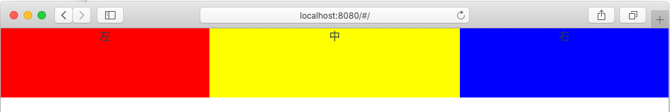 CSS實作三欄布局的方法(自适應)
 <style>
.layout{
width: 100%;
min-height: 200px;
}
.layout .left{
float:
left;width: 300px;
background: red;
}
.layout .right{
float: right;
width: 300px;background: blue;
}
.layout .center{
background: yellow;
}
</style>
<section class="layout float">
<div class="left">左</div>
<div class="right">右</div>
<div class="center">中</div>
</section>
<style>
    .layout{
    width: 100%;
    min-height: 200px;
    }
    .layout .left{
    position: absolute;
    left: 0;
    width: 300px;
    background: red;
    }
    .layout .right{
    position: absolute;
    right: 0;
    width: 300px;
    background: blue;
    }
    .layout .center{
    left: 300px;
    right: 300px;
    background: yellow;
    }
</style>
<section class="layout absolute">
  <div class="left">左</div>
  <div class="right">右</div>
  <div class="center">中</div>
</section>
<style>
.layout{
  width: 100%;
  display: flex;
  min-height: 200px;
  }
.layout .left{
  width: 300px;
  background: red;
  }
.layout .right{
  width: 300px;
  background: blue;
  }
.layout .center{
  flex: 1;
  background: yellow;
  }
</style>
<section class="layout flexbox">
  <div class="left">左</div>
  <div class="center">中</div>
  <div class="right">右</div>
</section>
<style>
.layout{
  width: 100%;
  display: table;
  min-height: 200px;
  }
.layout>div{
  display: table-cell;
}
.layout .left{
  width: 300px;
  background: red;
  }
.layout .right{
  width: 300px;
  background: blue;
  }
.layout .center{
  flex: 1;
  background: yellow;
  }
</style>
<section class="layout table">
  <div class="left">左</div>
  <div class="center">中</div>
  <div class="right">右</div>
</section>
<style>
.layout{
  width: 100%;
  display: grid;
  grid-template-columns: 300px auto 300px;
  grid-template-rows: 100px;
  }
.layout .left{
  background: red;
  }
.layout .right{
  background: blue;
  }
.layout .center{
  background: yellow;
  }
</style>
<section class="layout grid">
  <div class="left">左</div>
  <div class="center">中</div>
  <div class="right">右</div>
</section>
![沒救了! 困擾程式員一輩子的5個魔咒, 改掉比登天還難![圖]](data:image/gif;base64,R0lGODlhAQABAIAAAP///wAAACwAAAAAAQABAAACAkQBADs=)