html樣式
一、二、三這三個點數很容易,div裡面有幾個點就加幾個span。到了四,就需要進行分組。四分兩組,五和六分三組
css代碼
先寫容器骰子的樣式
body{
display: flex;
justify-content: space-around;
align-items: center;
}
div{
width: 100px;
height: 100px;
background: #e7e7e7;
padding: 4px;
box-shadow: inset 0 5px white, inset 0 -5px #bbb, inset 5px 0 #d7d7d7, inset -5px 0 #d7d7d7;
border-radius: 10px;
}
接下來寫點數span的樣式,寫一、二、三點。##先把骰子的六個面在遊覽器水準居中排列:六個div,給它們設定相同的樣式。同時body要把它轉換成彈性盒。讓六個div在body彈性盒中,沿着主軸(x軸)自由配置設定,同時在側軸(y軸)居中。
span{
width: 30px;
height: 30px;
background: #000;
border-radius: 15px;
}
div:nth-child(1){
display: flex;
justify-content: center;
align-items: center;
}
div:nth-child(2){
display: flex;
justify-content: space-between;
}
div:nth-child(2) span:nth-child(2){
align-self: flex-end;
}
div:nth-child(3){
display: flex;
justify-content: space-between;
}
div:nth-child(3) span:nth-child(2){
align-self: center;
}
div:nth-child(3) span:nth-child(3){
align-self: flex-end;
}
第四點有兩種寫法。不論哪一種,article的樣式都一樣
article{
display: flex;
justify-content: space-between;
}
第一種
div:nth-child(4){
display: flex;
justify-content: space-between;
}
div:nth-child(4) article{
display: flex;
flex-direction: column;
justify-content: space-between;
}
第二種
div:nth-child(4){
display: flex;
flex-direction: column;
justify-content: space-between;
}
五和六的代碼
div:nth-child(5){
display: flex;
flex-direction: column;
}
div:nth-child(5) article:nth-child(2){
justify-content: center;
}
div:nth-child(6){
display: flex;
flex-direction: column;
}
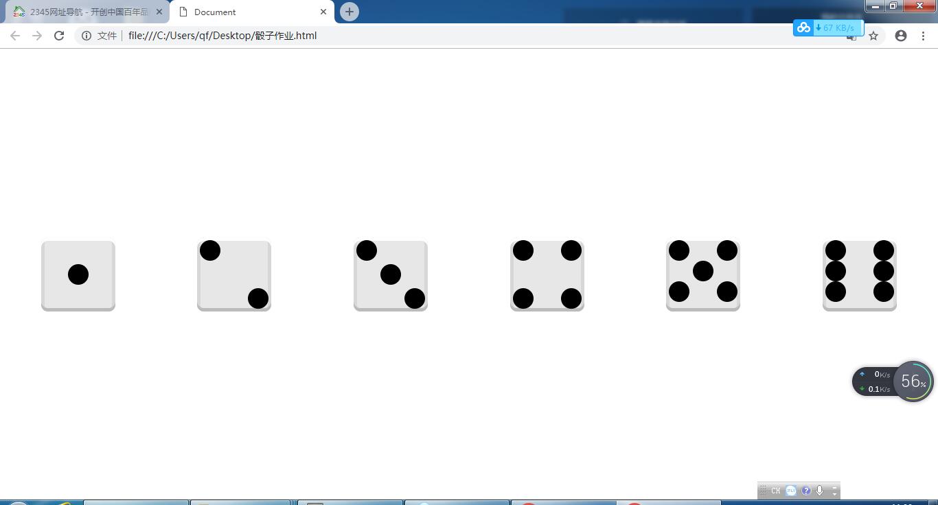
最後的效果如下圖所示