SlidingDrawer可以實作抽屜元件的功能,但有局限性,隻支援從右向左打開或從下向上打開抽屜
這個抽屜元件在使用時,需要由兩部分組成:
1) 抽屜内容(Content)
2) 抽屜把手(Handle):一般使用一張圖檔來處理。
效果圖:
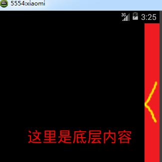

編寫一個布局,完成抽屜元件的顯示:activity_main.xml
<RelativeLayout xmlns:android="http://schemas.android.com/apk/res/android"
xmlns:tools="http://schemas.android.com/tools"
android:layout_width="match_parent"
android:layout_height="match_parent" >
<TextView
android:layout_width="match_parent"
android:layout_height="match_parent"
android:gravity="center"
android:text="這裡是底層内容"
android:textColor="#ff0000"
android:textSize="30sp" />
<SlidingDrawer
android:id="@+id/sliding"
android:layout_width="match_parent"
android:layout_height="match_parent"
android:content="@+id/content"
android:handle="@+id/handle_img"
android:orientation="horizontal" >
<ImageView
android:id="@id/handle_img"
android:layout_width="30dp"
android:layout_height="800dp"
android:src="@drawable/show" />
<LinearLayout
android:id="@id/content"
android:background="#0000ff"
android:layout_width="match_parent"
android:layout_height="match_parent"
android:orientation="vertical" >
<Button
android:id="@+id/select_btn"
android:layout_width="wrap_content"
android:layout_height="wrap_content"
android:text="選擇對話框" />
<Button
android:id="@+id/radio_btn"
android:layout_width="wrap_content"
android:layout_height="wrap_content"
android:text="單選對話框" />
<Button
android:id="@+id/checkbox_btn"
android:layout_width="wrap_content"
android:layout_height="wrap_content"
android:text="多選對話框" />
<Button
android:id="@+id/date_btn"
android:layout_width="wrap_content"
android:layout_height="wrap_content"
android:text="日期選擇對話框" />
<Button
android:id="@+id/time_btn"
android:layout_width="wrap_content"
android:layout_height="wrap_content"
android:text="時間選擇對話框" />
<Button
android:id="@+id/my_btn"
android:layout_width="wrap_content"
android:layout_height="wrap_content"
android:text="自定義對話框" />
<Button
android:id="@+id/toast_btn"
android:layout_width="wrap_content"
android:layout_height="wrap_content"
android:text="自定義浮動框" />
</LinearLayout>
</SlidingDrawer>
</RelativeLayout>
//SlidingDrawer也要設定方向,水準方向就是從右向左,垂直方向就是從下向上
可以加入監聽,控制SlidingDrawer中的Handle圖檔的切換。
private SlidingDrawer drawer;
private ImageView handleImg;
drawer = (SlidingDrawer)findViewById(R.id.sliding);
handleImg = (ImageView) findViewById(R.id.handle_img);
drawer.setOnDrawerOpenListener(newOnDrawerOpenListener() {
@Override
public void onDrawerOpened() {
handleImg.setImageResource(R.drawable.hide);
}
});
drawer.setOnDrawerCloseListener(new OnDrawerCloseListener() {
@Override
public void onDrawerClosed() {
handleImg.setImageResource(R.drawable.show);
}
});
抽屜元件功能實作;-------------------------------------------------------------------------------------------------------------------
自定義View的配置和使用:
自定義View就是開發人員自行開發一個元件,可以自由控制元件實作的功能,在99%的遊戲中,和很多大型的應用中都會用到自定義View。
編寫自定義的View時,必須繼承一個View的類,并覆寫onDraw方法。
onDraw方法中提供了繪制目前元件内部的所有内容的功能。
同時還要覆寫構造方法。
一般的自定義元件都要加入onTouchListener觸屏監聽。
一、建立一個自定義的元件,并完成一些簡單的繪制操作。
public class MyView extends View {
public MyView(Context context) {
super(context);
}
public MyView(Context context, AttributeSet attrs) {
super(context, attrs);
}
public MyView(Context context, AttributeSet attrs, int defStyle) {
super(context, attrs, defStyle);
}
// 繪制元件中的具體内容
@Override
protected void onDraw(Canvascanvas) {
// 先清空之前繪制的所有内容.
super.onDraw(canvas);
// 建立繪制參數對象
Paint paint = new Paint();
// 通過該對象設定繪制的顔色,文字大小,填充狀态等資訊
paint.setTextSize(20);
paint.setColor(Color.RED);
// 繪制一些内容
// 繪制文字
canvas.drawText("測試資訊", 100, 50, paint);
// 切換新的顔色
paint.setColor(Color.GREEN);
// 繪制線
canvas.drawLine(50, 100, 100, 200, paint);
// 設定繪制的形式,以及顔色
paint.setColor(Color.BLUE);
paint.setStyle(Style.FILL_AND_STROKE);
// 繪制圖形
canvas.drawRect(100, 400, 300, 500,paint);
// 繪制已有的圖檔
canvas.drawBitmap(BitmapFactory.decodeResource(getResources(),
R.drawable.close_dir), 100, 600, paint);
}
}
二、建立配置實用
<RelativeLayout xmlns:android="http://schemas.android.com/apk/res/android"
xmlns:tools="http://schemas.android.com/tools"
android:layout_width="match_parent"
android:layout_height="match_parent"
android:background="#ffffff">
<org.liky.first.view.MyView
android:id="@+id/my_view"
android:layout_width="match_parent"
android:layout_height="match_parent">
</org.liky.first.view.MyView>
</RelativeLayout>