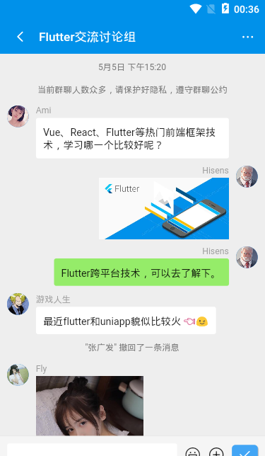
最近flutter跨平台應用技術比較火,作為前端開發有必要去學習了解下。這次給大家分享的是基于flutter+dart+chewie+photo_view+image_picker等技術開發仿微信app聊天項目。
技術點
- 編碼/技術:Vscode + Flutter 1.12.13/Dart 2.7.0
- 視訊元件:chewie: ^0.9.7
- 圖檔/拍照:image_picker: ^0.6.6+1
- 圖檔預覽元件:photo_view: ^0.9.2
- 彈窗元件:SimpleDialog/AlertDialog/SnackBar(flutter封裝自定義)
- 本地存儲:shared_preferences: ^0.5.7+1
- 字型圖示:阿裡iconfont字型圖示庫
flutter入口頁面main.dart
/**
 * @tpl Flutter入口頁面 | Q:282310962
 */

import 'package:flutter/material.dart';

// 引入公共樣式
import 'styles/common.dart';

// 引入底部Tabbar頁面導航
import 'components/tabbar.dart';

// 引入位址路由
import 'router/routes.dart';

void main() => runApp(MyApp());

class MyApp extends StatelessWidget {
  @override
  Widget build(BuildContext context) {
    return MaterialApp(
      title: 'Flutter App',
      debugShowCheckedModeBanner: false,
      theme: ThemeData(
        primaryColor: GStyle.appbarColor,
      ),
      home: TabBarPage(),
      onGenerateRoute: onGenerateRoute,
    );
  }
} 
flutter圖示Icon及自定義IconData元件
flutter中自帶圖示使用非常簡單 Icon(Icons.search)
可是如果想要自定義圖示,如使用阿裡圖示iconfont如何實作,這時就需要用到IconData來實作自定義圖示了。Icon(IconData(0xe60e, fontFamily:'iconfont'), size:24.0)
使用IconData需要先下載下傳阿裡圖示庫字型檔案,然後在pubspec.yaml中引入字型
class GStyle {
    // __ 自定義圖示
    static iconfont(int codePoint, {double size = 16.0, Color color}) {
        return Icon(
            IconData(codePoint, fontFamily: 'iconfont', matchTextDirection: true),
            size: size,
            color: color,
        );
    }
}
flutter實作badge紅點提示
在app中,類似如下紅點提醒很常見,平時微信中就有見到,可以flutter沒有提供這種元件,隻能自定義實作了。
class GStyle {
    // 消息紅點
    static badge(int count, {Color color = Colors.red, bool isdot = false, double height = 18.0, double width = 18.0}) {
        final _num = count > 99 ? '···' : count;
        return Container(
            alignment: Alignment.center, height: !isdot ? height : height/2, width: !isdot ? width : width/2,
            decoration: BoxDecoration(color: color, borderRadius: BorderRadius.circular(100.0)),
            child: !isdot ? Text('$_num', style: TextStyle(color: Colors.white, fontSize: 12.0)) : null
        );
    }
}
調用非常簡單:支援自定義紅點大小、顔色,預設數字超過99就...顯示;
GStyle.badge(0, isdot:true)
GStyle.badge(13)
GStyle.badge(168, color: Colors.green, height: 17.0, width: 17.0)
flutter聊天頁面|編輯框表情處理
flutter中TextField文本框提供的maxLines屬性可實作多行/換行文本,不過預設會有個高度,可在外層加個容器限制最小高度,然後設定
maxLines: null
keyboardType: TextInputType.multiline
Container(
    margin: GStyle.margin(10.0),
    decoration: BoxDecoration(color: Colors.white, borderRadius: BorderRadius.circular(3.0)),
    constraints: BoxConstraints(minHeight: 30.0, maxHeight: 150.0),
    child: TextField(
        maxLines: null,
        keyboardType: TextInputType.multiline,
        decoration: InputDecoration(
          hintStyle: TextStyle(fontSize: 14.0),
          isDense: true,
          contentPadding: EdgeInsets.all(5.0),
          border: OutlineInputBorder(borderSide: BorderSide.none)
        ),
        controller: _textEditingController,
        focusNode: _focusNode,
        onChanged: (val) {
          setState(() {
            editorLastCursor = _textEditingController.selection.baseOffset;
          });
        },
        onTap: () {handleEditorTaped();},
    ),
),
flutter滾動聊天消息到最底部,通過ListView元件controller控制器實作
ScrollController _msgController = new ScrollController();
...
ListView(
    controller: _msgController,
    padding: EdgeInsets.all(10.0),
    children: renderMsgTpl(),
)

// 滾動消息至聊天底部
void scrollMsgBottom() {
    timer = Timer(Duration(milliseconds: 100), () => _msgController.jumpTo(_msgController.position.maxScrollExtent));
}
好了,基于flutter聊天室項目今天就介紹到這裡,希望大家能喜歡~~