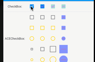
CheckBox 複選框對于所有的開發朋友并不陌生,Flutter 提供了簡單便捷的使用方法,但針對不同的業務場景,可能會有些許的不同,例如圓角矩形替換為圓形,複選框尺寸調整等;
小菜今天通過對 CheckBox 進行研究擴充實作如下功能的 自定義 ACECheckBox 複選框;
- 複選框可變更未選中狀态顔色;
- 複選框支援圓形樣式;
- 複選框支援自定義尺寸;
CheckBox
源碼分析
const Checkbox({
    Key key,
    @required this.value,       // 複選框狀态 true/false/null
    this.tristate = false,      // 是否為三态
    @required this.onChanged,   // 狀态變更回調
    this.activeColor,           // 選中狀态填充顔色
    this.checkColor,            // 選中狀态對号顔色
    this.materialTapTargetSize, // 點選範圍
})
分析源碼可知,tristate 為 true 時複選框有三種狀态;為 false 時 value 不可為 null;
案例嘗試
return Checkbox( value: state, onChanged: (value) => setState(() => state = value));

return Checkbox(value: state, checkColor: Colors.purpleAccent.withOpacity(0.7),
      onChanged: (value) => setState(() => state = value));

return Checkbox(value: state, activeColor: Colors.teal.withOpacity(0.3), checkColor: Colors.purpleAccent.withOpacity(0.7),
      onChanged: (value) => setState(() => state = value));

return Checkbox(tristate: true, value: _triState == null ? _triState : state,
      activeColor: Colors.teal.withOpacity(0.3), checkColor: Colors.purpleAccent.withOpacity(0.7),
      onChanged: (value) => setState(() {
            if (value == null) {
              _triState = value;
            } else {
              _triState = ''; state = value;
            }
          }));
} 
ACECheckBox
擴充一:變更未選中顔色
// CheckBox
inactiveColor: widget.onChanged != null ? themeData.unselectedWidgetColor : themeData.disabledColor,
// ACECheckBox
inactiveColor: widget.onChanged != null
    ? widget.unCheckColor ?? themeData.unselectedWidgetColor
    : themeData.disabledColor,
分析 CheckBox 源碼,其中複選框未選中顔色通過 ThemeData.unselectedWidgetColor 設定,修改顔色成本較大,小菜添加了 unCheckColor 屬性,可自由設定未選中狀态顔色,未設定時預設為 ThemeData.unselectedWidgetColor;
return ACECheckbox(value: aceState, unCheckColor: Colors.amberAccent, onChanged: (value) => setState(() => aceState = value));

return ACECheckbox(value: aceState, checkColor: Colors.red.withOpacity(0.7),
      unCheckColor: Colors.amberAccent, onChanged: (value) => setState(() => aceState = value));

return ACECheckbox(value: aceState, activeColor: Colors.indigoAccent.withOpacity(0.3), checkColor: Colors.red.withOpacity(0.7),
      unCheckColor: Colors.amberAccent, onChanged: (value) => setState(() => aceState = value));

return ACECheckbox(tristate: true, value: _triAceState == null ? _triAceState : aceState,
      activeColor: Colors.indigoAccent.withOpacity(0.7), checkColor: Colors.red.withOpacity(0.4),
      unCheckColor: Colors.amberAccent, onChanged: (value) {
        setState(() {
          if (value == null) {
            _triAceState = value;
          } else {
            _triAceState = ''; aceState = value;
          }
        });
}); 
擴充二:添加圓形樣式
// 繪制邊框
_drawBorder(canvas, outer, t, offset, type, paint) {
  assert(t >= 0.0 && t <= 0.5);
  final double size = outer.width;
  if ((type ?? ACECheckBoxType.normal) == ACECheckBoxType.normal) {
    canvas.drawDRRect(
        outer, outer.deflate(math.min(size / 2.0, _kStrokeWidth + size * t)),
        paint..strokeWidth = _kStrokeWidth / 2.0..style = PaintingStyle.fill);
  } else {
    canvas.drawCircle(
        Offset(offset.dx + size / 2.0, offset.dy + size / 2.0), size / 2.0,
        paint..strokeWidth = _kStrokeWidth..style = PaintingStyle.stroke);
  }
}
// 繪制填充
_drawInner(canvas, outer, offset, type, paint) {
  if ((type ?? ACECheckBoxType.normal) == ACECheckBoxType.normal) {
    canvas.drawRRect(outer, paint);
  } else {
    canvas.drawCircle(
        Offset(offset.dx + outer.width / 2.0, offset.dy + outer.width / 2.0),
        outer.width / 2.0, paint);
  }
}
分析源碼可知,CheckBox 邊框和内部填充以及對号全是通過 Canvas 進行繪制,其中繪制邊框時,采用雙層圓角矩形方式 drawDRRect,預設兩層圓角矩形之間是填充方式;小菜添加 ACECheckBoxType 屬性,允許使用者設定圓角樣式;
繪制邊框時畫筆屬性要與 drawDRRect 進行區分;其中複選框邊框和内部填充兩部分需要進行樣式判斷;
return ACECheckbox(value: aceState, unCheckColor: Colors.amberAccent, type: ACECheckBoxType.circle, onChanged: (value) => setState(() => aceState = value));

return ACECheckbox(value: aceState, checkColor: Colors.red.withOpacity(0.7),
      unCheckColor: Colors.amberAccent, type: ACECheckBoxType.circle,
      onChanged: (value) => setState(() => aceState = value));

return ACECheckbox(
      value: aceState, activeColor: Colors.indigoAccent.withOpacity(0.3), checkColor: Colors.red.withOpacity(0.7),
      unCheckColor: Colors.amberAccent, type: ACECheckBoxType.circle,
      onChanged: (value) => setState(() => aceState = value));

return ACECheckbox(tristate: true, value: _triAceState == null ? _triAceState : aceState,
      activeColor: Colors.indigoAccent.withOpacity(0.7), checkColor: Colors.red.withOpacity(0.4),
      unCheckColor: Colors.amberAccent, type: ACECheckBoxType.circle,
      onChanged: (value) {
        setState(() {
          if (value == null) {
            _triAceState = value;
          } else {
            _triAceState = ''; aceState = value;
          }
        });
}); 擴充三:自定義尺寸
@override
void paint(PaintingContext context, Offset offset) {
  final Canvas canvas = context.canvas;
  paintRadialReaction(canvas, offset, size.center(Offset.zero));

  final Paint strokePaint = _createStrokePaint(checkColor);
  final Offset origin = offset + (size / 2.0 - Size.square(width) / 2.0);
  final AnimationStatus status = position.status;
  final double tNormalized = status == AnimationStatus.forward || status == AnimationStatus.completed ? position.value : 1.0 - position.value;
  if (_oldValue == false || value == false) {
    final double t = value == false ? 1.0 - tNormalized : tNormalized;
    final RRect outer = _outerRectAt(origin, t);
    final Paint paint = Paint()..color = _colorAt(t);
    if (t <= 0.5) {
      _drawBorder(canvas, outer, t, origin, type, paint);
    } else {
      _drawInner(canvas, outer, origin, type, paint);
      final double tShrink = (t - 0.5) * 2.0;
      if (_oldValue == null || value == null)
        _drawDash(canvas, origin, tShrink, width, strokePaint);
      else
        _drawCheck(canvas, origin, tShrink, width, strokePaint);
    }
  } else {
    final RRect outer = _outerRectAt(origin, 1.0);
    final Paint paint = Paint()..color = _colorAt(1.0);
    _drawInner(canvas, outer, origin, type, paint);
    if (tNormalized <= 0.5) {
      final double tShrink = 1.0 - tNormalized * 2.0;
      if (_oldValue == true)
        _drawCheck(canvas, origin, tShrink, width, strokePaint);
      else
        _drawDash(canvas, origin, tShrink, width, strokePaint);
    } else {
      final double tExpand = (tNormalized - 0.5) * 2.0;
      if (value == true)
        _drawCheck(canvas, origin, tExpand, width, strokePaint);
      else
        _drawDash(canvas, origin, tExpand, width, strokePaint);
    }
  }
}
分析源碼 CheckBox 尺寸是固定的 Checkbox.width = 18.0,無法調整尺寸,小菜添加一個 width 參數,預設為 18.0 允許使用者按需調整尺寸;如上是繪制複選框的三态情況;
return ACECheckbox(value: aceState, width: 10.0, onChanged: (value) => setState(() => aceState = value));

return ACECheckbox(value: aceState, checkColor: Colors.red.withOpacity(0.7), width: 18.0,
      onChanged: (value) => setState(() => aceState = value));

return ACECheckbox(value: aceState, activeColor: Colors.indigoAccent.withOpacity(0.3), checkColor: Colors.red.withOpacity(0.7),
      width: 28.0, onChanged: (value) => setState(() => aceState = value));

return ACECheckbox(tristate: true, value: _triAceState == null ? _triAceState : aceState,
      activeColor: Colors.indigoAccent.withOpacity(0.7), checkColor: Colors.red.withOpacity(0.4),
      type: ACECheckBoxType.normal, width: 38.0, onChanged: (value) {
        setState(() {
          if (value == null) {
            _triAceState = value;
          } else {
            _triAceState = ''; aceState = value;
          }
        });
}); 小菜在擴充過程中,學習 CheckBox 源碼,還有很多有意思的地方,包括對 true/false/null 三态的處理方式,以及 .lerp 動畫效果的應用,在實際應用中都很有幫助;
小菜自定義 ACECheckBox 的擴充還不夠完善,目前暫未添加圖檔或 Icon 的樣式,以後有機會一同擴充;如有錯誤請多多指導!
來源: 阿策小和尚