- 統計差異基因數目
tfit <- treat(vfit, lfc=1)
dt <- decideTests(tfit)
summary(dt)
        BasalvsLP BasalvsML LPvsML
Down        1417      1512    203
NotSig     11030     10895  13780
Up          1718      1758    182
一些研究需要不止一個調整後的p值cutoff值。 為了對重要性進行更嚴格的定義,可能需要log-fold-change(log-FC)超過最小值。 一般用來計算經驗貝葉斯慢化t-統計的p值,并具有最小的log-FC要求。
- 儲存檔案
de.common <- which(dt[,1]!=0 & dt[,2]!=0)
length(de.common)


vennDiagram(dt[,1:2], circle.col=c("turquoise", "salmon"))
write.fit(tfit, dt, file="results.txt")
#使用topTreat輸出差異基因資訊
#The top DE genes can be listed using topTreat for results using treat
# (or topTable for results using eBayes).
#By default topTreat arranges genes from smallest to largest adjusted p-value with associated gene information,
#log-FC, average log-CPM, moderated t-statistic,
#raw and adjusted p-value for each gene.
#The number of top genes displayed can be specified, where n=Inf includes all genes.
basal.vs.lp <- topTreat(tfit, coef=1, n=Inf)
basal.vs.ml <- topTreat(tfit, coef=2, n=Inf)
head(basal.vs.lp)
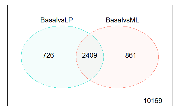
維恩圖顯示僅比較基礎與僅LP(左),基礎與僅ML(右)之間比較基因DE的數量,以及兩個比較(中心)中DE的基因數目。 任何比較中不是DE的基因的數目标記在右下角。
- 差異基因可視化
為了總結目測所有基因的結果,可以使用plotMD函數生成顯示來自線性模型的log-FC與平均對數-CPM值拟合的均值 - 差異圖,其中突出顯示差異表達的基因。
plotMD(tfit, column=1, status=dt[,1],
       main=colnames(tfit)[1],
       xlim=c(-8,13))

- 使用Glimma生成互動式均值差分圖。
log-FC與log-CPM值顯示在左側面闆中,與右側面闆中標明基因的每個樣品的單個值相關。 結果表也顯示在這些圖下方,以及搜尋欄以允許使用者使用可用的注釋資訊來查找特定的基因。
glMDPlot(tfit, coef=1, status=dt,
         main=colnames(tfit)[1],
         side.main="ENTREZID",
         counts=x$counts,
         groups=group, launch=T)
- 熱圖
使用來自gplots軟體包的heatmap.2函數,從基礎對比LP對比度的頂部100個DE基因(按調整的p值排列)建立熱圖。熱圖将樣品按細胞類型正确聚類,并将基因重新排列成具有相似表達模式的區塊。從熱圖中,我們觀察到ML和LP樣品的表達對于基礎和LP之間的前100個DE基因非常相似。
library(gplots)
basal.vs.lp.topgenes <- basal.vs.lp$ENTREZID[1:100]
i <- which(v$genes$ENTREZID %in% basal.vs.lp.topgenes)
mycol <- colorpanel(1000,"blue","white","red")
heatmap.2(v$E[i,], scale="row",
          labRow=v$genes$SYMBOL[i], labCol=group,
          col=mycol, trace="none", density.info="none",
          margin=c(8,6), lhei=c(2,10), dendrogram="column")