步進器的差別
Stepper視圖與Slider的程式設計接口幾乎相同:它具有double類型的Minimum,Maximum和Value屬性,并觸發ValueChanged事件處理程式。
但是,Stepper的Maximum屬性的預設值為100,Stepper還會添加一個Increment屬性,其預設值為1. Stepper視覺效果僅由兩個帶有減号和加号的按鈕組成。這兩個按鈕的按下會根據Increment屬性在Minimum到Maximum之間逐漸更改值。
雖然Stepper的Value和其他屬性是double類型,但Stepper通常用于選擇整數值。您可能不希望((最大 - 最小)÷增量)的值高達100,如預設值所示。如果您在其中一個按鈕上按住手指,則會在iOS上觸發打字重複,但在Android或Windows 10 Mobile上則不會。不管你的程式為使用者提供了另一種更改Stepper值的方法(可能是文本Entry視圖),你不想強迫使用者按100次按鈕從最小值到最大值。
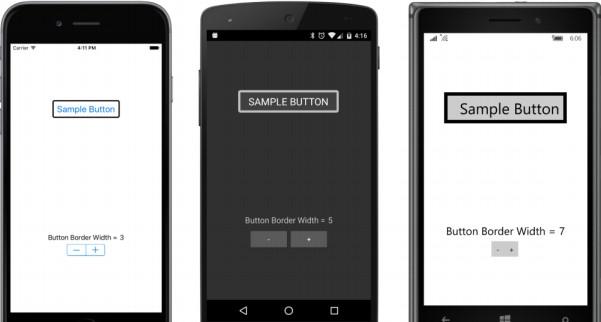
StepperDemo程式将Stepper的Maximum屬性設定為10,并使用Step?per作為基本設計輔助來确定Button邊框的最佳邊框寬度。 StackLayout頂部的Button僅用于顯示目的,并具有BackgroundColor和BorderColor的必要屬性設定,以啟用Android和Windows 10 Mobile上的邊框顯示。
Stepper是以下StackLayout中的最後一個子節點。 Button和Stepper之間是一對Label元素,用于顯示目前的Stepper值:
<ContentPage xmlns="http://xamarin.com/schemas/2014/forms"
             xmlns:x="http://schemas.microsoft.com/winfx/2009/xaml"
             x:Class="StepperDemo.StepperDemoPage">
    <StackLayout>
        <Button x:Name="button"
                Text=" Sample Button "
                FontSize="Large"
                HorizontalOptions="Center"
                VerticalOptions="CenterAndExpand">
            <Button.BackgroundColor>
                <OnPlatform x:TypeArguments="Color"
                            Android="#404040" />
                </Button.BackgroundColor>
            <Button.BorderColor>
                <OnPlatform x:TypeArguments="Color"
                            Android="#C0C0C0"
                            WinPhone="Black" />
            </Button.BorderColor>
        </Button>
        <StackLayout VerticalOptions="CenterAndExpand">

            <StackLayout Orientation="Horizontal"
                         HorizontalOptions="Center">
                <StackLayout.Resources>
                    <ResourceDictionary>
                        <Style TargetType="Label">
                            <Setter Property="FontSize" Value="Medium" />
                        </Style>
                    </ResourceDictionary>
                </StackLayout.Resources>

                <Label Text="Button Border Width =" />
                <Label x:Name="label" />
            </StackLayout>
            <Stepper x:Name="stepper"
                     Maximum="10"
                     ValueChanged="OnStepperValueChanged"
                     HorizontalOptions="Center" />
        </StackLayout>
    </StackLayout>
</ContentPage>
顯示Stepper值的Label從代碼隐藏檔案的構造函數初始化。 随着Stepper的Value屬性的每次更改,事件處理程式顯示新值并設定Button邊框寬度:
public partial class StepperDemoPage : ContentPage
{
    public StepperDemoPage()
    {
        InitializeComponent();
        // Initialize display.
        OnStepperValueChanged(stepper, null);
    }
    void OnStepperValueChanged(object sender, ValueChangedEventArgs args)
    {
        Stepper stepper = (Stepper)sender;
        button.BorderWidth = stepper.Value;
        label.Text = stepper.Value.ToString("F0");
    }
} 
![win10 在目前檔案夾快速打開cmd指令行[圖]](data:image/gif;base64,R0lGODlhAQABAIAAAP///wAAACwAAAAAAQABAAACAkQBADs=)