前面的博文介绍了字体的设置,如cygwin和putty的字体设置。一个好看的等宽字体,会充分保护眼睛,让工作更加愉快。
选择好的字体,主要看能否轻易分辨易混淆字符,如il1,0oo,:;,‘ ’与“,至于字符高矮,符号大小,个人觉得不是问题。
分享下我常用的几种字体。
<a href="http://higoge.github.io/www.dafont.com/bitstream-vera-mono.font">bitstream vera sans mono</a>
<a href="https://github.com/todylu/monaco.ttf" target="_blank">monaco</a>
<a href="https://github.com/adobe-fonts/source-code-pro" target="_blank">source code pro</a>
<a href="http://font.ubuntu.com/" target="_blank">ubuntu mono</a>
<a href="http://www.iplaysoft.com/consolas.html" target="_blank">yahei consolas hybrid</a>
<a href="http://www.zhihu.com/question/20299865" target="_blank">tsentsiu mono</a>
<a></a>
效果如图。
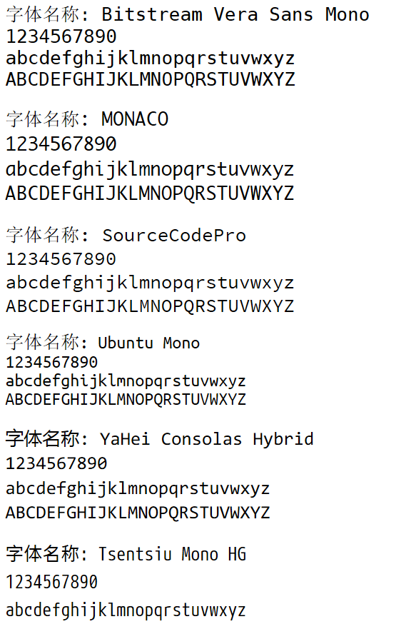
前四种字体只有英文的等宽显示,中文采用宋体显示。后两种均采用特定的中文显示,并且中文英文严格按照2:1显示。(不知道为什么yahei consolas hybrid作为浏览器字体中文混搭时不等宽。)
个人目前设置:中英文,如文本编辑器,采用tsentsiu mono hg字体(果断弃用yahei.consolas);纯英文,如putty连接linux,采用bitstream vera sans mono。

以上所有字体,汪汪的网盘均提供下载,路径为<code>/fonts</code>。
~~ eof ~~