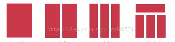
CSS页面布局
制作布局
一列布局
例子:
<head>
<meta http-equiv="Content-Type" content="text/html;charset=utf-8" />
<title>布局</title>
<style type="text/css">
body{ margin:0;padding:0}
.top{height:100px;background:blue}
.main{width:800px;height:300px;background:#ccc;margin:0 auto}
.foot{width:800px;height:100px;background:#900;margin:0 auto}
div{text-align:center}
</style>
</head>
<body>
<div class="top">top</div>
<div class="main">main</div>
<div class="foot">foot</div>
</body>
怎样去获得屏幕的自适应宽度、高度
例子:
<head>
<meta http="Content-Type" content="text/html;charset=utf-8" />
<title>一列布局</title>
<style type="text/css">
body{margin:0;padding:0;font-szie:30px}
div{text-align:center;font-weight:bold}
.main,.footer{width:960px;margin:0 auto}
.head{width:100%;height:100px;background:#ccc}
.main{height:600px;background:#fcc}
.footer{height:50px;background:#9cf}
</style>
</head>
<body>
<div class="head">head</div>
<div class="main">main</div>
<div class="footer">footer</div>
</body>
两列布局
例子:自适应
<head>
<meta http=equiv="Content-Type" content="text/html; charset=utf-8" />
<title>两列布局</title>
<style>
body{margin:0;padding:0}
.left{width:20%;height:500px;float:left;background:#ccc}
.right{width:80%;height:500px;float:right;background:#ddd}
div{text-align:center}
</style>
</head>
<body>
<div class="left">left</div>
<div class="right">right</div>
</body>
例子:
<head>
<meta http=equiv="Content-Type" content="text/html; charset=utf-8" />
<title>两列布局</title>
<style>
body{margin:0;padding:0}
.main{width:800px;margin:0 auto;background:blue}
.left{width:20%;height:518px;float:left;background:#ccc}
.right{width:80%;height:500px;float:right;background:#ddd}
div{text-align:center}
</style>
</head>
<body>
<div class="main">main</div>
<div class="left">left</div>
<div class="right">right</div>
</body>
例子:
<head>
<meta http-equiv="Content-Type"content="text/html;charset=utf-8" />
<title>两列布局</title>
<style type="text/css">
body{margin:10;padding:5;font-size:30px;font-weight:bold}
div{text-align:center;line-height:50px}
.main{width:960px;height:200px;margin:0 auto}
.left{width:300px;height:600px;background:#ccc;float:left}
.right{width:600px;height:600px;background:#FCC;float:right}
</style>
</head>
<body>
<div class="main">main</div>
<div class="left">left</div>
<div class="right">right</div>
</body>
例子:三列布局
<head>
<meta http-equiv="Content-Type"content="text/html;charset=utf-8" />
<title>三列布局</title>
<style type="text/css">
body{margin:0;padding:0}
.left{width:33.33%;height:500px;float:left;background:#ccc}
.middle{width:33.33%;height:500px;float:left;background:#999}
.right{width:33.33%;height:500px;float:right;background:#ddd}
</style>
</head>
<body>
<div class="left">left</div>
<div class="middle">middle</div>
<div class="right">right</div>
</body>
需要的是自适应屏幕的高度及宽度
例子:
<head>
<meta http-equiv="Content-Type"content="text/html;charset=utf-8" />
<title>三列布局</title>
<style type="text/css">
body{margin:0;padding:0}
.left{width:200px;height:500px;background:#ccc;position:absolute;left:0;top:0}
.middle{height:500px;background:#999;margin:0 310px 0 210px}
.right{width:300px;height:500px;background:#ddd;position:absolute;right:0;top:0}
</style>
</head>
<body>
<div class="left">left200px</div>
<div class="middle">midwwwgwewghwefgwf8ywge8w过完户发改委发个好玩感悟if各位if误会误会共分为复古味顾问覅故事覅覆盖物if物管费公司公司附属国或覅㐎 和覅我和我以复合物if文化覅各位以符号位u和覅为hi乌尔禾为维护华盛顿覅剺 和覅为会务儿无就护卫富五为划分委会UI符号位复合物而UI毫无hi符号位复合物而UI我一个人完全 瑞发改委顾问UI各位㐎 格尔发改委以发改委与规范 个以乌尔国五UIWWIuefgwuifghgcb dle</div>
<div class="right">right300px</div>
</body>
混合布局
例子:混合布局
<head>
<meta http-equiv="Content-Type" content="text/html;charset=utf-8" />
<title>综合布局</title>
<style type="text/css">
body{margin:0;padding:0}
.top{height:100px;background:blue}
.main{width:800px;height:600px;background:#ccc;margin:0 auto}
.left{width:200px;height:600px;background:yellow;float:left}
.right{width:600px;heigth:600px;background:#369;float:right}
.foot{width:800px;height:100px;background:#900;margin:0 auto}
div{text-align:center}
</style>
</head>
<body>
<div class="top">top</div>
<div class="main">
<div class="left">left</div>
<div class="right">right</div>
</div>
<div class="foot">foot</div>
</body>
例子:
<head>
<meta http-equiv="Content-Type" content="text/html;charset=utf-8" />
<title>综合布局</title>
<style type="text/css">
body{margin:0;padding:0}
.top{height:100px;background:blue}
.main{width:800px;height:600px;background:#ccc;margin:0 auto}
.left{width:200px;height:600px;background:yellow;float:left}
.right{width:600px;heigth:600px;backgorund:#369;float:right}
.sub_l{width:400px;height:600px;background:green;float:left}
.sub_r{width:200px;height:600px;bakcground:#09F;float:right}
.foot{width:800px;height:100px;background:#900;margin:0 auto}
div{text-align:center}
</style>
</head>
<body>
<div class="top">top</div>
<div class="main">
<div class="left">left</div>
<div class="right">
<div class="sub_l">subl</div>
<div class="sub_r">subr</div>
</div>
</div>
<div class="foot">foot</div>
</body>
例子:
<head>
<meta http-equiv="Content-Type" content="text/html;charset=utf-8" />
<title>综合布局</title>
<style type="text/css">
body{margin:0;padding:0}
.top{width:800px;height:100px;background:blue;margin:0 auto}
.main{width:800px;height:600px;background:#ccc;margin:0 auto}
.left{width:200px;height:600px;background:yellow;float:left}
.right{width:600px;heigth:600px;backgorund:#369;float:right}
.foot{width:800px;height:100px;background:#900;margin:0 auto}
div{text-align:center}
</style>
</head>
<body>
<div class="top">top</div>
<div class="main">
<div class="left">left</div>
<div class="right">right</div>
</div>
<div class="foot">foot</div>
</body>
DIV+CSS进行网页布局
流动布局
浮动布局
绝对定位布局
标准文档流
盒子模型
Float属性
Position属性
自动居中一列布局案例------盒子模型的使用方法
浮动布局模型--------float属性-----解决浮动影响的方法
绝对定位布局案例
绝对定位实现横向两列或多列布局布局
W3C标准
由万维网联盟指定的一系列标准
结构化标准语言(html和xml)
表现标准语言(CSS)
行为标准语言(DOM和ECMAScript) 倡导结构,样式,行为分离
CSS中的定位机制
CSS中,存在3种的定位机制:
标准文档流(normal flow)
浮动(floats)
绝对定位(Absolute positioning)
标准文档流(normal flow)
特点:
从上到下,从左到右,输出文档内容
由块级元素和行级元素组成
常见的块级元素:div ul li dl dt p
行级元素:span strong img input
特点:能在同一行内显示,不会改变html文档结构
块级元素,行级元素都是盒子模型
盒子模型-----网页布局的基石

优先级,就近原则,
行内样式,内部样式,外部样式
<style type=”text/css”>
Img{margin:10px 18px;border:1px solid #b1adad;}
</style>
自动居中,一列布局 ----------技能点:标准文档楼,块级元素,margin属性
<style type="text/css">
*{margin:0;padding:0;}
#wrap{width:770px;margin:0 auto;position:flxed;}
#header{width:100%;height:200px;border:1px solid red;}
#mainbody{width:100%;height:200px;border:1px;solid blue;}
#footer{width:100%;height:200px;border:1px solid green;}
</style>
如果想让页面自动居中,当设置margin属性为auto时,不能再设置浮动或绝对定位属性
Auto原理:(浏览器的宽度-外包含层的宽度)/2=外边框
浮动布局--------横向多列浮动
Float属性
Left左浮动,right有浮动,none不浮动
或左右移动直到触碰到容器为止
浮动的元素,任然处于文档流中,会对周围元素有影响
当元素没有设置宽度值,而设置了浮动属性,元素的宽度随内容的变化而变化
若它设置的浮动,则仅临着它右侧的元素有影响
清楚浮动的常用方法
Clear属性---- 常用的clear:both
Clear:left;或者clear:right 如:p{clear:both;}
同时设置p{width:100%+overflow:hiddin;}
横向两列布局---主要技能,float属性,使纵向排列的块级元素,横向排列
Margin属性,设置两列之间的间距
<!DOCTYPE html PUBLIC "-//W3C//DTD XHTML 1.0 Transitional//EN" "http://www.w3.org/TR/xhtml1/DTD/xhtml1-transitional.dtd">
<html xmlns="http://www.w3.org/1999/xhtml">
<head>
<meta http-equiv="Content-Type" content="text/html; charset=gb2312" />
<title>无标题文档</title>
<style type="text/css">
*{margin:0;padding:0;}
#wrap{background:#00C;margin:0 auto;width:960px;}
#header{background:#F30;width:100%;}
#mainbody{background:#FC0;width:100%;overflow:hidden;}
.left{width:800px;height:200px;background:#000;float:left;} //margin-right:20px;
.right{width:140px;height:500px;background:#690;float:right;}
#footer{background:#639;width:100%;}
</style>
</head>
<body>
<div id="wrap">
<div id="header">header</div>
<div id="mainbody">
<div class="left"></div>
<div class="right"></div>
</div>
<div id="footer">footer</div>
</div>
</body>
</html>
绝对定位布局
通过Position属性实现
Css中规定的第三种定位机制
能够实现横向多列布局及较为复杂的定位
用有三种定位:1、静态定位,2、相对定位,3、绝对定位
可设置4个属性值:
Static(静态定位)
Relative(相对定位)
Absolute(绝对定位)
Fixed(固定定位)
Relative(相对定位)
相对于自身原有位置进行偏移
仍处于标准文档流中
随即拥有偏移属性和z-index属性
Absolute(绝对定位)
建立了以包含块为基准的定位
完全脱离了标准文档流
随即拥有偏移和z-index属性
无论是否存在定位祖先元素,都保持在元素初始位置,脱离了标准文档流
设置偏移量
偏移参照基准:
无已定位祖先元素,以<html>为偏移参照基准
有已定位祖先元素,以距离其最近的已定位的祖先元素为偏移参照基准
横向两列布局,常用于一列固定宽度,另一列宽度自适应的情况
Relative---父元素相对定位
Absolute----自适应宽度元素的绝对定位
注意:固定宽度列的高度>自适应宽度的列
<head>
<meta http-equiv="Content-Type" content="text/html; charset=gb2312" />
<title>相对定位,绝对定位</title>
<!--
<style type="text/css">
.box1{background:red;height:300px;position:relative;top:50px;left:50px;}
.box2{background:green;height:300px;}
.box3{background:blue;height:300px;}
</style>
-->
<style type="text/css">
.box1{background:red;height:300px;}
.box2{background:green;height:300px;position:absolute;left:50px;top:20px;}
.box3{background:blue;height:300px;}
.box{height:60px;background:#FC0;position:relative;}
.wrap{height:400px;background:#999;position:absolute;}
</style>
</head>
<body>
<!--
<div class="box1">box1</div>
<div class="box2">box2</div>
<div class="box3">box3</div>
-->
<div class="wrap">
<div class="box1">box1</div>
<div class="box">
<div class="box2">box2</div>
</div>
<div class="box3">box3</div>
</div>
</body>
html结构,css表现,JavaScript行为
结构表现分离
<!DOCTYPE html PUBLIC "-//W3C//DTD XHTML 1.0 Transitional//EN" "http://www.w3.org/TR/xhtml1/DTD/xhtml1-transitional.dtd">
<html xmlns="http://www.w3.org/1999/xhtml">
<head>
<meta http-equiv="Content-Type" content="text/html; charset=utf-8" />
<meta name="author" content="" />
<meta name="copyright" content="" />
<title></title>
<style type="text/css">
body,div,dl,dt,dd,ul,ol,li,h1,h2,h3,h4,h5,h6,pre,form,fieldset,input,textarea,p,blockquote,th,td{margin: 0;padding: 0;list-style: none;font:12px/1.5 "Arial", "sans-serif", "微软雅黑", "宋体", "Tahoma"}
body{ padding-top:50px; line-height:20px}
.userPic{padding:5px; border:1px #ccc solid}
.demo01, .demo02{ margin-bottom:20px}
p{ text-indent:2em}
.demo01{width:600px; overflow:hidden}
.demo01 .left{ width:100px; float:left}
.demo01 .left .userPic{margin-left:20px}
.demo01 .right{ width:458px; float:right; padding:20px;background-color: #EEF7FF;border: 1px solid #CCC}
.demo01 .right h6{ margin-bottom:5px}
.demo01 .right .pubTime{ float:right;color:#999; margin-top:-8px}
.demo02{width:600px; overflow:hidden}
.demo02 .userPic{float:left; margin-left:20px}
.demo02 .right{ width:458px; float:right; padding:20px;background-color: #EEF7FF;border: 1px solid #CCC}
.demo02 .right h6{ margin-bottom:5px}
.demo02 .right .pubTime{ float:right;color:#999; margin-top:-8px}
.demo03{width: 460px;padding:20px;position: relative;background-color: #EEF7FF;border: 1px solid #CCC; margin-left:100px}
.demo03 h6{ margin-bottom:5px}
.demo03 .dialog p{text-indent: 2em; line-height:20px}
.demo03 .userPic{ float:left; margin:-20px 0 0 -100px}
.demo03 .pubTime{position:absolute; top:10px; right:20px; color:#999;}
</style>
</head>
<body>
<!---demo01----------------------------------->
<div class="demo01">
<div class="left">
<img class="userPic" src="images/head01.jpg" width="50" height="50" />
</div>
<div class="right">
<span class="pubTime">10分钟前</span>
<h6>樱桃小丸子</h6>
<p>式批准运营的远程教育公共服务体系,为遍布全国的学员提供学历(专升本,高起专)和非学历教育咨询、报名</p>
</div>
</div>
<!---demo02----------------------------------->
<div class="demo02">
<img class="userPic" src="images/head01.jpg" width="50" height="50" />
<div class="right">
<span class="pubTime">10分钟前</span>
<h6>樱桃小丸子</h6>
<p>式批准运营的远程教育公共服务体系,为遍布全国的学员提供学历(专升本,高起专)和非学历教育咨询、报名、学习辅导、课程考试</p>
</div>
</div>
<!---demo03----------------------------------->
<div class="demo03">
<img class="userPic" src="images/head01.jpg" width="50" height="50" />
<h5>樱桃小丸子</h5>
<p>部高等教立项体系,为遍布全国的学员提供学历(专升本,高起专)和非学历教育咨询、报名、学习辅导、课程</p>
<span class="pubTime">10分钟前</span>
</div>
</body>
</html>
练习
初级
<!DOCTYPE html PUBLIC "-//W3C//DTD XHTML 1.0 Transitional//EN" "http://www.w3.org/TR/xhtml1/DTD/xhtml1-transitional.dtd">
<html xmlns="http://www.w3.org/1999/xhtml">
<head>
<meta http-equiv="Content-Type" content="text/html; charset=gb2312" />
<title>无标题文档</title>
<style>
body,p,h1,h2,h3,h4,h5,h6,form,ul,ol,hr{margin: 0;padding: 0;font:14px/1.5normal,"Arial", "sans-serif", "微软雅黑", "宋体", "Tahoma";color:#666}
ul,ol{list-style:none}
.demo01{width:600px;position:relative}
.demo01 .left{width:100px;;float:left}
.demo01 .left img{margin-left:20px}
.demo01 .right{width:458px;padding:20px;float:right;background:#9CF;border:1px solid #ccc}
.demo01 .right p{font-size:12px;line-height:25px;}
.demo01 span{position:absolute;right:20px;top:18px;font-size:12px}
</style>
</head>
<body>
<div class="demo01">
<div class="left">
<img src="../install/website/website1/icon_1.gif" />
</div>
<div class="right">
<h6>樱桃小丸子</h6>
<p>2005年4月正式批准运营的远程教育公共服务体系,时学习支。</p>
<span>10分钟之前</span>
</div>
</div>
</body>
</html>
中级
<!DOCTYPE html PUBLIC "-//W3C//DTD XHTML 1.0 Transitional//EN" "http://www.w3.org/TR/xhtml1/DTD/xhtml1-transitional.dtd">
<html xmlns="http://www.w3.org/1999/xhtml">
<head>
<meta http-equiv="Content-Type" content="text/html; charset=gb2312" />
<title>无标题文档</title>
<style>
body,p,h1,h2,h3,h4,h5,h6,form,ul,ol,hr{margin: 0;padding: 0;font:14px/1.5normal,"Arial", "sans-serif", "微软雅黑", "宋体", "Tahoma";color:#666}
ul,ol{list-style:none}
.demo01{width:600px;position:relative;overflow:hidden}
.demo01 img{float:left}
.demo01 .right{width:458px;padding:20px;float:right;background:#9CF;border:1px solid #ccc}
.demo01 .right p{font-size:12px;line-height:25px;}
.demo01 span{position:absolute;right:20px;top:18px;font-size:12px}
</style>
</head>
<body>
<div class="demo01">
<img src="../install/website/website1/icon_1.gif" />
<div class="right">
<h6>樱桃小丸子</h6>
<p>奥鹏教育是由教育部高等教育司,为遍布全国的学员提供学历(专升本,高起专)和非学历教育咨询、报名、学习辅导。</p>
<span>10分钟之前</span>
</div>
</div>
</body>
</html>
高级
内容与模块之间的关系
<!DOCTYPE html PUBLIC "-//W3C//DTD XHTML 1.0 Transitional//EN" "http://www.w3.org/TR/xhtml1/DTD/xhtml1-transitional.dtd">
<html xmlns="http://www.w3.org/1999/xhtml">
<head>
<meta http-equiv="Content-Type" content="text/html; charset=gb2312" />
<title>无标题文档</title>
</head>
<style>
.demo01{width:458px;padding:20px;float:left;background:#9CF;border:1px solid #ccc;margin-left:100px}
.demo01 img{float:left;margin:-20px 0 0 -100px;}
.demo01 p{font-size:12px;line-height:25px;}
.demo01 span{position:absolute;right:20px;top:18px;font-size:12px}
</style>
<body>
<div class="demo01">
<img src="../install/website/website1/icon_1.gif" />
<h6>小丸子</h6>
<p>务体系,为遍布全国的学员提供学历(专升本,高起专)和非学历教育咨询、报名、学习辅导、课程考试、交费等7X24小时学习支持服务400-810-6736。</p>
<span>10分钟之前</span>
</div>
</body>
</html>
Text-indent:585px 文本缩进