自定义控件并不是一项多么难的技术,关于自定义控件这部分有不少文章讲的很透彻,这里我主要把自己练习自定义控件的过程记录下来。
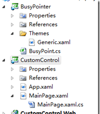
这里我以自定义控件BusyPointer为例,首先我们新建一个应用程序,命名为CustomControl,这里我们将自定义控件放入单独的项目中,所以在解决方案里添加一个Silverlight Class Library项目,命名为BusyPointer,现在我们把Class1.cs类删除,然后在BusyPointer项目中添加一个Silverlight Template Control,我们为之命名为BusyPoint,这时架构如下图所示,项目中增加了一个类文件,同时增加了名为Generic的xaml文件。
现在我们开始定义控件逻辑对于BusyPoint这个控件,这里我们只是简单模仿Win7里一个鼠标行为在BusyPoint.cs文件中给其定义了一个依赖属性。
public bool IsBusy
{
get
return (bool)GetValue(IsBusyProperty);
}
set
SetValue(IsBusyProperty, value);
ChangeState();
private void ChangeState()
if (IsBusy) VisualStateManager.GoToState(this, "Busied", true);
else VisualStateManager.GoToState(this, "Normal", true);
public static readonly DependencyProperty IsBusyProperty =
DependencyProperty.Register("IsBusy", typeof(bool), typeof(BusyPoint), new PropertyMetadata(new PropertyChangedCallback(OnBusyChanged)));
private static void OnBusyChanged(DependencyObject sender, DependencyPropertyChangedEventArgs e)
((BusyPoint)sender).IsBusy = (bool)e.NewValue;
关于依赖属性这个部分就不细说了,这里我们声明了一个用于当IsBusy值发生变化时的回调方法OnBusyChanged,现在我们在Generic.xaml中定义控件的样式。
<Style TargetType="local:BusyPoint">
<Setter Property="Template">
<Setter.Value>
<ControlTemplate TargetType="local:BusyPoint">
<Grid x:Name="LayoutRoot" Background="Transparent">
<vsm:VisualStateManager.VisualStateGroups>
<vsm:VisualStateGroup x:Name="CommonStates">
<vsm:VisualState x:Name="Normal" />
<vsm:VisualState x:Name="Busied">
<Storyboard>
<DoubleAnimationUsingKeyFrames Storyboard.TargetName="VisualElement" Storyboard.TargetProperty="(UIElement.RenderTransform).Angle" RepeatBehavior="Forever">
<SplineDoubleKeyFrame KeyTime="0:0:1" Value="360" />
</DoubleAnimationUsingKeyFrames>
</Storyboard>
</vsm:VisualState>
</vsm:VisualStateGroup>
</vsm:VisualStateManager.VisualStateGroups>
<Ellipse Width="20" Height="20" StrokeThickness="5.5" x:Name="VisualElement">
<Ellipse.Stroke>
<LinearGradientBrush EndPoint="0.5,1" StartPoint="0.5,0">
<GradientStop Color="#FF096475" Offset="0.571" />
<GradientStop Color="#FFA8FCFC" Offset="1" />
</LinearGradientBrush>
</Ellipse.Stroke>
<Ellipse.RenderTransform>
<RotateTransform CenterX="12.5" CenterY="12.5" />
</Ellipse.RenderTransform>
</Ellipse>
</Grid>
</ControlTemplate>
</Setter.Value>
</Style>
这里我们还需要添加一下命名空间xmlns:vsm="clr:namespace:System.Windows;assembly=System.Windows"

dll添加完成后,我们在MainPage.xaml页面中添加一个引用xmlns:by="clr-namespace:BusyPointer;assembly=BusyPointer",UI代码如下:
<by:BusyPoint x:Name="busy" IsBusy="False"></by:BusyPoint>
<Button Content="Button" Name="button1" Click="button1_Click" />
这里我们将BusyPoint控件的IsBusy设为False,我们通过这个Button将其设为True。
this.busy.IsBusy = true;
虽然比起系统自带的鼠标头不怎么优雅,当然这个部分并不是重点了,只是以这个控件为例,将自定义控件的步骤梳理了一遍。